Facebook viral marketing: When and why do apps “jump the shark?”
Excel spreadsheet download
For those of you who are interested in the gory details, please download the following spreadsheet here:
Download: Viral and Retention Excel Model
Math warning!
This blog post will be a little more technical than usual, so I apologize to those of you who are bored by this. Anyway, let’s get started.
See this image before? Many would describe that as, EPIC FAIL ;-)
That’s what happens when you “jump the shark” and your app goes from successful to completely not successful. Why does this happens? This blog post is to dissect that exact issue.
Modeling user acquisition
First off, let’s look at some ways to model user acquisition. For those of you with the spreadsheet, this is the second tab. You first start with a couple constants:
- Invite conversion rate % = 10%
- Average invites per person = 8.00
- Initial user base = 10,000
- Carrying capacity = 100,000
(note that these are just example numbers)
To understand how these constants work, you basically want to think about how viral marketing works. What happens is that you start out with an initial userbase (=10k), and every time your userbase grows, each user ends up sending out invites (=8.00), which then have a specific conversion rate (=10%).
That means that in the first time period, you have 10k. In the second time period, you get 10k*8*10% more users, which equals 8k more users, who are the next round of users who send invites. Then in the third time period, it’s 8k*8*10%, and so on. Note that the new batch of users needs to exceed the previous batch, in order to “go viral.” That ratio is often referred to as the viral coefficient. In fact, here’s the equation for this unbounded viral equation:
u(t) = u(0) * (1 + i * conv)^t
where u(0) = 10k, i = 8.00, conv = 10%, and t is the # of time periods
However, note that this assumes that your “carrying capacity,” that is, how many users are in the total network, is unlimited. However, on Facebook, that’s not true – once you burn through the 60 million new users, then you don’t have any left. Similarly, it doesn’t reflect the reality that as you saturate the network, your invites may end up going towards people who have already evaluated or installed your app, and they are unlikely to install it again.
A simple model for network saturation
Thus, one simplifying assumption is that as you saturate the network, the conversion rate on your invites goes down. In one possible model, you’d argue:
- If you have installs on 0% of the network, then your natural conversion rate (10%) holds
- If you have installs on 50%, then your natural conversion rate is discounted 50%, which equals 5%
- If you have installs on 99%, then your natural conversion rate is discounted 99%, and etc.
Note that you might even argue that this is an optimistic view. You might argue, for example, that the “discount” on your conversion rate should be related to the total % of the userbase that’s been invited, not the total % that’s installed something.
In that version, if someone hates your app and doesn’t want to install it, it’s unlikely that they will ever install it. In the version I’m describing, the only people who won’t install your app are the people who have already done so.
To describe this mathematically, you might say that at each point, there’s an “adjusted conversion rate” which looks like:
adjusted conversion rate
= natural conversion rate * saturation %
= natural conversion rate * (1 – current installs / total Facebook population)
so if you agree that’s true, then you can combine the this last equation into the initial one:
u(t) can be defined as:
= u(0) * (1 + i * adjusted_conv)^t
= u(0) * (1 + i * conv * u(t-1) / carrying_capacity)^t
(This can then be simplified further, but I’ll leave the math to the reader – the spreadsheet reflects this thinking already)
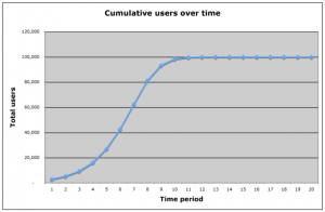
As a result of this, you see that your cumulative install base kinda looks like a logistic curve:
Now that you see that the cumulative users follows an interesting trend, where it starts to grow exponentially, but then starts to hit saturation. Then it eventually takes some time, but it starts to plateau as you reach the carrying capacity of the network.
Quick break for Cohort analysis re-introduction
Before reading through this post, you might want to glance over a previous blog I wrote on cohort analysis and its relationship to user retention reports
You may want to read that before going further…
Back to our story…
Previously, I discussed how you can mathematically model the viral acquisition process, particularly as you hit the network saturation point. However, while the model shows a growth curve for cumulative users, it doesn’t take into account how retention metrics fit in.
In the spreadsheet linked above, you can flip to the “User retention” tab, which shows a cohort analysis perspective of the hypothetical site. Here’s how to read it:
- On the Y-axis are “Time period cohorts” which are defined by the group of users that joined in a particular time period. So #1 means, the users that joined in period #1
- On the X-axis are the “Time period” which defines the time period that the specific cohort is in
So for example, in 1×1, there are an initial 3,000 active users on the site.
However, by the next time period, the 3,000 active users have declined to 1,500 users. However, because there are a bunch of virally generated users, there’s a new cohort of 2,328 users who have joined as cohort 2. The number of “new” cohorts is defined by the rows in the other spreadsheet tab, “Viral acquisition.”
Then notice that at the bottom of each time period, there’s a count for how many users are active in total, in each specific time period.
Does this make sense? If not, shoot me an email at voodoo[at]gmail with what you’re confused by, and I’ll update this blog with more clarifications!
Introducing the retention coefficient
So the key driver for retention is the % of users that stay alive in a specific cohort, between one period to the next. If it’s 50%, then if you start out with 3k users, in the next period you’ll be left with 1.5k users. If it’s 100% retention, then 3k users ends up with 3k users.
So let’s play around with the numbers.
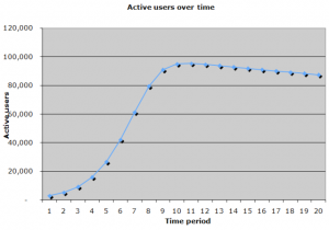
At 99% retention, which means that over 20 periods you are losing very few users, you get a graph of total active users that looks like this:
This chart looks pretty good, of course. You start with exponential growth, then hit a plateau, and you have a very slow burn on your userbase. I suspect that the Facebook site, among other highly popular sites, essentially have >99.999% retention between days. I say that because people seem to use the site for years at a time, and probably the early users of the site are probably mostly still on it.
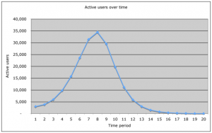
Now for the EPIC FAIL.
OK, here’s the fun part, which is when you drop the retention coefficient down to 50%:
Ouch. Doesn’t look good. If you’ve read all the way this, far it’s pretty clear why this happens, but let’s summarize:
Key conclusion
The key in this calculation, if you look at the stats, is that:
- Early on, the growth of the curve is carried by the invitations
- However, over time the invitations start to slow down as you hit network saturation
- The retention coefficient affects your system by creating a “lagging indicator” on your acquisition – if you have good retention, even as your invites slow down, you won’t feel it as much
- If your retention sucks, then look out: The new invites can’t sustain the growth, and you end up with a rather dire “shark fin.”
Things look great at first, but if you can’t retain users long-term, then you don’t have a business.
Improvements to the model
I want to make a couple comments on how the simplified model contained within the spreadsheet could be improved dramatically:
- Don’t just model invites, model multiple viral channels
- Include “usage loops” not just the “invite loops,” which are triggered by users trying out the product
- Try both a global carrying capacity, as well as a “niche discount” for the number, if your app is super-niche and focused on a particular demographic or user behavior
- Be able to handle realistic numbers – perhaps even retrofit it onto Adonomics data, for example
- Factor in re-engagement channels
- etc.
Obviously if anyone would like to think about this more, feel free to and shoot me an email.
PS. Get new updates/analysis on tech and startupsI write a high-quality, weekly newsletter covering what's happening in Silicon Valley, focused on startups, marketing, and mobile.
Views expressed in “content” (including posts, podcasts, videos) linked on this website or posted in social media and other platforms (collectively, “content distribution outlets”) are my own and are not the views of AH Capital Management, L.L.C. (“a16z”) or its respective affiliates. AH Capital Management is an investment adviser registered with the Securities and Exchange Commission. Registration as an investment adviser does not imply any special skill or training. The posts are not directed to any investors or potential investors, and do not constitute an offer to sell -- or a solicitation of an offer to buy -- any securities, and may not be used or relied upon in evaluating the merits of any investment.
The content should not be construed as or relied upon in any manner as investment, legal, tax, or other advice. You should consult your own advisers as to legal, business, tax, and other related matters concerning any investment. Any projections, estimates, forecasts, targets, prospects and/or opinions expressed in these materials are subject to change without notice and may differ or be contrary to opinions expressed by others. Any charts provided here are for informational purposes only, and should not be relied upon when making any investment decision. Certain information contained in here has been obtained from third-party sources. While taken from sources believed to be reliable, I have not independently verified such information and makes no representations about the enduring accuracy of the information or its appropriateness for a given situation. The content speaks only as of the date indicated.
Under no circumstances should any posts or other information provided on this website -- or on associated content distribution outlets -- be construed as an offer soliciting the purchase or sale of any security or interest in any pooled investment vehicle sponsored, discussed, or mentioned by a16z personnel. Nor should it be construed as an offer to provide investment advisory services; an offer to invest in an a16z-managed pooled investment vehicle will be made separately and only by means of the confidential offering documents of the specific pooled investment vehicles -- which should be read in their entirety, and only to those who, among other requirements, meet certain qualifications under federal securities laws. Such investors, defined as accredited investors and qualified purchasers, are generally deemed capable of evaluating the merits and risks of prospective investments and financial matters. There can be no assurances that a16z’s investment objectives will be achieved or investment strategies will be successful. Any investment in a vehicle managed by a16z involves a high degree of risk including the risk that the entire amount invested is lost. Any investments or portfolio companies mentioned, referred to, or described are not representative of all investments in vehicles managed by a16z and there can be no assurance that the investments will be profitable or that other investments made in the future will have similar characteristics or results. A list of investments made by funds managed by a16z is available at https://a16z.com/investments/. Excluded from this list are investments for which the issuer has not provided permission for a16z to disclose publicly as well as unannounced investments in publicly traded digital assets. Past results of Andreessen Horowitz’s investments, pooled investment vehicles, or investment strategies are not necessarily indicative of future results. Please see https://a16z.com/disclosures for additional important information.


