Ignore PR and buzz, use Google Trends to assess traction instead
[Yelp shows a healthy navigational search graph – lots of people are continuing to search for its brand, and you can see some seasonality where it peaks every August, goes down during Q4, then starts coming back up in Q1.]
PR buzz is useless for assessing product traction
Traction is everything, and it’s easy to confuse press buzz with actually having product/market fit. Writers for blogs and newspapers love novel ideas that sound amazing on paper, especially when the new products are being introduced by credible entrepreneurs. However, when you’re in the business of making product and investment decisions, it’s important to understand what’s actually working and what’s not- having buzz isn’t enough.
This article is about one of the ways to answer the question, “Is X product really working?” The easiest, fastest, free way to assess the traction of a competitor or buzzy startup is to use Google Trends. It’s a great tool from Google that gives you a chart of how many search queries are being generated, which is a fantastic way to see if the consumer pull demand is increasing or decreasing.
Navigational queries are the best representation of consumer “pull” from the market
The reason why this works is that Navigational Queries are one of the three major kinds of queries that consumers plug into search engines. People search for a brand like “yelp” “facebook” “zynga” when they want to directly navigate to that domain, and as you might imagine, it’s a strong indicator of customer loyalty. These navigational searches represent the “pull” of the market, and if the graph of this pull is flat or declining, then you might have a problem on your hands.
Consumer demand is the leading indicator, uniques are the lagging indicator
The reason why a graph of navigational queries is so powerful is that it partially removes three major sources of traffic which are often inauthentic, unsustainable, or susceptible to artificial inflation:
- Unsustainable paid ads, where spending outpaces lifetime value of the users acquired. Or, commonly in mobile, where a bunch of ads are purchased in an attempt to shoot an app up in the charts.
- Content farming, where a lot of low-quality content pages are created. Although a lot of users may end up arriving at these pages as a result of searching and clicking on something, they don’t know (or care) that they are on these pages- these aren’t really long-term users or customers.
- Drive-by traffic, which often looks like photo/video hosting, or IFRAME’d content, which people click into from Twitter, Facebook, or some other social channel. Similar to content farming, these are often “one click wonder” visits where people click in to view some content, but don’t actually engage or care about the underlying product.
Of course, doing something simple like graphic navigational queries isn’t strong enough to remove the entire effect of the above- instead, it just mutes it a little bit, and that’s the important thing in the long run. Ideally you want to see a long, smooth set of traffic that’s been built over months and years, not a huge spike driven by unsustainable means.
This consumer demand curve is really the leading indicator of traffic. Generally if I continue to see the graph going up and to the right, I will think that a company is pretty healthy. If it’s not, no matter how much is being written about them in the press, I’ll be skeptical.
Zooming in on traffic seasonality
One of the best parts about Google Trends is how granular it gets. You can ask to see the graphs on a 30-day rolling basis, as well as breaking it down by country. One the common patterns you’ll see is that there are two kinds of websites:
- Time-saving, where you use them at work Monday-Friday and they help you do your job.
- Time-wasting, where you use them at home in the evenings, and heavily on the weekends. They spike Saturday/Sunday and flatten out during the weekday.
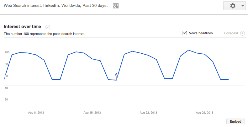
Here’s an obvious example of a time-saving product, Linkedin, which shows huge gains during the week but then it gets depressed during the weekends- amazingly the weekdays are 100% higher than the weekends, according to this chart!
Triangulate with AppAnnie, Facebook stats, Twittercounter, Twitter search, and Quantcast
Of course, there’s a ton of caveats to using such a simple tool. Searches will rise even when unsustainable methods are used, just because more consumers are being exposed to the brand. Similarly, the other big issue is that mobile apps don’t often benefit from search engine traffic the same way that websites do, since none of the content in the apps are being indexed.
Thus, remember that this analysis is strongest for web products, and to think of this as directional.
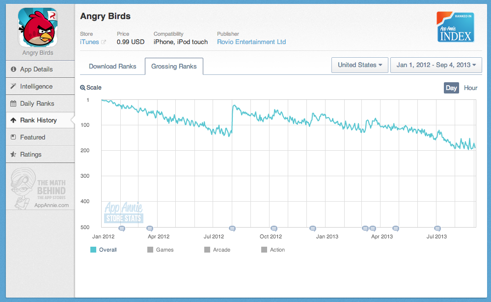
If you want a higher degree of confidence, consider using AppAnnie, Facebook stats, and Quantcast to figure out what’s going on. With AppAnnie, you can see the rankings of mobile apps and how they change over time. This can be useful in conjunction with Google Trends, since you can look up something like Angry Birds, which used to be the top grossing iOS app, which you can see below:
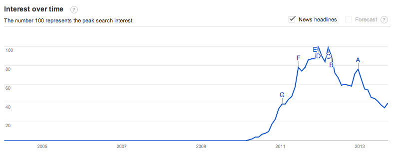
When you combine the above drop in rankings to their Google Trends chart, which I’ve included below, you can see that Angry Birds is stalling quite a bit:
You can also use Facebook stats services, for the products that allow for Facebook sign-in, to get a sense for how things are directionally going. Quantcast and Compete are also free services that let you look up uniques/month for web products, though they are often wildly in conflict with each other since they use the same kind of sampling that makes Alexa unreliable too. Back in 2006 I wrote about how Alexa works and all the flaws with their methodology, that I learned first-hand working with Nielsen/ComScore in my adtech days.
Qualitatively, doing a Twitter search on the brand is great too. Ideally you want to see a ton of authentic tweets about people actually talking about the product- again, the focus is on whether or not people really understand they are using a product and what they think of it. You can supplement this with a service like Twittercounter to see if their follower count is growing well over time. If a product claims a ton of uniques in a press release, but very few followers and very little Twitter conversation, it might be inauthentic traffic. (Thanks to Adam Besvinick for reminding me to mention Twitter searches)
How are Airbnb, Foursquare, Pinterest, Twitter, Quora, and Yahoo doing?
And finally, I thought it might be interesting to share the current graphs of a couple current (and previous) high-fliers to see how they’re doing on Google Trends. Some of the are universally considered to be doing well, and some are not. let’s see what Google Trends says, at least on a high-level.
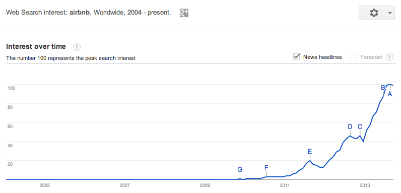
Airbnb
Seems to be growing very nicely. You can see some seasonal peaks in August where people rush to go on vacation for the summer, and then it rapidly drops off from there. The growth seems very strong.
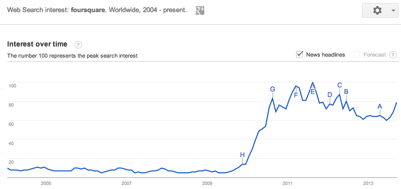
Foursquare
This is a tricky one- you both see that it’s flat, which is in line with what’s being discussed in the press. On the other hand, since it’s mostly mobile, it’s hard to say if this navigational query analysis is that useful. The silver lining on this also is that the traffic has held steady and hasn’t declined for a year now, which means there’s likely a strong core of retention holding everything together. Requires some more analysis to figure out what’s going on here.
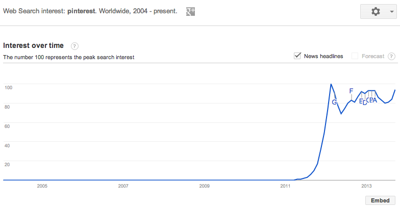
Pinterest
Same kind of indicators as Foursquare. There was a huge run up in 2011/2012, due to a lot of Open Graph nonsense, but now that the traffic spigot has died down, there’s still a good base of activity. As I understand it, they’re over 100M uu/month and holding onto that traffic, which should be enough audience to build a solid company.
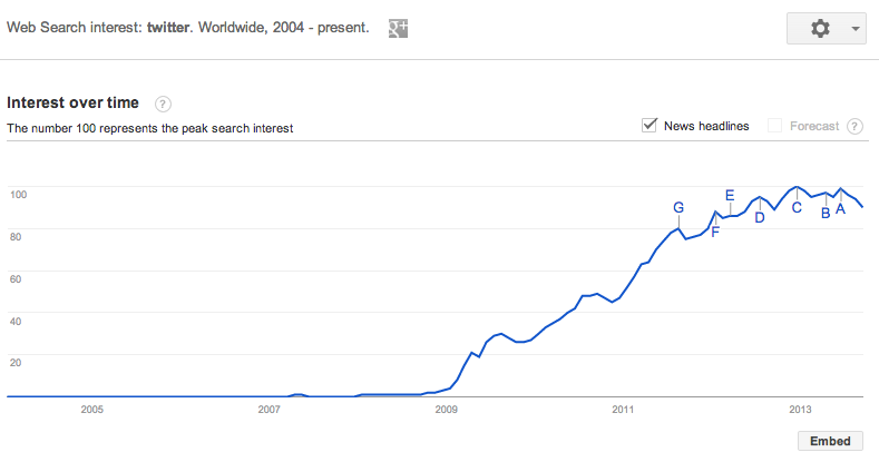
Twitter
Alongside Facebook’s graph, both seem like they are plateau’ing and going flat. But could this just be users transitioning from web-centric usage to mobile? I guess we’ll know when their IPO S-1 documents come out- are they accelerating audience growth or is is starting to slow down?
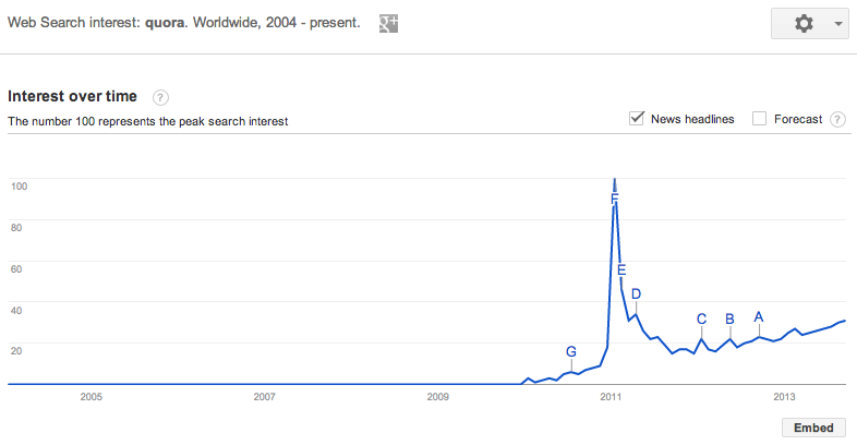
Quora
Although Quora hasn’t been in the news much lately, and a lot of digerati seem to have abandoned ship, their core base of traffic looks pretty good. Growing slowly. Building high-quality content via SEO is really hard- but it looks like Quora is gradually succeeding. Also note the epic launch curve, and that years later the current demand graph is still 1/3 of the initial peak.
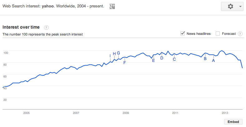
Yahoo
It’s fascinating to me that Yahoo was actually still growing strongly up until 2010 or so. Now it’s flat and maybe even declining a bit. Curious to see if these curves can actually reverse themselves- a more detailed analysis would probably pull up these curves for every single important property, from Mail to News to everything else, and see if any one property is dropping faster than the others.
I write a high-quality, weekly newsletter covering what's happening in Silicon Valley, focused on startups, marketing, and mobile.
Views expressed in “content” (including posts, podcasts, videos) linked on this website or posted in social media and other platforms (collectively, “content distribution outlets”) are my own and are not the views of AH Capital Management, L.L.C. (“a16z”) or its respective affiliates. AH Capital Management is an investment adviser registered with the Securities and Exchange Commission. Registration as an investment adviser does not imply any special skill or training. The posts are not directed to any investors or potential investors, and do not constitute an offer to sell -- or a solicitation of an offer to buy -- any securities, and may not be used or relied upon in evaluating the merits of any investment.
The content should not be construed as or relied upon in any manner as investment, legal, tax, or other advice. You should consult your own advisers as to legal, business, tax, and other related matters concerning any investment. Any projections, estimates, forecasts, targets, prospects and/or opinions expressed in these materials are subject to change without notice and may differ or be contrary to opinions expressed by others. Any charts provided here are for informational purposes only, and should not be relied upon when making any investment decision. Certain information contained in here has been obtained from third-party sources. While taken from sources believed to be reliable, I have not independently verified such information and makes no representations about the enduring accuracy of the information or its appropriateness for a given situation. The content speaks only as of the date indicated.
Under no circumstances should any posts or other information provided on this website -- or on associated content distribution outlets -- be construed as an offer soliciting the purchase or sale of any security or interest in any pooled investment vehicle sponsored, discussed, or mentioned by a16z personnel. Nor should it be construed as an offer to provide investment advisory services; an offer to invest in an a16z-managed pooled investment vehicle will be made separately and only by means of the confidential offering documents of the specific pooled investment vehicles -- which should be read in their entirety, and only to those who, among other requirements, meet certain qualifications under federal securities laws. Such investors, defined as accredited investors and qualified purchasers, are generally deemed capable of evaluating the merits and risks of prospective investments and financial matters. There can be no assurances that a16z’s investment objectives will be achieved or investment strategies will be successful. Any investment in a vehicle managed by a16z involves a high degree of risk including the risk that the entire amount invested is lost. Any investments or portfolio companies mentioned, referred to, or described are not representative of all investments in vehicles managed by a16z and there can be no assurance that the investments will be profitable or that other investments made in the future will have similar characteristics or results. A list of investments made by funds managed by a16z is available at https://a16z.com/investments/. Excluded from this list are investments for which the issuer has not provided permission for a16z to disclose publicly as well as unannounced investments in publicly traded digital assets. Past results of Andreessen Horowitz’s investments, pooled investment vehicles, or investment strategies are not necessarily indicative of future results. Please see https://a16z.com/disclosures for additional important information.
