Mattan Griffel has written some great essays on user growth over at Growhack, and you can follow him on Twitter at @mattangriffel. In particular I’m fond of his essay The Minimal Homepage, which states something that everyone who’s A/B tested their homepage knows: Keep it simple, and ask for your signup upfront. It’s one of the easiest and highest ROI ways to increase signups, because your visitors won’t find their way onto low conversion pages and bounce. Surprisingly, it’s still counterintuitive to many. I’ve referred people to this blog post before, and Mattan graciously offered for it to be reposted here. Enjoy! -Andrew
Mattan Griffel:
The Minimal Homepage
What do you notice about the homepages of the fastest growing companies in the world?
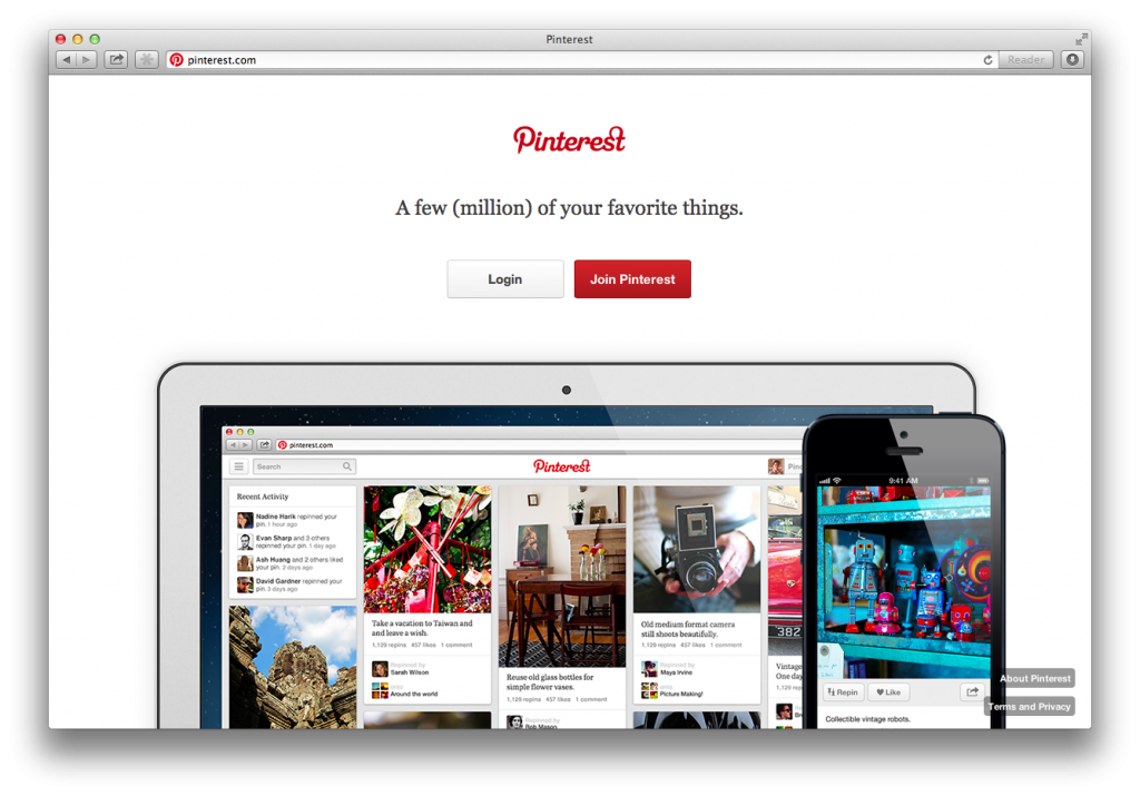
Here’s what I’ve noticed:
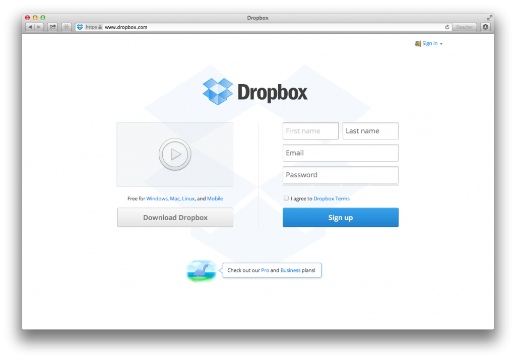
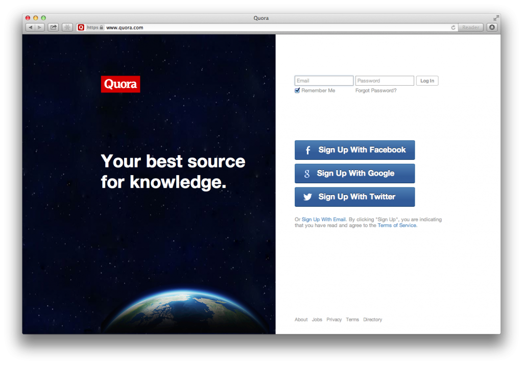
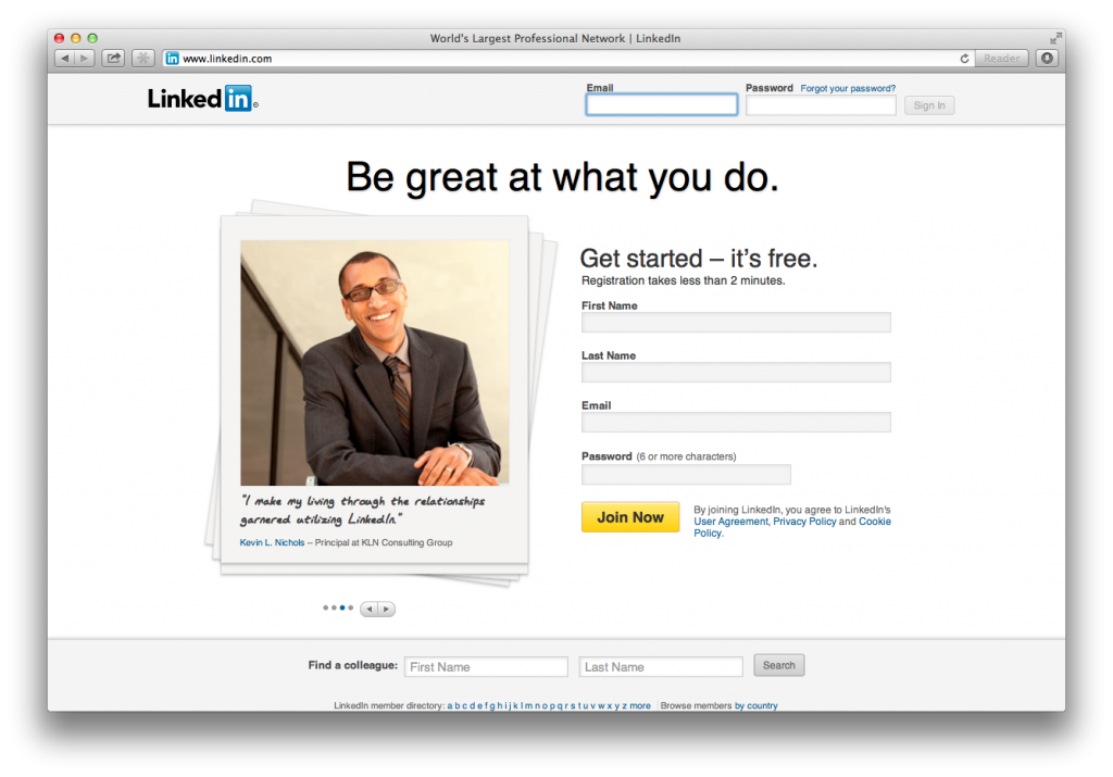
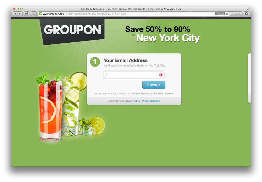
- No access without signup. Most startups make the mistake of giving people who visit their site free access to content, whether it’s apartment booking or daily deals. This is often a bad idea. Contrary to popular belief, the more things a visitor can interact with on your site before they’re prompted to sign up, the lower your signup rate will be.
- Navigation and hyperlinks are almost always absent. Over the years internet marketers have developed what they call the “Squeeze Page” with minimal content and a single clear call-to-action because they discovered that additional information could distract a visitor or cause them to click away to a different website. Notice that there’s nothing below the fold on any of these sites.
- Focus on a single, clear value proposition. In almost every case, the product’s value proposition is boiled down to one clear statement: “Your best source for knowledge” or “Be great at what you do”. People almost never read more than one sentence on your site (and they won’t even read that one unless it’s big enough and strategically placed), so there’s no point in trying to figure out your top 3 “bulletpoints”. This also makes it much, much easier to test as a growth hacker. Just replace one sentence with another until it works.
- Your product is not about sharing. I see this mistake all the time. Lots of startups start out thinking that people will use their product because it helps them “share” things more easily. Let me be clear here: most people do not share. And even those people who share things aren’t sharing things 90% of the time. Most of the time on the web is spend consuming, not producing. More than 50% of Twitter users almost never tweet. This is why Twitter has shifted their messaging from “the easiest way to share with your friends’ to “Find out what’s happening, right now, with the people and organizations you care about”. If you cater only to proactive people, you’ll be alienating most of your potential users.
- Big images. Big images increase conversion rates. Just do it.
- Embedded signup forms. Start your signup process on the homepage so people don’t have to click through to a new page for no reason. Generally speaking, the more clicks you have in your signup process, the more people will drop off along the way. Note that these signup forms are almost always on the right-hand side, above the fold. They also rarely ask for more than a name, email and password.
When I tell people these things they often complain: “But everyone knows Twitter and Facebook, so they don’t have to explain what their product is about. No one has ever heard of [my startup] so I actually need to explain it to people.”
You are wrong.
Maybe you and I already know what Twitter and Facebook are about, but we’re not the people they’re trying to get to sign up on their homepage. 2.4 billion people use the internet and more using it each day. Believe it or not, there are still people on earth who haven’t heard of Twitter or Facebook. Those are the people these homepages are trying to convert – not the luddites who refuse to sign up (trust me, Twitter and Facebook stopped caring about them long ago).
The same is true for your startup. Don’t be stubborn and don’t think that for some reason your startup is an exception. Making that kind of assumption because you’re scared to try something counter-intuitive is a sure way to make sure you never do anything innovative.
[UPDATE: I read a great comment on Facebook and wanted to share it below. -andrew]
Emmett Shear makes a great point in a comment on this essay, included below:
I dislike essays like http://andrewchen.co/2013/07/29/the-highest-roi-way-to-increase-signups-make-a-minimal-homepage-guest-post/ because while part of his point is valid (look at all these companies who have decided to gate things behind “signup first” and have very simple front pages!) there are tons of counter examples. Just look at the Alexa top 10.
#3 YouTube — putting a giant “sign up first” wall in front of YouTube probably would have killed them.
#6 Amazon — Amazon is all about converting people into accounts AFTER they decide to buy, and you better believe they’ve a/b tested it.
#7 Wikipedia — Primarily a read-first experience
#8 QQ – Holy crap that is a lot of textNow Google/Facebook/Baidu certainly follow the “simple homepage” design. But he’s overgeneralizing terribly and shows no indication he’s aware of it. The point of thinking about design is to be aware of tradeoffs, not to push the latest trend as “the smart way to do it”.
Said another way, increasing signups isn’t necessarily important for every company, and many successful companies don’t focus on it. So I would restate to “here’s how to increase signups” idea with “here’s how to increase signups once you’ve decided that signups are important to increase.” Great point Emmett!

