Archive for the ‘Uncategorized’ Category
New data shows losing 80% of mobile users is normal, and why the best apps do better
Exclusive data on retention curves for mobile apps
In a recent essay covering the Next Feature Fallacy, I explained why shipping “just one more feature” doesn’t fix your product. The root cause is that the average app has pretty bad retention metrics. Today, I’m excited to share some real numbers on mobile retention. I’ve worked with mobile intelligence startup Quettra and it’s founder/CEO Ankit Jain (formerly head of search+discovery for Google Play) to put together some exclusive data/graphs on retention rates** based on anonymized datapoints from over 125M mobile phones.
Average retention for Google Play apps
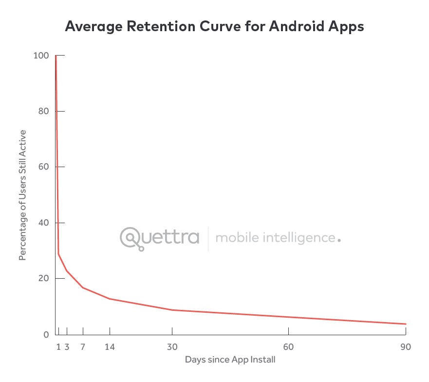
The first graph shows a retention curve: The number of days that have passed since the initial install, and what % of those users are active on that particular day. As my readers know, this is often used in a sentence like “the D7 retention is 40%” meaning that seven days after the initial install, 40% of those users was active on that specific day.
The graph is pretty amazing to see:
Based on Quettra’s data, we can see that the average app loses 77% of its DAUs within the first 3 days after the install. Within 30 days, it’s lost 90% of DAUs. Within 90 days, it’s over 95%. Stunning. The other way to say this is that the average app mostly loses its entire userbase within a few months, which is why of the >1.5 million apps in the Google Play store, only a few thousand sustain meaningful traffic. (*Tabular data in the footnotes if you’re interested)
Ankit Jain, who collaborated with me on this essay, commented on this trend:
Users try out a lot of apps but decide which ones they want to ‘stop using’ within the first 3-7 days. For ‘decent’ apps, the majority of users retained for 7 days stick around much longer. The key to success is to get the users hooked during that critical first 3-7 day period.
This maps to my own experience, where I see that most of the leverage in improving these retention curves happen in how the product is described, the onboarding flow, and what triggers you set up to drive ongoing retention. This work is generally focused on the first days of usage, whereas the long-term numbers are hard to budge, no matter how many reminder emails you send.
Note that when we say that these DAUs are being “lost” it doesn’t mean that users are suddenly going completely inactive – they might just be using the app once per week, or a few times per month. Different apps have different usage patterns, as I’ve written about in What factors influence DAU/MAU? with data from Flurry. Just because you lose a Daily Active User doesn’t mean that you’re losing a Monthly Active User, yet because the two correlate, you can’t sustain the latter without the former.
Get new updates, usually once a week – featuring long-form essays with what’s going on in tech.
How do the best apps perform? Much better.
The second graph we’ll discuss is a comparison of retention curves based on Google Play ranking. The data shows that there is a very clear and direct correlation:
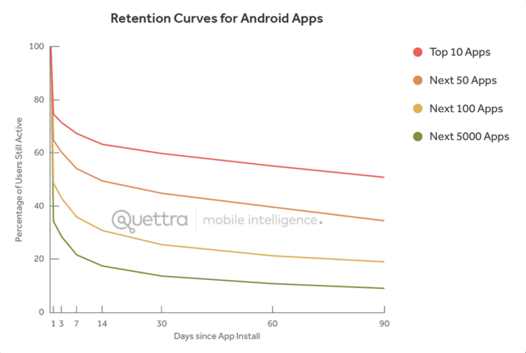
The top apps have higher D1 retention rates, and end with much stronger absolute D30 numbers. However, interestingly enough, the falloff from D1 to D30 is about the same as all the other apps. Another way to say it is that users find the top apps immediately useful, use it repeatedly in the first week, and the drop off happens at about the same speed as the average apps. Fascinating.
Bending the curve happens via activation, not notification spam
To me, this is further validation that the best way to bend the retention curve is to target the first few days of usage, and in particular the first visit. That way, users set up themselves up for success. Although the data shown today relates to mobile apps, I’ve seen data for desktop clients and websites, and they all look the same. So whether you’re building a mobile app or something else, the same idea applies:
- For a blogging product, you might want users to pick a theme, a name, and write their first post, to get them invested.
- For a social service, you might want users to import their addressbook and connect to a few friends, to give them a strong feed experience and opt them into friend notifications
- For a SaaS analytics product, you might want users to put their JS tag on their site, so that you can start collecting data for them and sending digest emails
- For an enterprise collaboration product, you might want users to start up a new project and add a couple coworkers to get them started
Each of the scenarios above can have both a qualitative activation goal, as well as quantitive results to make sure it’s really happening. Whatever you do, sending a shitload of spammy email notifications with the subject line “We Miss You” is unlikely to bend the curve significantly.
I hate those, and you should too.
(Thanks again to Ankit Jain of Quettra for sharing this data and assisting me in developing this piece. More from them here, which examines app-by-app retention rates for messaging apps)
*Tabular data
| 0 | 1 | 3 | 7 | 14 | 30 | 60 | 90 | |
| Top 10 Apps | 100 | 74.67 | 71.51 | 67.39 | 63.28 | 59.80 | 55.10 | 50.87 |
| Next 50 Apps | 100 | 64.85 | 60.31 | 54.13 | 49.48 | 44.81 | 39.60 | 34.50 |
| Next 100 Apps | 100 | 48.72 | 42.96 | 35.93 | 30.79 | 25.45 | 21.25 | 18.98 |
| Next 5000 Apps | 100 | 34.31 | 28.54 | 21.64 | 17.43 | 13.62 | 10.74 | 8.99 |
| Average | 100 | 29.17 | 23.42 | 17.28 | 13.11 | 9.55 | 6.82 | 3.97 |
**Methodology
Some notes on methodology below, shared by Quettra:
Quettra software, that currently resides on over 125M Android devices worldwide, collects install and usage statistics of every application present on the device. For this report, we examine five months of data starting from January 1, 2015.
Since we exclusively consider Android users in this study, we exclude Google apps (e.g. Gmail, YouTube, Maps, Hangouts, Google Play etc.) and other commonly pre-installed apps from our study to remove biases. We also only consider apps that have over 10,000 installs worldwide.
A note on privacy, which is very important to us: All data that we collected is anonymized, and no personally identifiable information is collected by any of our systems. From our understanding, this is the first time ubiquitous mobile application usage has been analyzed at such large scale. Quettra does not have a direct relationship with any of the apps or app developers mentioned in this report.
Photos of the women who programmed the ENIAC, wrote the code for Apollo 11, and designed the Mac

Ada Lovelace, an early computing pioneer, featured prominently in Walter Isaacson’s book The Innovators
Innovation is messy, and too easy to oversimplify
After finishing Walter Isaacson’s biography of Steve Jobs, I eagerly devoured his followup book, The Innovators. This book zooms out to focus not on an individual, but on the teams of collaborators and competitors who’ve driven technology forward, and the messiness of innovation. The stars of the story turn out to be the often unappreciated women who contributed to computing at key moments, and the book fittingly begins and ends with Ada Lovelace, an 19th century mathematician who defined the first algorithm and loops. I recommend the book, and here are the NYT and NPR write-ups which you can check out as well.
Isaacson’s book resonated with me because once you know how messy the success stories are, it’s obvious why the media always chooses to simplify things down to just a few characters with simple motivations. As a result, we know what kind of shoes that Steve Jobs wears, but forget the names of the people around him who worked for years to make the products we love.
The stories from the book have been floating around in my brain for a few months now, and coincided with two other pieces that went viral on Twitter/Facebook. First, there’s been some great photos of Margaret Hamilton who led the software development for Apollo 11 mission. Second, there was a discussion on Charlie Rose on the women who worked on the original Macintosh. I did some research and put together a few photos of these key pioneers from computing history. Seeing their faces and names help make them more real, and I wanted to share the photos along with some blurbs for context.
If you have more photos to send me, just tweet them at @andrewchen and I’ll continue to update this article.
Women of ENIAC
One of the most interesting backstories in Isaacson’s book is the fact that women mostly dominated software in the early years of computing. Programming seemed close to typing or clerical work, and so it was mostly driven by women:
Bartik was one of six female mathematicians who created programs for one of the world’s first fully electronic general-purpose computers. Isaacson says the men didn’t think it was an important job.
“Men were interested in building, the hardware,” says Isaacson, “doing the circuits, figuring out the machinery. And women were very good mathematicians back then.”
In the earliest days of computing, the US Army built the ENIAC, the first electronic general purpose computer in 1946. And women programmed it – but not the way we do now – it was driven by connecting electrical wires and using punch cards for data.

Left: Patsy Simmers, holding ENIAC board Next: Mrs. Gail Taylor, holding EDVAC board Next: Mrs. Milly Beck, holding ORDVAC board Right: Mrs. Norma Stec, holding BRLESC I board.

Left: Betty Jennings. Right: Frances Bilas

Jean Jennings (left), Marlyn Wescoff (center), and Ruth Lichterman program ENIAC at the University of Pennsylvania, circa 1946.
Margaret Hamilton and Apollo 11
Twitter has been circulating this amazing photo of Margaret Hamilton and printouts of the Apollo Guidance Computer source code. This is the code that was used in the Apollo 11 mission, you know, the one that took humankind to the moon. This is how Margaret describes it:
In this picture, I am standing next to listings of the actual Apollo Guidance Computer (AGC) source code. To clarify, there are no other kinds of printouts, like debugging printouts, or logs, or what have you, in the picture.
There are some nice articles about this photo on both Vox and Medium, which are worth reading.
Here it is, along with a few other photos of her during this time:
A side note to this that I found pretty nerdtastic is that the the guidance computer used something called “core rope memory” which was weaved together by an army of “little old ladies” in order to resist the harsh environment of space.
To resist the harsh rigors of space, NASA used something called core rope memory in the Apollo and Gemini missions of the 1960s and 70s. The memory consisted of ferrite cores connected together by wire. The cores were used as transformers, and acted as either a binary one or zero. The software was created by weaving together sequences of one and zero cores by hand. According to the documentary Moon Machines, engineers at the time nicknamed it LOL memory, an acronym for “little old lady,” after the women on the factory floor that wove the memory together.
Here’s what it looked like:
Susan Kare, Joanna Hoffman and the Mac
Megan Smith, the new chief technology officer of the United States, was on Charlie Rose recently and referenced the fact that the women who worked on the Macintosh were unfairly written out of the Steve Jobs movie – you can see the video excerpt of her speaking about it here. I tracked down the photo she was referring to, and wanted to share it below.

Macintosh team members: Row 1 (top): Rony Sebok, Susan Kare; Row 2: Andy Hertzfeld, Bill Atkinson, Owen Densmore; Row 3: Jerome Coonen, Bruce Horn, Steve Capps, Larry Kenyon; Row 4: Donn Denman, Tracy Kenyon, Patti Kenyon
On the top of the pyramid photo is Susan Kare, who was a designer on the original Mac and did all the typefaces and icons. Some of the most famous visuals, such as the happy mac, watch, etc., are all from her.
![]()
One cool thing to add to your office: Some signed/numbered prints of Susan’s most famous work. I have a couple – here’s the link to get your own.
Here’s a May 2014 talk. Susan Kare, Iconographer (EG8) from EG Conference on Vimeo.
Another key member of the original Mac team, Joanna Hoffman, isn’t in the pyramid photo but I was able to find a video of her talking about the Mac on YouTube, and embedded it below. Here’s the link if you can’t see the embed. She wasn’t in the Steve Jobs movie from Ashton Kutcher, but it looks like she will be played by Kate Winslet in the new Aaron Sorkin film coming out.
Here’s the video:
Bonus graph: Women majoring in Computer Science
Hope you enjoyed the photos. If you have more links/photos to include, please send them to me at @andrewchen.
As a final note, one of the most surprising facts from Isaacson’s book is that early computing had a high level of participation from women, but dropped off over time. I was curious when/why this happened, and later found an interesting article from NPR which includes a graph visualizing the % of computer science majors who are women over the last few decades.
The graph below is from the NPR article called When Women Stopped Coding – it’s worth reading. It speculates that women stopped majoring in Computer Science around the time that computers hit the home, in the early 80s. That’s when male college students often showed up with years of experience working with computers, and intro classes came with much higher expectations on experience with computers.
The Next Feature Fallacy: The fallacy that the next new feature will suddenly make people use your product
A few weeks ago, I read this tweet, and found myself nodding my head in vigorous agreement.
The Next Feature Fallacy: the fallacy that the next feature you add will suddenly make people want to use the entire product.
— Joshua Porter (@bokardo) May 14, 2015
For people who love to build product, when something’s not working, it’s tempting to simply build more product. It leads to the launch-fail-relaunch cycle that I alluded to in a previous essay, Mobile app startups are failing like it’s 1999. However, this rarely works, and when you look at the metrics, it’s obvious why.
The metrics behind the Next Feature Fallacy
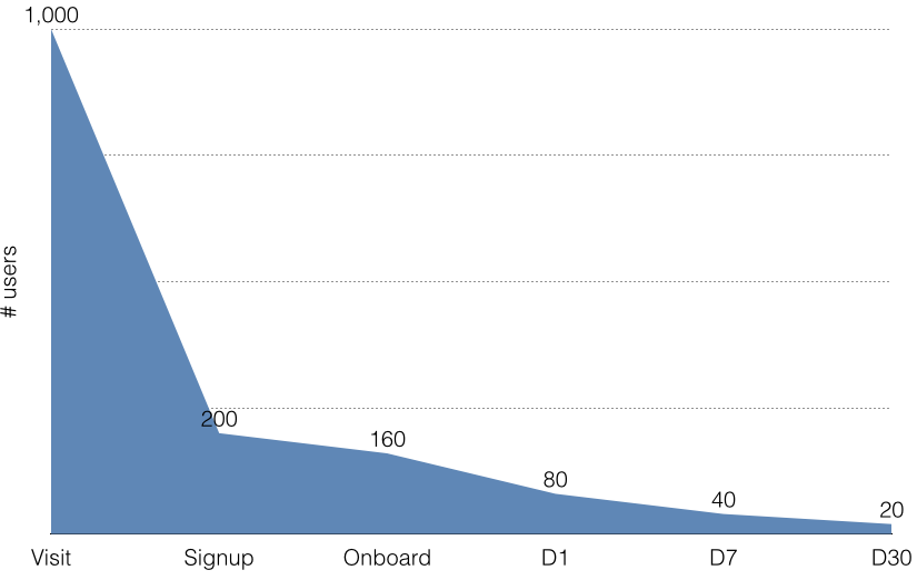
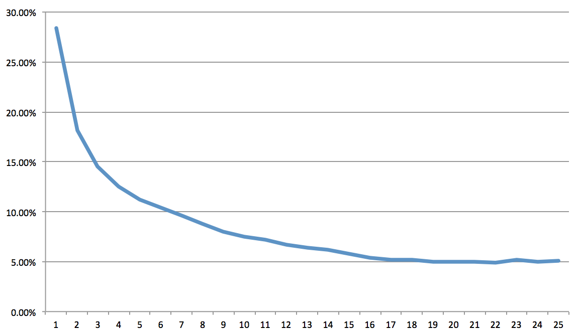
Let’s go into the numbers. The reason why the Fallacy is true can be described by one simple diagram, which might be described as the most tragic curve in tech:
The above diagram shows the precipitous drop-off between initially attracting a user versus the difficulty of retaining them over the first month. Perhaps it reminds you of the diagram, popularized by Edward Tufte, of the destruction of the Napoleon’s Grande Armée during his disastrous invasion of Russia. The curve drops off fast- very fast. I’ve seen a lot of real data around this, and believe me, there are very few cases where things look pretty.
Some example metrics for a web app with average (but not great) numbers:
- 1000 users visit your homepage to check out your product
- 20% sign up
- 80% finish onboarding
- 40% visit the next day after signup
- 20% visit the next week after signup
- 10% visit after 30 days after signup
- After 30 days, 20 users (out of 1000!) are DAUs
This is pretty typical, and you can see the steep drop-off.
And yes, occasionally I’ve seen better numbers than this, for apps that have built a great brand, or are getting most of their traffic through high-conversion referrals. Or the D1/D7/D30 for certain categories, like messaging apps, are often 2-3X higher than what I’m publishing above. But in the main, everyone is a bit depressed about their numbers. I’ve written about the routine mediocrity of these metrics in more detail here: Why consumer product metrics are all terrible.
The vast majority of features won’t bend the curve
These metrics are terrible, and the Next Feature Fallacy strikes because it’s easy to build new features that don’t target the important parts. Two mistakes are often made when designing features meant to bend this engagement curve:
- Too few people will use the feature. In particular, that the features target engaged/retained users rather than non-users and new users
- Too little impact is made when they do engage. Especially the case when important/key functions are displayed like optional actions outside of the onboarding process.
These mistakes are made because there’s often the well-intentioned instinct to focus on features that drive deep engagement. Of course you need a strong baseline of engagement, but at its extreme, this turns misguided because features that aren’t often used can’t bend the curve. A “day 7 feature” will automatically be used less than an experience tied to onboarding, since the tragic curve above shows that fewer than 4% of visitors will end up seeing it.
Similarly, a product’s onboarding experience can be weak if there isn’t a strong opinion on the right way to use (and setup) the product. In the early Twitter days, you’d sign up and immediately be dropped onto a blank feed, and a text box to type in your status. While this might let you explore the product and do anything, ultimately this is a weaker design then asking you to follow a bunch of accounts, which is the current design. Understanding that Twitter is meant to be mostly used as a reader, potentially without tweeting much, is a deep insight and a strong opinion that has paid dividends for the product.
Another frame to think about is to make sure a new feature doesn’t assume deep engagement/investment in your product. Let’s introduce the concept of an engagement wall, which exists at the moment that your product asks the user to deeply invest in their product usage, where “behind the wall” means that the feature can only be experienced once the users buys into a product, and engages. An example might be a high-effort, low % action like posting a photo, creating a new project, or dropping files into a folder. In front of the wall means features that create value without much investment, such as browsing a feed, rating some photos, or clicking a link. If you build a bunch of amazing features that are behind the engagement wall, then chances are, only a small % of users will experience the benefits. Adding a bunch of these features won’t bend the curve.
How to pick the next feature
Picking the features that bend the curve requires a strong understanding of your user lifecycle.
First and foremost is maximizing the reach of your feature, so it impacts the most people. It’s a good rule of thumb that the best features often focus mostly on non-users and casual users, with the reason that there’s simply many more of them. A small increase in the front of the tragic curve can ripple down benefits to the rest of it. This means the landing page, onboarding sequence, and the initial out-of-box product experience are critical, and usually don’t get enough attention.
Similarly, it’s important to have deep insights on what users need to do to become activated, so that their first visit is set up properly. For social networks, getting them to follow/add friends is key, because that kicks off a number of loops that will bring them back later on. For a SaaS metrics app, it might be getting a JS tag onto the right pages. For a blog, it might be for them to pick a name, theme, and write the first post so they get invested. Isolating the minimum onboarding process lets you keep the initial steps high-conversion, yet set up their experience for success.
When a product is still early, when you’re searching for and building game-changing features, the resources those features eat through can be massive. The risk that your company takes in building them might be too high, and your team might overestimate the probability that a feature will meet your expected growth goals for it. There is always a chance that the next feature will bend the curve, but it requires being smart, shrewd, and informed. Good luck.
Why investors don’t fund dating
I’ve been listening to the excellent Season 2 of the podcast Startup, which gives an inside look at YCombinator startup The Dating Ring (NYT coverage here). The episodes are all great. They talk about many important topics, but I had some specific comments on fundraising for dating products.
Here’s a simple fact: It’s super hard to get a dating product funded by mainstream Silicon Valley investors, even though it’s a favorite startup category from 20-something entrepreneurs. There’s a large swath of angels/funds who categorically refuse to invest in the dating category in the same way that many refuse to invest in games, hardware, gambling, etc. Perhaps they’d make an exception for a breakout like CoffeeMeetsBagel (I’m an advisor) or Tinder, but in the main, it’s an uphill battle for dating apps to attract interest. Here’s some data on the few dating cos that have raised.
Obviously, anyone starting a new company in dating should try to understand investor biases in this sector. This essay also compliments a previous one on operating, from HowAboutWe co-founder Aaron Schildkrout, now at Uber, who also wrote about his experiences.
Here are the reasons usually given for why investors don’t do dating:
- Built-in churn
- Dating has a shelf-life
- Paid acquisition channels are expensive
- City-by-city expansion sucks
- Hard to exit
- Demographic mismatch with investors
Let’s break it down.
Built-in churn
Churn sucks, and the better your dating product works, the more your customers will churn*. Every churned customer is a new customer you’ll have to acquire just to get back to even. When you look at a successful subscription service like Netflix or Hulu, you might find a churn rate of 2-5% per month, and you can calculate the annual churn through the following:
Annual Churn = 1-(1-churn_rate)^12
2% monthly churn = 1-(1-0.02)^12 = 21% annual churn
10% monthly churn = 1-(1-0.1)^12 = 70% annual churn
If you have an 70% annual churn rate, you have to have a strategy to replace almost your entire customer base each year, plus a bunch of percentage points to drive topline growth. You can imagine why successful public SaaS companies try to keep their monthly churn under 2%.
So what do the churn rates look like for a dating product? I’ve heard numbers as high as 20-30% monthly. Let’s calculate that:
20% monthly churn = 1-(1-0.2)^12 = 93% annual churn
You read that right. And that means at 20% monthly churn, it gets very hard to retain what you have, much less fill the top-of-funnel with enough new customers to grow the business. Scary.
With most subscription products, the more you improve your product, the lower your churn. With dating products, the better you are at delivering dates and matches, the more they churn! As you might imagine, that creates the wrong incentives. A product focused on casual dating, like Tinder, might escape this dilemma, but dating products generally have built-in churn that’s unavoidable.
Dating is niche and has a shelf-life
All this churn is especially complicated by the fact that the dating market at any given time is pretty niche. Similar to buying a car, refinancing your student loans, or moving into a new house, the reality is that being “in the market” as a single person looking to meet others has a limited time window. Another way to say this is the dating has “intent” the same way that shopping might, especially when you are talking about a paid subscription service. This limits the market size as well as restricting the types of marketing channels you can use to read those consumers.
A similar challenge is that these products aren’t “social” in the same way that Skype or Facebook might be. Although the stigma is quickly passing, it’s not like consumers want to sign up for a dating site and then invite their friends+family to join them on the site. In that way, it’s more similar to a financial or health product, where some privacy is required.
Again, one of the ways that the new generation of mobile dating products solve this is that they are free plus focus more on casual dating. Both factors open up the market to a wider audience, reduce churn, and create opportunities for viral growth.
Paid acquisition channels are expensive
Dating products have historically depended on paid acquisition channels to build their customer base, and other subscription products have generally done the same. In order to make the ROI work, you have to calculate your customer acquisition cost (CAC) versus your lifetime value (LTV) and make sure you are making enough money to support both the marketing as well as operations. In SaaS, you’d try to get a 3X ratio for CAC:LTV but that’s building in some profit for the company – a dating startup might be able to run it closer to the metal to get their initial growth.
Here’s a couple scenarios for products that buy their customers:
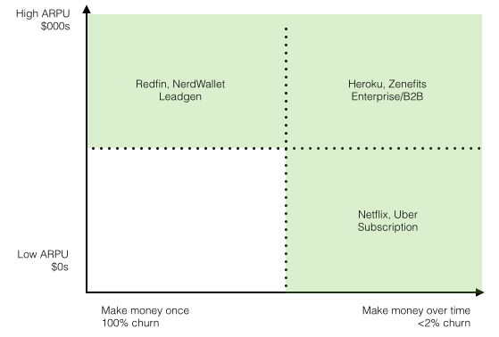
- Make a ton of money all at once (example: car/insurance/loan/mortgage leadgen)
- Make a little bit of money over a long period of time (storage, streaming music, etc.)
- Make a little money at first, then grow the revenue over a long period of time (SaaS)
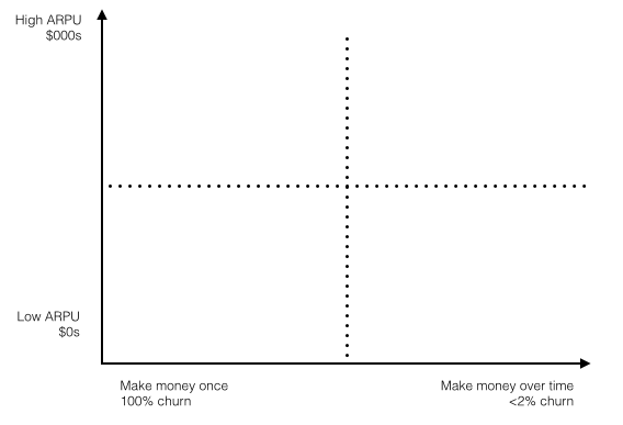
Here’s a visualization of this:
When you start to fill in this chart, you can see a couple things:
First, you’ll observe that of course the “ideal” case might look like a super low churn business that also generates a ton of revenue from each customer. However, the market size might be much smaller than the others. Christoph Janz, a venture capitalist and initial investor in Zendesk wrote a great essay on this topic, called Five ways to build a $100M business that talks about market size as an issue for this.
But back to dating- where does it go? The trouble is, it has some of the same economics for consumer subscription products priced at <$50/month, but at the same time, super high churn that looks like a one-time product. It’s hard to build a high LTV off of that, and so paid channels turn tricky.
Again, this is an area where the new mobile dating apps excel. They have the ability to tap into organic viral/word-of-mouth installs, are super sticky due to their messaging features, and free installs mean infinity return on ad spend (ROAS). At the same time, their focus on casual dating lowers churn and they can monetize via microtransactions. It’s a different model that’s more attractive.
City-by-city expansion sucks
Dating products inherently rely on a local marketplace, and bootstrapping a series of marketplaces is very hard, and expensive. People are willing to travel to meet each other, but only so much. And there needs to be the right mix of male/female participants (or whatever permutation makes sense). To make this work, each city needs to get spun up the same way that on-demand services are spun up, which is one of the reasons why local expansion has remained expensive and unscalable.
This is why we often see dating products continually hold a series of unscalable events/parties/etc in a city to get things going. Until there’s word-of-mouth, and enough people to generate a quality experience, the marketplace will suck. But it’s slow going.
Demographic mismatch with older, married investors
Dating solves a problem that’s most universal and acute for unmarried 18-35yos. Most investors who can write checks (as opposed to associates) are older, married, with kids. Oftentimes they haven’t had to date anyone in decades, unless you’re talking about Ashley Madison. Given this demographic mismatch, it’s a lot harder to get investors to put in the time to really understand the nuances of how one dating product is superior to another. This isn’t just a problem for dating, but also for women’s fashion or startups targeting international markets. It’s tricky, and investors would often rather sit back and wait for traction rather than investing on the merits of a product, something they’re willing to do in other categories. (Thanks to my friend Jason Crawford for adding this point)
Hard to exit
In the end, we’ve seen that dating products often end up being owned by IAC. They own Match, OKCupid, Tinder, HowAboutWe, and others. They have deep experience in local and dating, and the deep pockets to squeeze profit from the category. In contrast, we’ve seen recent dating cos like Zoosk withdraw their IPO plans. I don’t have any inside info, but I’m sure it’s because the churn was high, the channels were degraded, and it was hard to replace lost customers.
In the end, the lack of exits might be more the result, not the cause, of investor disinterest in dating. After all, given the challenges above, it’s very hard to maintain a steady customer base much less grow it consistently year-after-year.
A final note on this: Investor pattern-matching is lazy and often sucks. Google wasn’t the 1st search engine and it wasn’t clear the category was a good investment. Lots of failures. Same with Facebook or Whatsapp. But the investors who won were able to look at the specific characteristics of some of these new companies, rather than looking at the category, and bet that they’d figure it out. Very possible within dating as well, and I wish everyone who’s working in the category that they will be the ones to figure it out.
UPDATE: Fixed some math, thanks Hacker News commenters.
Why we should aim to build a forever company, not just a unicorn
“Unicorn company.” It’s the latest bit of jargon that’s infected our conversations here in the Bay Area, to the point where both WSJ and Fortune have clever infographics and lists of the top companies. In pitches, entrepreneurs are asked to explain how their new company will become the next unicorn startup, and the tech press routinely debates if a hot new team will build the next unicorn. And yet, this term could not be a more meaningless goal for entrepreneurs.
After all, what’s the definition of a unicorn startup? Just one that reaches $1B in valuation? Who cares? I wish we’d just go back to saying “billion dollar startup” rather than unicorn, to reflect the real nature of the term, not one with a cutesy veneer.
It’s the ultimate vanity metric, because $1B of shareholder value is merely the lagging indicator that we’ve created something useful for the world. This should never, in itself, be the goal of starting up a company. So let’s all stop talking about unicorns. I’m calling peak unicorn. Let’s focus on the inputs for building impactful, lasting companies, where wealth creation is a side effect of doing a great job.
Instead, let’s talk about how to build our forever companies.
Low-attention spans in tech
When I first started out, as a young techie with a low attention-span living in Seattle, I had an irrational admiration for self-described “serial entrepreneurs,” the ones who build and sell a bunch of startups in their careers, even when they are quick flips. The variety of starting up multiple companies seems dreadfully exciting, especially when you are young and lack purpose. However, the more time I spend in the industry, the more my admiration shifts to those who start and run their companies for years, decades, and perhaps their whole lifetimes. Warren Buffett, Richard Branson, Jeff Bezos, Mark Zuckerberg, and others all fall into this camp.
These folks have started and built their forever companies. These companies also happen to be incredibly successful, but more importantly, as entrepreneurs they’ve found their life’s work.
After all, many of us in tech idolize Steve Jobs for his sense for design, and his vision. Some even emulate his fashion. But you know what’s hard to emulate? The fact that he started working on hardware/software products as a teenager, and built on those ideas for the next 40 years of his life, until he ran out of time. How many of us can profess a lifetime of dedication towards our work like that?
Counterbalance
The forever company is an entrepreneur-focused counterbalance to the financially-motivated goal of becoming a unicorn. Hopefully we can build both! Of course we all want our companies to be valuable, and make a big impact, but while a unicorn concerns itself with the output of entrepreneurship, the goal of a forever company starts with the inputs and the right intentions.
This is different than a lifestyle company. Bezos runs Amazon as his forever company, but it’s certainly not just to support his lifestyle, it’s to make a much bigger impact than that. And Amazon took millions in venture capital money on their way to becoming a public company, to fully capture the opportunity. There’s a different kind of problem when the desire for a lifestyle interferes with the “forever” part of the goal. Those who underinvest in their products create the danger for a smarter/bigger/funded competitor to put them out of business, which is a lifestyle company that doesn’t last forever! This distinction is subtle, but important.
I didn’t coin the term. It’s the kind of idea that could only come out of a deep, late-night conversation with my sister and bro-in-law Ada and Sachin, who also work in tech. They mentioned it in passing as a worth goal for themselves, one day, and the term really resonated with me. It’s stuck like few things have, and I hope it sticks with all my readers too.
When forever companies scale, and when they don’t
Sometimes forever companies scale and become a multi-billion dollar company. In many cases, a forever company and a unicorn are the same, when the market is big, the team is talented, and there’s some good luck. These are the companies we all want to start and want to fund in Silicon Valley. These companies are easy to embrace.
But sometimes, a forever company just implies a lifetime of dedication towards something that may never get big. There is great honor in that as well, and I can’t help but admire those who pursue this goal. By now, we’ve all seen Jiro Dreams of Sushi, and his passion and skill for sushi is incredible. Closer to tech might be someone like David Kelley of IDEO, who founded his firm decades ago, and while they’ll never be a unicorn, I imagine he must be very proud of the work they’ve done over the past 25+ years.
Finally, I want to leave you with a great interview with Jiro I saw recently. He talks about feeling like a master only after reaching 50 years. The discussion on handmade versus automation fascinating, as well as the work ethic of younger generations. Everyone who’s working in design or engineering in software will relate, I’m sure.
I’ve embedded it below but if it doesn’t show, here’s the link to Vimeo. Enjoy.
Ten classic books that define tech
Today, I was asked for the definitive list of books that I’d recommend as the classics for tech products and business. It’s hard to pare things down to such a short list, since there’s so much great stuff that’s been written.
In addition, a lot of new exciting books have been published in recent years, but they haven’t stood the test of time. My lists solely consists of books that skew oldish, but have aged well and continue to provide value today. This leaves out amazing contributions such as The Hard Thing About Hard Things, Zero to One, and The Lean Startup, which will undoubtedly make a list like this in future years.
With that in mind, here’s my list. I’m sure you’ve read many of them, but hopefully you find a gem or two that you haven’t already read. In no particular order:
- Crossing the Chasm
- The Inmates are Running the Asylum
- The Mythical Man Month
- Designing Interactions
- The Design of Everyday Things
- Founders at Work
- Innovator’s Dilemma
- High Output Management
- My Life in Advertising
- Four Steps to the Epiphany
- Bonus 11th book :) Different: Escaping the Competitive Herd
There’s also a number of great books that just tell the narrative of one company, such as The New New Thing, Startup, eBoys, Only the Paranoid Survive, Breaking Windows, but I’ve left those off the list even though they are very fun to read.
I’m sure I’ve missed some great ones! If you want suggest a replacement and/or share your own list, tweet me at @andrewchen.
How I first met Eric Ries and also why I’ve ordered his new Kickstarter-exclusive book The Leader’s Guide

Taken a few weeks ago at dinner, at Mission Rock in Dogpatch
tldr
It’s the last week to order Eric Ries’s new book, called The Leader’s Guide. In a very innovative experiment, it’s being published exclusively on Kickstarter. It’s the only way to buy a copy. I’ve already ordered a signed version and encourage you to support his work too. Here’s the link.
Making entrepreneurship mainstream
Like many of you, I’m a huge fan of Eric – he’s created a compelling, cohesive framework for thinking iteratively and entrepreneurially about products. The ideas are so powerful that the ideas in the book – such as “pivoting” and “MVP” – are now part of industry jargon and have even been featured on HBO’s Silicon Valley. (Also, isn’t it inevitable that he makes a cameo at some point?) The ideas in Lean Startup are amazingly powerful, and I continue to reference them all the time.
How I first met Eric
Last month in March 2015, I hosted a dinner at Mission Rock in Dogpatch where he was a special guest, and we talked about how we first met back in 2008. Eric and I had our first coffee before The Lean Startup was a real thing, when he was between jobs and hanging out at Kleiner Perkins. (PS. if you’re interested in attending events like this in the future, subscribe to my newsletter and you’ll get email updates if I do this again sometime)
Anyway, here’s how I first got to know Eric- at that point, I was writing a niche, mostly unread blog about tech and products, at the end of my stint as an Entrepreneur-in-Residence at Mohr Davidow Ventures. I had maybe 100 readers total. It was thrilling to find another niche, mostly unread blog full of content I was interested in :) Looking at my referer traffic, I noticed I was getting a tiny bit of traffic from a blog called “Startup Lessons Learned.”
I clicked through, and my mind was blown…
First off, the blog was anonymously written. There were a ton of essays across a bunch of meaty topics – picking products, continuous deployment, landing pages, and metrics. It was obviously from someone who was on the front lines. I couldn’t tell who was writing it, but whoever it was, the content was amazing. I bookmarked it and added it to my Google Reader, and would diligently check for updates every week.
I just couldn’t believe that someone was writing this much great stuff without taking credit for it :) Eventually I found a cryptic email address from the blog, decided to write in to figure out who the hell was writing this amazing content. Soon after, I got a quick reply, and that’s how we first met.
A few months later, Eric told me a few months later he was going to leave Kleiner to work on a book. I was very confused :) Turns out that book he was working on was The Lean Startup, and it ended up doing pretty well!
Fast forward
The success of The Lean Startup has changed the culture of entrepreneurship across the world. And many new ideas, frameworks, and refinements have been built on top of the ideas presented in the original book. There’s a ton of lessons learned from trying to implement these ideas across a wide variety of industries – for example, at the aforementioned dinner event we heard from Eric on how people have tried to apply the ideas to non-tech industries like manufacturing, aerospace, as well as some of the nuances of applying MVPs in a design-centric world of consumer mobile apps.
Because of this, I was thrilled to hear that a lot of these case studies and ideas have been collected into a new book, The Leader’s Guide. I ordered my copy immediately upon hearing about it.
Here’s the link if you want to check it out too:
The Leader’s Guide, by Eric Ries.
This is what free, ad-supported Uber rides might look like. Mockups, economics, and analysis.
Cheaper and cheaper rides
Free, ad-supported Uber rides are inevitable, and if Uber doesn’t do them, a different competitor – perhaps Google! – will do it. It would be the next step in the industry’s trajectory towards lowering prices. Uber started in the high-end of the market, as “everyone’s private driver” which emphasized quality, but the early pricing was out of range for most. Dropping prices will increase demand, grow the market, and nothing will do that faster than going free.
Starting with UberX and now UberPool, each tier of service has dropped the price, tapping into more and more latent demand. Today, the figures are staggering – in San Francisco, Uber’s revenue is 3X bigger than the city’s entire taxi industry. Worldwide, the company now does 1 million rides per day and is adding 50,000 new drivers per month. Not bad at all. I wrote a tweet about this concept a few weeks ago and wanted to expand more on this topic.
Free!
The next step is free. Lowering prices drive all sorts of goodness- more rides, busier drivers, shorter wait times – all which powers the company’s network effects. So how would you push the prices even lower than UberPool?
Well, here’s a crazy idea:
UberZero. A free, ad-supported tier of service that’s cheaper than UberPool and UberX.
That’s right, ads. I think it can be done well. And no, I don’t mean the cheesy in-taxi TVs that play ads nonstop, because those are broken for a variety of reasons I’ll cover. Instead, my proposal would be to put the ad units on your smartphone, in the dead time while waiting for your car and when you’re on your ride. And then to connect these ads with the big existing markets for app installs, lead generation, video ads, and local ads.
After all, advertisers are already comfortable paying a couple bucks for a variety of direct response actions from users. Individually, or together, you could imagine the above budgets making a big dent into the price of a single ride. In some cases, it might just be a discount of $1 or $2 off. In other cases, you might make the ride completely free.
Mockups for four potential ad units
Here’s four potential ad units that might work. These mockups were done in collaboration with the talented Chris Liu (@machinehuman), who’s done UX at Mercedes Benz, Alexa/A9, and IMVU. It was fun to throw together a couple designs.
Without further adieu, some of the concepts:
1) App Installs
The first and most obvious opportunity would be to tap into the ecosystem of paid app installs. Most of the $10B+ market for mobile ads is from driving app installs.
The user experience would be something like this- today, right after you book a ride, you often just sit there, staring at your phone, wondering how many minutes it takes for an Uber to travel a few blocks in San Francisco. Instead of just twiddling your thumbs waiting, how about getting a buck or two off your ride just from downloading and playing with an app?
Or similarly, imagine your current in-car experience. I often get into an Uber, pull out my phone, and do a little email during the ride. It would be easy to simply redirect my attention to an app, or a video ad, or some other activity that creates value for both myself and an advertiser.
It might look something like this:
As mentioned earlier, app developers are often paying $3-10 per install, especially in the games and commerce categories. This is a meaningful % when UberPool currently lets you go anywhere in San Francisco for $7 flat fee.
The biggest problem with this is that this is an incentivized install, which performs worse and Apple doesn’t like it. The plus side is that the folks who are really spending money in this area direct marketing-oriented and will back out the proper Cost-Per-Install to bid given all of that. As for Apple’s dislike of incentivized installs, you could certainly combine it with other ad units, and make the install a completely optional thing, which brings us to the next idea…
2) Video ads
One of the most compelling new ad formats for mobile is video, which are commanding high rates, especially when combined with a call to action to install an app. This is one of the many reasons why ad-supported companies like Twitter and Facebook are doubling down on in-stream videos.
So while you wait for your car to arrive, or once you get into the car, just watch a short clip that does a full-screen takeover of your phone. Then after you watch, the ad presents an optional action to download the app, which is a double dip on value. This packages both a brand ad with some a direct response ad unit, making for a powerful combination.
In Snapchat’s early tests on video advertising, Adweek and others have reported they are asking $750k, equivalent to a $100 CPM to participate. There’s no reason why Uber wouldn’t be able to command similar rates, especially for endemic advertisers in travel, shopping, and local.
It might look something like this:
The key problem here would be to provide context and targeting. A classic TV ad against a show like, say, Oprah, provides both context, targeting, and a brand halo effect. An ad to an anonymous passenger isn’t compelling until you know a little bit more about them.
This begs the question, what do we know about a passenger? What would make sense from a targeting standpoint? Targeting is interesting because it’s an anonymous segment of people, which you could make off a number of interesting values:
- Name
- Contact info (email/phone)
- Location
- Where they’re coming from and where they’re going
- Work or personal credit card
Of course from a targeting perspective, you’d never pass on the personally-identifiable information to an advertiser, unless there was opt-in (more on that later!). But how compelling would it be to for example target people in a segment like the following:
- Passengers heading to a movie theater
- Passengers coming from SFO airport, heading to SOMA
- Passengers with email addresses like @google.com and @fb.com
- Passengers traveling in a group of 2+ going out on a Friday night
- Passengers heading home from work, or vice versa
- Passengers heading to the Dreamforce conference
- … and many more combinations
Now ask yourself, who else is able to deliver targeting ad inventory like this? There’s a very short list of companies that could even contemplate it. Of course it’ll be up to Uber as well as passengers to decide whether or not this kind of targeting criteria can be aggregated anonymously for ad targeting, but history has shown that ad targeting options tend to increase rather than decrease over time.
If you found the examples above compelling, imagine an instant rebate on your ride that relied on opt-in from the passenger to share this contact information directly. There’s a whole world of leadgen that’s willing to pay big bucks for accurate contact information for people who are in the market for targeted services and products.
3) Lead gen, especially for SaaS/B2B
I find leadgen an especially intriguing possibility because it’s commonplace for advertisers to pay something like $10 for an email address. For a SaaS/B2B advertiser, that number is even higher, as much as $30-50 in some cases. And if you’re talking about getting a credit card alongside an app install, that might be as high as $200 or more.
Of course you could never pass along a passenger’s contact info + credit card number without their consent. But what if you made it frictionless to consent? Then that previous list of attributes could all be sent in a series of confirmations: Name, contact info, payment information, etc.
At the heart of this is the fact that segmentation/targeting makes some audiences much more valuable than another. Today, a service like Uber charges a C-level executive the same price as the Average Joe. Imagine if you could have a leadgen campaign where an advertiser decides that someone with a “name@google.com” address is pretty valuable given that they’re a Google employee. Or perhaps it’s interesting to know that they are coming from a Salesforce conference.
You might provide a call to action like this:
This would make obvious sense for the high stakes world of SaaS/B2B leadgen, but it might also make sense to target a wide consumer base, especially around commerce. For example, targeting travelers who are arriving from the airport, to target them with highly personalized hotel/tour offers. Or targeting hardcore movie or concert-goers for their next night out.
Similar to the video ad scenario, the targeting capabilities would be key. Targeting based on location and context is key. And as I think about this, the most compelling part of the whole thing is that Uber/Lyft have data and context that is unique in the industry. They know where you are going, and where you are coming from, and enable you to go from Point A to Point B.
You know who else is like this and has created the most profitable and targeted advertising ever? Google, of course.
Google’s superpower is the Power of Redirection. When you search for something, Google can understand that intent and gently redirect you to the right place. Sometimes this is a destination that they deem relevant based on their algorithms, but sometimes, they just take you somewhere that’s paying them a bunch of money. This superpower is very valuable.
4) The Power of Redirection for local ads
Uber also has the redirection superpower, albeit in a different flavor. Similar to Google, when you plot a destination, there’s intent built into that. All the examples I’ve used previously indicate this- heading to Facebook’s HQ means something. Leaving from SFO means something. Heading to the 49ers stadium on a Sunday means something. And it would be easy for Uber to take you to your destination, but maybe they can suggest somewhere else to go, or perhaps they can suggest a complimentary product/service.
And using the analogy of organic versus paid search, perhaps there are organic destinations and there’s also paid destinations. In the case where a ride can be redirected to a paid destination, then Uber can literally, actually drive foot traffic. Pretty amazing!
For a trivial example, you might imagine something like this, that redirects you to a nearby Starbucks as a detour on your ride:
(The second mockup that bundles in restaurant reservations was sent in by Marc Köhlbrugge, founder of BetaList – thanks!)
You could imagine a clear application for travelers of course. Heading to the W Hotel? Why don’t you try an Aloft hotel and get $X off your stay. Think about how compelling this is compared to other forms of getting local foot traffic. Billboards? Radio? Well, in this case you can literally get someone to your footstep.
I think this could be fundamentally a new market, although it would make sense to tie this back to the $4.5B mobile/local ad market. Or you could tie it back to the unit economics of something like pay-per-call, where local vendors are willing to buy a live phone call with a customer for $10. Nevertheless, still super compelling when you are talking about tens of billions of local ad dollars moving to mobile over the next decade.
Lots of practical challenges
But wait, could you really make all rides free all the time? Maybe not. After all, there’s aren’t infinite drivers. Won’t this make the ride UX horrible? Maybe, which is why you’d have to be thoughtful with the design. Another issue is that advertisers won’t pay for passengers to download the same apps over and over again – they’ll want frequency caps. And Apple doesn’t like incentivized installs, or maybe passing PII to advertisers will be frowned upon by the press. All very real issues that will have to be worked out over time.
And in the end, maybe it’ll turn into free* with an asterisk, limited to 1 per day within your city and only in the morning. Or just another way to decrease fares by another 25%. Whichever way it’s done, I’m convinced it will be done, because the benefits are too great.
Isn’t this perfect for Google?
If Uber doesn’t do this, perhaps Google will. There’s been rumors that they’re working on some kind of Uber-competitor, and they already have all the advertisers to make the above ad units work.
Providing free, ad-supported rides would certainly be a unique way to enter the market. Even more so, there’s network effects. Ad networks are fundamentally marketplaces, and they have tremendous network effects at scale. You could see the following virtuous cycle:
- Free rides = way, way more rides
- More rides = more advertising reach
- More reach = more interesting targeting options, and drivers
- More advertisers = more profitable yet free rides
- Which leads to more drivers, customers, and more
At scale, a network like this would be very hard to attack, especially when combined with existing ad businesses like the type that Google possesses. Thus, if we see Google launch an Uber-competitor, I think it’d be a matter of time before they experimented with this.
Why old in-taxi advertising systems suck
The final point I want to make is to contrast all of these ideas with the old in-taxi ad systems we used to see. If you need your memory jogged, they used to look something like this:

These systems suck. And they can’t generate the kind of economics to power the subsidy we’d want to see to make a dent on the actually fare price. The point isn’t to actually make money via advertising- the point is to drive down the cost of a ride so that the market is more efficient and liquid, creating network effects.
These old advertising displays are archaic:
- Passive advertising content
- Doesn’t know anything about you or your trip
- Can’t get you to download an app
- Limited internet connectivity
These systems are ineffective because ultimately, this display belongs to the taxi and not you. As a result, it lacks some of the key ingredients that an advertiser finds valuable: an easy way to get your contact info, or to get you to install an app on your phone. It’s good for display untargeted video ads and not much else.
That’s why Uber sits on a special opportunity to build an ad platform that’s never existed before. It’d be an ad platform that has unique access to context, intent, and built on your personal device. If it’s done well, advertisers will love it and consumers will be grateful to have free/discounted rides.
Yet another reason to be bullish about the company, in addition to all the great momentum they already have.
(Special thanks to Chris Liu collaborating on these great mockups that really make the discussion in this essay pop!)
Personal update: I’ve moved to Oakland! Here’s why.

My new neighborhood, in Jack London Square, Oakland, CA.
Where’d you move?
I moved to a tiny neighborhood called Jack London Square in Oakland. Yes, it’s named for that guy that wrote about the gold rush. I’ve only been here 3 months but I really like it so far. Previously, I lived in Palo Alto for 5 years, then about 2 years in the Lower Pac Heights neighborhood of San Francisco, but had never really spent much time in the East Bay. I had sort of heard that people were moving from SF to Oakland, but didn’t really have a reason to check out the neighborhood until a few people I know moved here.
Here were some of the articles I read while doing research:
- Oakland: Brooklyn by the Bay (New York Times)
- In Oakland, a Sign of Some Very High Times (TechCrunch)
- Why are all of my friends moving to Oakland? (Bold Italic)
- A beginners guide to Oakland (Bold Italic)
PS. if you call Oakland “the next Brooklyn” to people who’ve lived here for a long time, they don’t like it :)
I live near there too! / How do I find out more about it?
If there’s interest, I’ll host a tech get-together or two.
Sign up here to get updates on an upcoming brunch/drinks/dimsum/whatever in Oakland.
There aren’t too many tech people here, so it’d be fun to get the small community that is out here together.
Where is it relative to San Francisco? How’s the commute?
I travel to the city pretty much every day. I usually take the BART, and sometimes the ferry (it has wifi!).
There’s a couple ways to get to the city:
- BART (10min walk + 20min BART)
- Ferry ride (25min ride + walk from Ferry building)
- Car (30min without traffic, 60min+ with traffic)
I used to live in the Mission, and going from 24th+Mission to SOMA is about comparable to my current commute. However, I occasionally do have the morbid fear that there’ll be an earthquake while I’m underwater in the train.
Where’s all the good food?
Right now, the Uptown neighborhood is opening the most new/amazing restaurants, where you can eat before you go to the Fox Theater or the Paramount for a show. Jack London Square has great food as well – there’s an eclectic mix of fancy pizza shops, vegan, and southern. A quick walk into Chinatown provides an endless supply of cheap eats, and the Oakland Chinatown is huge – about 2x the size of the city’s, without the tourist stuff.
A quick map search shows you where all the food is- pretty much in the Broadway/Telegraph corridor, but Rockridge, Temescal, and Grand Lake do well too.
Doesn’t Oakland have a ton of crime?
Crime was one of my top concerns moving to Oakland, but if the spectrum in San Francisco is aggressive/disturbed people in the Tenderloin to the nicest part of Presidio Heights, I think Oakland is about the same. You wouldn’t want to walk around Market St at 3am and you wouldn’t want to do that on Broadway in Oakland either. (Palo Alto / Menlo Park / Atherton are on a whole other planet, of course)
The biggest lesson I’ve learned from exploring the long list of East Bay neighborhoods is that Oakland is very diverse, and while the crime factor is a big one, it’s an acute problem for some neighborhoods and less of a problem for others. So, it all depends (just like SF, btw).
Houses in the Oakland Hills look like the kind of fancy houses you’d see while driving on 280 in the peninsula. Some neighborhoods like Rockridge, Grand Lake, and Adams Point are small and upscale, not unlike University Ave in Palo Alto. Uptown/Downtown feels like Market Street in San Francisco, but inexplicably cleaner. My new neighborhood, Jack London Square, feels a bit like South Beach in SOMA.
On the other hand, neighborhoods in deep East Oakland don’t feel very safe. That’s where you can find the car sideshows on YouTube.
Is it cheaper to live there?
For now, buying or renting seems to be about 50-75% the cost of San Francisco. Maybe as low as 30% if you are adventurous.
Is Oakland really warmer than San Francisco?
Yep. Sort of like the peninsula, up to 10 degrees warmer. Sometimes I miss the fog.
Here’s a typical day on the waterfront in Jack London Square.
Where do you go for coffee?
The headquarters for Blue Bottle Coffee is here. Yes, there’s usually a line.
But there’s also a bunch of other coffee places too:
- Bicycle Coffee (free on fridays!)
- Peerless Coffee
- Mr. Espresso
Interestingly enough, the density of tech in Oakland is still relatively low. Cafes aren’t full of tech bros with terminal open. Coworking spaces are more likely to be nonprofits, writers, and sales, rather than unpronounceable names of startups. I’m sure a bit of this might change over time, and there’s been rumors of one of the big cos taking over the old Sears building in downtown.

How do I dress when I visit Oakland?
Like this video.
What’s the best way to visit Oakland?
The first step is to come out here by car/BART/ferry and check it out. I’d encourage you to do it, I think you’ll be surprised by how nice it is. And as I said above, if you’re interested in attending a casual get-together in the new neighborhood, or if you already live around here, just sign up on this mailing list and I’ll post some future updates.
The most common mistake when forecasting growth for new products (and how to fix it)

Forecasting weather is hard, and so is forecasting product growth.
Startups are about growth
Paul Graham’s essay in 2012 called “Startup = Growth” makes a big point in the first paragraph:
A startup is a company designed to grow fast. Being newly founded does not in itself make a company a startup. Nor is it necessary for a startup to work on technology, or take venture funding, or have some sort of “exit.” The only essential thing is growth. Everything else we associate with startups follows from growth.
The other important reason for new products to focus on growth is simple: You’re starting from zero. Without growth, you have nothing, and the status quo is death. Combine that with the fact that investors just want to see traction, and it’s even more important to get to interesting numbers. In fact, later in the essay, pg talks about how important it is to hit “5-7% per week.”
Getting to this number while trying to show a hockey stick leads to a bad forecast. Here’s why.
The bad forecast
The most common mistake I see in product growth forecasts looks something like this:
In this example, the number of active users is a lagging indicator, and if you multiply this lagging indicator of a growth curve, it’s a truism that the growth will go up and to the right. If you do that, the whole thing is just a vanity exercise for how traction magically appears out of nowhere.
And of course these growth curves look the same: They all look like smooth, unadulterated hockey sticks. The problem is, it’s never that easy or smooth. In reality, you’re upgrading from one channel to another, and in the early days, you do PR but eventually that doesn’t scale. Then you’ll switch to a different channel, which takes some time but also eventually caps out. Eventually you’ll have to pick one of the very few growth models that scale to a massive level.
The point is, incrementing each month with a fixed percentage hides the details of the machinery required to generate the growth in the first place. This disconnects the actions required to be successful with the output of those actions. It disassociates the inputs from the outputs.
In other words, this type of forecast just isn’t very useful. Worse, it lulls you into a false sense of security, since “assume success” becomes the foundation of the whole model, when entrepreneurs should assume the opposite.
Create a better forecast by focusing on inputs, not outputs.
How to fix this forecast
A more complete model would start with a different foundation.
It would:
- Focus on leading indicators that are specific to your product/business – not cookie cutter metrics like MAU, total registered, etc.
- Start with inputs not lagging vanity metrics
- It’d show a series of steps that show how these inputs result in outputs
- And, how the inputs to the model would need to scale, in order to scale the output
In other words, rather than assuming a growth rate, the focus should be deriving the growth rate.
If you plan to 2X your revenue for your SaaS product, which is done by doubling the # of leads in your sales pipeline, and those leads come from content marketing – well, then I want to know how you’ll scale your content marketing. And how much content needs to be published, and whether that means new people have to be hired.
That also means that if you want to 2X your installs/day, and plan to do it with invites, I want to understand the plan to double your invites or their conversion rates.
Or better yet, say all of this in reverse, starting with the inputs and then resulting in the outputs.
Inputs are what you actually control
Focus on the inputs because that’s what you can actually control. The outputs are just what happens when everything happens according to plan.
One helpful part of this analysis is that it helps identify key bottlenecks. If your plan to generate 2x in revenue requires you to 5X sales team headcount when it’s been hard to find even one or two good people, you know it’s not realistic. If your SEO-driven leadgen model assumes that Google is going to index your fresh content faster and with higher rank than it’s ever done, then that’s a red flag.
In the end, it’s also true what they say:
No plan survives contact with the enemy.
— smart prussian army guy
Keep that in mind while you fiddle around with Excel formulas, and you’ll be in good shape.
The race for Apple Watch’s killer app
The upcoming race
As the release of the Apple Watch draws near, we’re seeing press coverage hit a frenzied pace – covering both the product, the watch’s designers, sales forecasts, and the retail displays. That’ll be fun for us as consumers. But for those of us who are in the business of building new products, the bigger news is that we have a big new platform for play with!
The launch of the Apple Watch will create an opportunity to build the first “watch-first” killer app, and if successful, it could create a new generation of apps and startups.
Why new platforms matter – the Law of Shitty Clickthroughs
Regular readers will know that I’m endlessly fascinated by new platforms. The reason is because of The Law of Shitty Clickthroughs, which claims that the aggregate performance of any channel will always go down over time, driven by competition, spam, and customer fatigue.
When you have a big new platform, you avoid all of this. So it’s not surprising that every new platform often leads to a batch of multi-billion dollar companies being minted. With mobile, it was Uber, Whatsapp, Snapchat, etc. With the Facebook platform, we saw the rise of social gaming companies like Zynga. With the web, we had the dot com bubble. It’s very possible that wearables, led by the Apple Watch, could be that big too.
With the Apple Watch, we have fresh snow:
- Right after the launch, there’s a period of experimentation and novelty, where people are excited to try out new apps, no matter how trivial
- A barrage of excitement from the tech and mainstream press, which will publicize all the big apps adding integration
- A device built around interacting with notifications and “glances” which, along with the novelty effects, will cause engagement rates to be ridiculously high
- The app store which will promote apps that integrate with the Watch in clever ways
- Unique APIs and scenarios in health, payments, news, etc., leading to creative new apps in these categories
At the same time, there will be less competition:
- Many apps will take a “wait and see” approach to the platform
- Some teams won’t try at all Apple Watch, since it won’t be easy to jam their app’s value into a wearables format – for example, you can’t just cram any game on there
- The best practices around onboarding, growth, engagement still have to be discovered – so there’s a higher chance someone new will figure it out
The above dynamics mean that the Watch launch will lead to some exciting results. Apple has been thoughtful and extraordinarily picky about bringing out new products, so with the Watch, we know they’ll put real effort and marketing prowess behind it. Combine that with the rumored ramp up to millions of units per month, and you can imagine a critical mass of high-value users forming quickly.
What kinds of apps will succeed? It’s hard to answer this question without looking at what you can do with the platform.
The Human Interface Guidelines is worth a skim
Beyond the ubiquitous buzz stories that have been released, it’s hard to have a nuanced discussion about the Apple Watch until you really dig into the details. Here to save us are two documents:
Both documents offer some tantalizing clues for the main uses for the Watch, as well as the APIs offered by Apple for developers to take advantage of. The HIG document is particularly enlightening. Going through the screenshots, here are the apps that are shown via screenshot:
- Visual messaging
- Weather
- Stock ticker
- Step counter
- Calendar
- Photo gallery
- Maps
- Time, of course :)
For the most part, this is exactly what you’d expect. These are all apps that have existed on the phone, and the Watch serves as an extra screen. I’m sure this will only be the start.
The more interesting question is what the new Watch APIs will uniquely allow.
Apple Watch will supercharge notifications
One of the biggest takeaways in reading through the HIG is the prominence of the notifications UI. Although you might find yourself idly swiping through the Glances UI to see what’s going on, it seems most likely that one of the most common interactions is to get a notification, check it on your watch, and then take action from there. This will be the core of many engagement loops.
For that reason, Apple has designed two flavors of notifications – a “short look” that is a summary of the new notification, and a “long look” that’s actually interactive with up to 4 action buttons. Here’s a long look notification:
Because it’s so easy to check your watch for notifications, and you’ll have your watch out all the time, I think we’ll see Apple Watch notifications perform much better than push notifications ever have. Combine this with the novelty period around the launch, and I think we’ll see reports of much higher retention, engagement, and usage for apps that have integrated Watch, and these case studies will drive more developers to adopt.
Waiting for the Watch-first killer app
Succeeding as a Watch-first app remains a compelling thought experiment. We saw that after a few years of smartphones, the question “Why does this app uniquely work for mobile?” is an important question.
Apps that were basically ports of a pre-existing website ended up duds – crammed with features and presenting a worse experience than just using the website. Contrast that to the breakthrough mobile apps that take advantage of the built-in camera, always-on internet, location, or other APIs available. Said another way, many flavors of “Uber for X” have failed because it’s unique to calling a taxi to constantly need to consume the service in new/unknown locations, and with high enough frequency for this consumption. Not every web app should be a mobile app. In the same analogy, the majority of apps in the initial release of the Watch may take it to simply be a fancier way to show annoying push notifications, and drive usage of the pre-existing iPhone app.
The more tantalizing question is what apps will cause high engagement on the Watch by itself, with minimal iPhone app interaction? That’s what a Watch-first killer app will will look like. I’m waiting with a lot of excitement for the industry to figure this out.
Good luck!
For everyone working on Watch-integrated apps, good luck, and I salute you for working to avoid the Law of Shitty Clickthroughs. If you’re working on something cool and want to show me, don’t hesitate to reach out at @andrewchen.
My top essays in 2014 about mobile, growth, and tech
Hello readers,
Happy 2015 and hope everyone had a relaxing holiday. As always, more essays are coming soon for the next year. In the meantime, I wanted to share some of my essays published here over the last year. If you want to stay up to date, just make sure to subscribe for updates.
Also, thanks to the SumoMe team (specifically Noah Kagan!) for supporting my hosting costs. I’ve used SumoMe since the product was in alpha and find it immensely helpful in building an audience.
Thanks,
Andrew
The essays
Without further ado, here’s a selection of essays published in 2014:
Make content creation easy: Short-form, ephemeral, mobile, and now, anonymous
How to design successful social products with 3 habit-forming feedback loops
How to solve the cold-start problem for social products
Why consumer product metrics are all terrible
There’s only a few ways to scale user growth, and here’s the list
Why aren’t App Constellations working?
New data shows up to 60% of users opt-out of push notifications
Early Traction: How to go from zero to 150,000 email subscribers
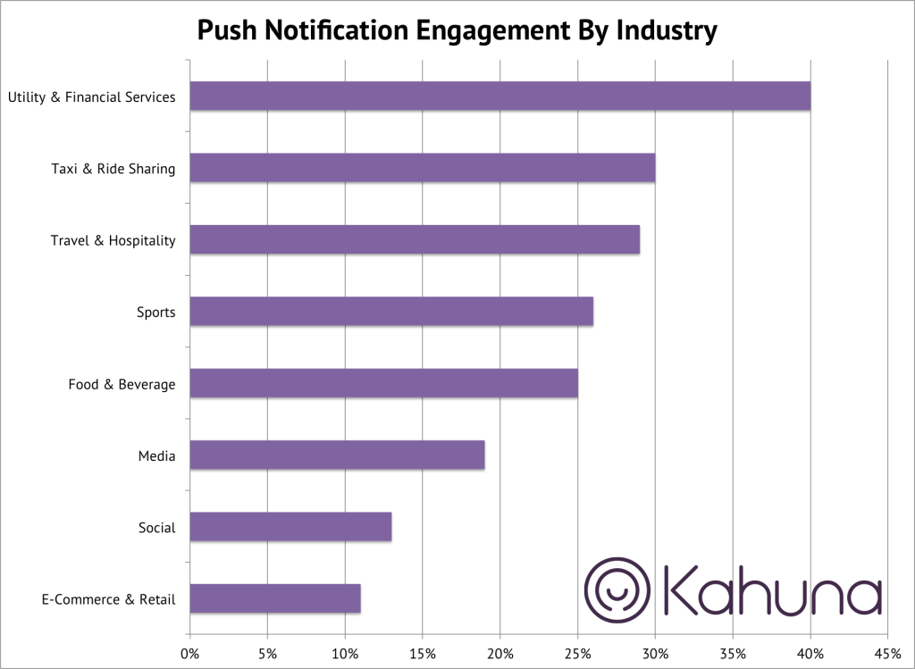
New data on push notifications show up to 40% CTRs, the best perform 4X better than the worst
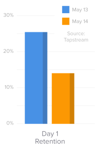
Mobile retention benchmarks for 2014 vs 2013 show a 50% drop in D1 retention
Why messaging apps are so addictive
If you want more, here’s the link to subscribe to future updates: http://eepurl.com/xY3WD.
Why messaging apps are so addictive (Guest Post)
[Andrew: This guest post is written by my friend and former Palo Alto running partner, Nir Eyal. Messaging apps have been a fascinating area within mobile, and the big reason for it is that the metrics – especially engagement – have been amazingly strong. I asked Nir to write a bit about why this might be the case, using the habit model. He’s in a unique position to comment on this: After spending time at Stanford and in the startup world, recently he’s been writing about psychology – particularly habit-building – and applying that to the realm of technology and products. Check out his new book Hooked: How to Build Habit-Forming Products and Nir blogs about the psychology of products at NirAndFar.com.]
Nir Eyal, Author of Hooked:
Today, there’s an app for just about everything. With all the amazing things our smartphones can do, there is one thing that hasn’t changed since the phone was first developed. No matter how advanced phones become, they are still communication devices — they connect people together.
Though I can’t remember the last time I actually talked to another person live on the phone, I text, email, Tweet, Skype and video message throughout my day. The “job-to-be-done” hasn’t changed — the phone still helps us communicate with people we care about — rather, the interface has evolved to provide options for sending the right message in the right format at the right time.
Clearly, we’re a social species and these tech solutions help us re-create the tribal connection we seek. However, there are other more hidden reasons why messaging services keep us checking, pecking, and duckface posing.
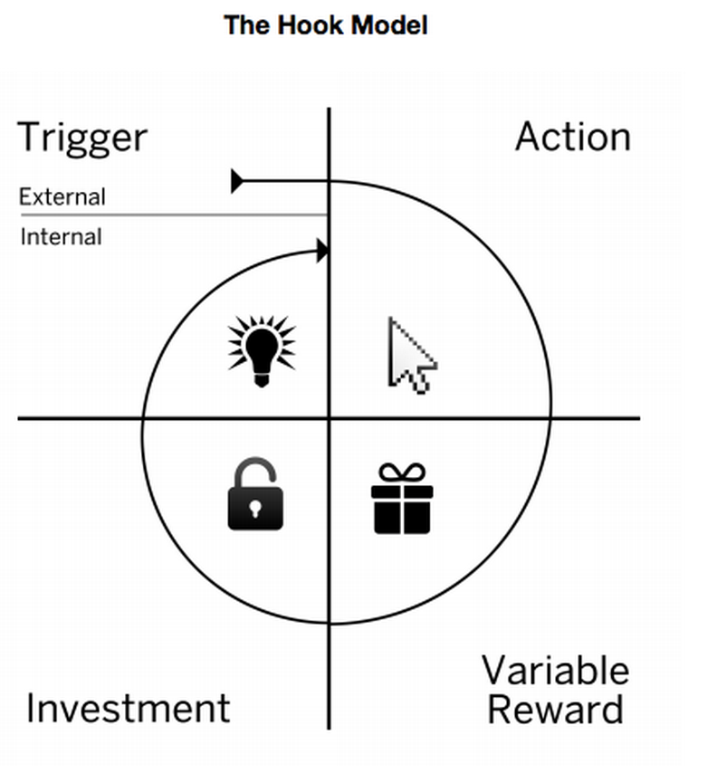
The Hook
In my book, Hooked: How to Build Habit-Forming Products, I detail a pattern found in products we can’t seem to put down. Though the pattern is found in all sorts of products, successful messaging services are particularly good at deploying the four steps I call, “the Hook,” to keep users coming back.
The Hook is composed of a trigger, action, variable reward, and investment. By understanding these four basic steps, businesses can build better products and services, and consumers can understand the hidden psychology behind our daily technology habits.
Nir Eyal’s Hook Model
Trigger
A trigger is what cues a habit. Whether in the form of an external trigger that tells users what to do next (such as a “click here” button) or an internal trigger (such as an emotion or routine), a trigger must be present for a habitual behavior to occur.
Over time, users form associations with internal triggers so that no external prompting is needed — they come back on their own out of habit. For example, when we’re lonely, we check Facebook. When we fear losing a moment, we capture it with Instagram. These situations and emotions don’t provide any explicit information for what solution solves our needs, rather we eventually form strong connections with products that scratch our emotional itch.
By passing through the four steps of the Hook, users form associations with internal triggers. However, before the habit is formed, companies use external prompts to get users to act. For messaging services, the external trigger is clear. Whenever a friend sends a message via WhatsApp, for example, you see a notification telling you to open the app to check the message.
WhatsApp’s External Trigger
Action
Notifications prompt users to act, in this case tapping the app. The action phase of the Hook is defined as the simplest behavior done in anticipation of a reward. Simply clicking on the app icon opens the messaging app and the message is read.
When the habit forms, users will take this simple action spontaneously to alleviate a feeling, such as the pang of boredom or missing someone special. Opening the app gives the user what they came for — a bit of relief obtained in the easiest way possible.
Variable Reward
The next step of the Hook is the variable rewards phase. This is when users get what they came for and yet are left wanting more.
This phase of the Hook utilizes the classic work of BF Skinner who published his research on intermittent reinforcement. Skinner found that when rewards were given variably, the action preceding the reward occurred more frequently. When forming a new habit, products that incorporate a bit of mystery have an easier time getting us hooked.
For example, Snapchat, the massively popular messaging app that 77% of American college students say they use every day, incorporates all sorts of variable rewards that spike curiosity and interest. The ease of sending selfies that the sender believes will self-destruct makes sending more, shall we say, “interesting,” pics possible. The payoff of opening the app is seeing what’s been sent. As is the case with many successful communication services, the variability is in the message itself — novelty keeps us tapping.
You never know what you’ll see when you open Snapchat
Investment
The final phase of the Hook prompts the user to put something into the service to increase the likelihood of using the service in the future. For example, when users add friends, set preferences, or create content they want to save, they are storing value in the platform. Storing value in a service increases its worth the more users engage with it, making it better with use.
Investments also increase the likelihood of users returning by getting them to load the next trigger. For example, sending a message prompts someone else to reply. Once you get the reply, a notification appears and you’ll likely click through the Hook again.
Growing a “buddylist” on Snapchat is an investment in the platform
Through frequent passes through the Hook, user preferences are shaped, tastes are formed, and habits take hold. Messaging services are here to stay and we’ll most likely see many more iterations on the theme as technological solutions find new ways to bring people together. By understanding the deeper psychology of what makes us click by knowing what makes us tick, we can build better products and ultimately live better lives.
IAC’s HowAboutWe co-founder: How to Avoid Delusional Thinking in Start-up Growth Strategy (Guest Post)
[Andrew: Trying to build and launch dating apps is a favorite pastime of 20-something tech entrepreneurs. However, dating products are notoriously hard to grow because it requires people to be “in-market” and also they don’t necessarily want their friends to know they’re online dating. Today, we have a great piece from a veteran of the space. Earlier this year, IAC bought HowAboutWe, a new dating product that was trying to reinvent the entire experience so that it’d focus on activities rather than dating profiles. The cofounder, Aaron Schildkrout, contributed the following essay below, enumerating the difficulties of the various growth channels, and also more generally, how to be realistic about your growth strategy. You can follow Aaron at @schildkrout on Twitter.]
Aaron Schildkrout:
How to Avoid Delusional Thinking in Start-up Growth Strategy
So, you have a consumer internet idea you think could be big.
The statistics say you’re are almost surely wrong. There is a 95+% chance you will fail for one of the following five reasons: a) your product idea is shitty; b) your market is small; c) your execution or team is weak; d) you are undercapitalized; or e) your growth strategy belies a belief in magic.
In this piece I’ll focus on this fifth demon: Magical strategy for growth. My primary case study will be the online dating industry, a petri dish for delusional startup growth strategies.
I co-founded @howaboutwe in 2010 and was co-CEO until its recent acquisition by IAC. Like everyone who has ever built an online dating company, we started off with a growth strategy that looked a lot like a manual of magic tricks. Most online dating startups never escape this; the number of historical failures in the dating space is staggering — the vapidity of magical thinking coming home to roost. We succeeding to an extent in transcending these challenges; I’ll speak about our small victories against delusion.
Magical Thinking
When I ask pre-launch or very early stage founders about their customer acquisition strategies, they invariably think they have a plan. They might share a document or slide with a list of tactics like “press,” “word of mouth and friend invites,” “biz dev,” and “content.” They may even thoughtfully quote Andrew Chen.
But when you really dig into their ideas and predicted results, the defining characteristic of such plans is almost invariably an uncanny belief in magic.
Here’s a basic overview of why magical thinking is so pervasive in early stage online dating distribution strategies, organized by acquisition channel:
Virality: The only two dating sites in the world that have attained true virality are Badoo and Tinder. A few others have attained rapid exponential growth through some complex dynamic including a large advertising spend. But in every one of these cases, the result has been a massively degraded experience verging on soft porn, disturbingly spammy tactics, and a userbase with very low lifetime values relative to match.com. With the unicorn exception of Tinder, the only way to attain virality in dating (discovered thus far) is to aggressively (read: deceptively?) capture the user’s email address book and spam the entire list. Basically: block the feeling that the user might find love (or, more to the point: sex) with a tricky address book capture. If your goal is to create a dating site that isn’t solely about finding sex and that has the potential to become a well-respected national or international brand with high subscription revenues, virality has, to-date, been nearly impossible to achieve. I’ve met with two or three dozen people in the last few years thinking about starting dating sites. Of these, maybe 90% have believed in some magic virality system. Of these, none have achieved magic.
Press: About 3 months into launching HowAboutWe we had a full-page front-page print article in the New York Times Sunday Styles section. It was literally the best non-TV press we could have gotten. It drove more traffic than we’d ever had by about 10x. It was an awesome achievement at that stage. Four years later, while an article like that would have been great, it would have driven a nearly indiscernible increase in traffic. It would be a cool, small, irrelevant bump. For early stage startups we were probably in the top 2 percentile for press converge. And this was key for branding and so on. But it was categorically NOT a business-creating source of traffic. This is very hard to understand for new entrepreneurs. They imbue press — like most things — with a magical aura of inexplicable growth creating powers.
BizDev: The problem here is distorted ideas about how much traffic other entities can drive. For instance, with HowAboutWe we had the idea that we would feature venues as great date spots and that, in return, they would drive their lists to us. But small venues don’t really have meaningful lists. We didn’t understand this at all — we believed in a magical conception of biz dev. Ultimately we found a biz dev strategy that has worked to a much more significant extent (see nymag.howaboutwe.com for an example of how we worked with much larger traffic sources to drive growth); but it is fairly rare to find such a tactic. Many — if not most — early BizDev ideas are rooted in delusion about the traffic-driving potential of proposed partners.
Content: Content is wonderful for branding. And if you have a product with high lifetime values, it can easily pay for itself. But it does not provide a business-supporting customer acquisition channel unless content is your product. HowAboutWe has a highly successful blog strategy rooted in thedatereport.com and nerve.com. But as a pure traffic-driver into our dating product, it was never, well, magical. Let’s say (none of these are real numbers) 100,000 people visited our articles each day. The conversion to the dating site is basically a glorified advertising system — so let’s say 1% of visitors click-thru. That’s 1,000 visitors. If we get a 20% conversion rates off those visitors, that’s 200 sign ups. If we have a 10% conversion to paid, that’s 20 paid users per day. Let’s say paid users are worth $100 to us. That’s ~$2,000 per day. That’s a bit over half a million bucks per year. Not bad; but it’s not a significant business. Content is cool, but not magic.
SEO: Yeah right.
Paid Acquisition / Direct Marketing: For dating, this is by far the most interesting category. It is the ONLY strategy that has ever worked to build a truly mainstream dating brand over time, with the sole exceptions of OKCupid (whose primary strategy was being free and which took nearly a decade to attain true scale) and possibly Tinder (tbd). Very few consumer web companies talk in their very early stages about buying traffic as a core part of their customer acquisition strategy (though this is changing). This relative absence is indicative — more than anything else — of the belief in magic. Advertising is the only reliable, scalable, predictable way of acquiring users for mainstream dating sites.
For those who do include direct acquisition in their strategy, there is usually a massive underestimation of the amount of work required for hardcore funnel and LTV optimization. Building a truly effective CRM alone is years of work, and this is just one piece of the optimization required to even begin to compete for positive ROIs with the major dating advertisers in the world (match.com, for example, spends hundred(s) of millions of dollars each year on ads; you can be sure their conversion funnel is fairly well-optimized).
So, either the absence of a paid acquisition strategy or the presence of one that underestimates what optimizing a conversion funnel really takes both echo the magical beliefs that pervade most early distribution plans.
~~
Delusion about customer acquisition is incredibly understandable, particularly for first time entrepreneurs. It’s painful to truly understand how hard attracting users is, and pain is hard to face.
Enter: PainMath, my antidote to blind magical thinking.
PainMath: An exercise in anti-delusion
a. Imagine you are building a new product. Magic aside, describe very clearly and mathematically a scenario in which there is genuine, business-validating, detectable desire for this product? Specifically, how many people will have to enter the top of your funnel daily for you to get to an annual revenue run rate of $10mm or a user base of 10mm? (This number/metric will be different depending on your business — but pick something that would be a significant achievement, that would leave you firmly outside of very early stage company building.)
b. Figure out from where you think these will people come. Include in your description conversion rates at every stage of your funnel plus virality coefficients.
c. Now, cut to a bare minimum all unexplained “organic” traffic (this includes press, unexplained word-of-mouth, any nondescript biz dev strategy, and content), cut your projected conversion rates by 50% at every stage of your funnel, and do the math again.
d. If you have included virality in your traffic sources, really do the math about what the virality coefficient will have to be to achieve what you are predicting. If it’s over .3%, you are likely deceiving yourself. Do your math again.
e. Then remember that almost every single startup, of which almost all have failed, had a reasonably smart but prideful person at the helm thinking their idea would work — a reasonably smart but prideful person like you and me — and do your math again.
f. Then, as you set out (because you almost invariably will, even if this math revealed a desert of implausibility), continue to do this math. Aggressively. And measure your results against this. Again and again.
The result of this PainMath is going to be rough for almost every new entrepreneur, particularly in the consumer web space.
No wonder we resort to the wand.
Making Magic
Here’s the rub: to win at the game of company-making, you have to believe in magic.
Why? Because by far the most important and powerful customer acquisition tactic is building a product that people love. And this — this is actually a matter of magic. It is something magical about what you make that will create true love and deep, sustainable distribution. The other tactics are important — and sometimes become the key to growth — but in almost no consumer product cases can they be relied upon.
To be clear: blind faith will destroy you almost every time. The key is to KNOW what magic you are believing in and to seek to move from magic to realism as quickly as possible. If you can’t bridge this gap, then you need to pivot. Magical thinking too-long harbored is failure in the works. But without magical thinking — in almost every case — you won’t be able to get started.
Instagram is a great example of this. I don’t know what their early thoughts about distribution were, but I can tell you right now that there is no customer acquisition plan they could have made that, when faced with the PainMath crucible, wouldn’t have yielded a quick sprint for the woods. What made them explode was the magic of the product. Instagram made everyday people into artists. And basically everyone in the early 3rd millennium crafts epoch of which we’re all part wants to be an artist or craftsperson. Instagram gave people a magical experience, transforming them, and this generated tremendous — magical—growth.
At HowAboutWe we created a new way to date based on the incredibly obvious idea that online dating interactions should be based on getting offline. We made dating about actually going on dates, in the real world. This was the newest dating idea since eharmony’s no-search matching algorithm. And there was a magic in it, in scrolling through a stream of people saying the romantic things they wanted to do. This created high conversion rates, which let us advertise increasingly profitably. This small bit of magic (and I have no presumptions here) allowed us to close biz dev deals with real distribution potential. It allowed content, press, and word-of-mouth to be above average contributors to growth.
Tinder has achieved this to a far more dramatic extent: swipe right…mutual match…magic! Safe, hot, addictive magic. This has been the absolute key to their growth.
Likewise with every other great consumer product for which the PainMath equation yielded hopelessness: magic has, ironically, been the solution.
It’s a lovely catch 22. It’s magical thinking that causes nearly every consumer web startup to fail. And yet it’s magic that’s at the root of customer love — and thus at the root of truly successful customer acquisition strategies.
You can’t believe in magic. But occasionally, you can make it.
Mobile retention benchmarks for 2014 vs 2013 show a 50% drop in D1 retention (Guest post)
[Andrew: There’s very little data out there on mobile, and so in the last few weeks, I’ve had guest posts on the % of users who opt-in to push notifications, as well as clickthrough rates of push. Today, I have some new metrics around retention, including for the first time, a systematic study of D1/D7/D30 retention for mobile apps. This is released by Mack Flavelle of Tapstream, who you can follow on Twitter]
Mack Flavelle, Tapstream:
As most app developers know, retaining new users is hard and some would say it gets harder every year. At Tapstream we wanted to test that notion so we looked at anonymized aggregates of attribution data collected by our platform as our customers acquire and engage their mobile users. The steep decline of engagement rates year over year was a surprise even to us.
We compared data from May 2013 to data from May 2014. To give you some context, in May 2013 an average app developer would retain about a quarter of their users a day after acquisition.
This is what keeps marketers up at nights: it means that three quarters of their acquired users didn’t stick around even for one day.
But when compared to May 2014, 25.5% retention on day one suddenly started looking very good:
On average only 14% of users stuck around a day after downloading an app. That is less than one in seven users. Those are abysmal rates by any measure.
This is exactly why we at Tapstream created Onboarding Links: to engage new users the moment they run the app for the first time. Reducing the app abandonment rates is becoming a crucial part of user acquisition.
Beyond day one
Another dimension of this data is looking further down the funnel to see how user retention fared at day 7 and day 30 after acquisition.
Again, the results are not encouraging:
Day 7 retention went from a respectable 23% to a measly 10% in May 2014, while Day 30 retention plummeted from 14% to 2.3% – a full 84% decrease.
To put this into perspective, the average next-day retention rate in May 2014 is almost the same (14.06%) as Day 30 retention rate a year ago (14.30%).
The story behind the numbers
What’s causing this dynamic to play out in the mobile app ecosystem is up for debate, but here are the most obvious culprits for why user retention in mobile has dropped 50% in the last year:
Incredibly low barrier to entry so no sunk cost loyalty
It takes about 10 seconds, a smattering of taps and usually zero dollars before a consumer is the proud new owner of your app. But easy come, easy go – there’s usually so little investment in your app there’s no pain of switching. As table stakes for app design get raised (remember when every app used default nave elements and controller views?) the next shiny thing to come along and grab consumer attention really is very shiny.
Incredibly low barrier to entry so no filter on user quality
When you have an expensive product and somebody buys it you can generally assume they did some research beforehand and had an idea of what they were getting into. They essentially self-filter to be loyal users by the time they engage with the product. With apps any such assumptions are out the window – there is nearly zero intent signalling by the consumer, even after they have “purchased” your app.
Disconnect between time of download and first open
There’s often a lack of context when a new user opens an app. This isn’t Christmas morning, unwrapping the box hoping for an NES. Between the moment somebody absent-mindedly downloads your app and opens it for the first time they’ve probably checked Facebook six times, Twitter three, bid on two obscure statues on Ebay and attended a funeral. The likelihood of them remembering the emotional switch that got them to download is reasonably slim.
Forklifting apps and other bad initial experiences
One of the tricks du jour, championed by the Japanese card games and the genre they inspired, is forklifting content into the app on first open. Sure the app itself is tiny, you don’t even need WiFi to get it, but then there’s a six-minute load time the first time you open it. This and other terrible first-run experiences can lead to serious drop off.
None of those explain the drastic decrease in retention over the last year. That may be a byproduct of the explosion in available apps. In fact most people would assume so, considering the huge number of apps available today.
The problem with that theory is that in May of 2013 nobody said
“I really wish there were more than half a million apps available, because I would definitely download and use more”
Arguably the variety of supply already far outstripped the demand.
So the relevant info becomes how many apps are being downloaded per device in May 2013 versus a year later. Are people downloading more apps and that’s why they’re not sticking around, or are they downloading better apps which is why they’re not sticking around?
Lucky for us one of the smartest minds in mobile started looking at that last year.
“Finally, these numbers are accelerating. Apple did 5bn downloads in the three months from December 2012 to March 2013, and then another 5bn from March to 15 May. The lack of precision means we can’t say this was double the rate, but the trend is clear, and it looks the same at Android…”
– Benedict Evans, from his blog.
Assuming Ben is right (and he often is) we can infer a gentle increase in the number of apps downloaded per phone, coupled with a higher quality of apps across the board has meant that the competition in the app store has become more fierce not only in terms of number of animals in the jungle but also the ferocity of those animals. Both of these factors end up driving down user retention in mobile apps versus a year ago.
source: http://en.wikipedia.org/wiki/App_Store_(iOS)
Though this chart ends in 2012 and is iOS-specific we know that the trend continues but only steeper across both ecosystems as seen here and here.
About data used to generate this report:
Data was collected by Tapstream for months of May 2013 and May 2014 from over 100M devices. It is anonymized and it includes both iOS and Android apps, spanning many verticals from gaming to travel. The data excludes apps with DAUs of over 1M.
New data on push notifications show up to 40% CTRs, the best perform 4X better than the worst (Guest post)
[Andrew: A few weeks ago, the folks at Kahuna released some great data showing that up to 60% of users opt-out of push notifications. Now they’re releasing some new data on the click-through rates of push notifications, showing the differences between app categories and breaking down the reasons why some apps are so much stronger than others. They were gracious enough to share this data for the first time, as a guest post on here – you can get in touch with the author, Alli Brian or Adam Marchick, Kahuna’s CEO.]
Push notification click-through rates via Alli Brian @ Kahuna
The best apps know how to use push notifications to their advantage. They’ve figure out how to make their service part of their users’ daily routine, and they leverage push as a vehicle to do this.
Recent data from Kahuna reveals that push engagement rates vary widely across industries – utility and financial services apps seeing the highest performance, and retail and social experiencing the worst. Here’s a comprehensive look at the state of push engagement rates, as well as a roadmap for getting back on track if your app is trailing behind.
Here’s the data:
You can see that push engagement rates for utility and financial services notifications (40%) are nearly four times higher than for e-commerce & retail notifications (12%). While all industry notifications benefit from significantly higher engagement rate than they see from traditional email engagement, the wide discrepancy can result in significant revenue loss for underperforming apps.
Get new updates, usually once a week – featuring long-form essays with what’s going on in tech.
Apps That Are Winning
High push notification engagement rates are most often seen by apps with high frequency users. These apps use notifications to nudge their users do something that has become part of their regular routines. Utility, Financial Services and Ride Sharing apps lead the way – think about how normal it is to make these apps part of your daily or weekly routine. Looking for directions, watching your budget and taking a taxi are very regular activities, and using push to incentivize these actions is extremely effective. Here are a few examples:
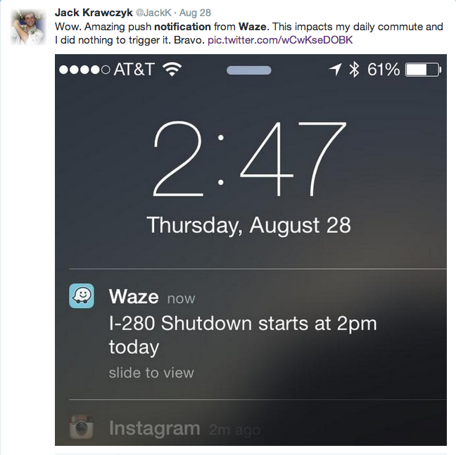
Utility apps have an obvious job to do – know your users daily routines and help them out when they appear to be getting into trouble. That’s what this push notification from Waze did – it was sent to Waze users folks who regularly take the 280 freeway from San Francisco to Silicon Valley. And Waze users appreciated the heads up. Other high performing notifications from utility apps like job search or apartment rental services include new job listings or apartment availability alerts.
User engagement with these notifications (when appropriately timed) can be off the charts – as high as 80%.
Financial services apps also experience strong push engagement. By nature of the industry, money management is an important part of our daily lives. Hold the purse strings (or send a notification about them) and your users will be quick to respond. Take a look at this notification from Level Money. Their push engagement is off the chart.
But What If You’re Having A Harder Time Of It?
If you are in an industry that suffers from low push engagement rates, how do you overcome this? Retail, social and media apps typically have a more difficult time creating push notifications in a way that provides real user value. The good news: research shows that you can influence push engagement rates by using strategies that motivate users to integrate your app into their regular routines. Here are the top three techniques that will improve your notification response rates.
1. Find your Cadence:
Notification tolerance varies across app industries and individual users, so make the most of your notifications. Not all apps should be sending push notifications once a day, and engaged users have a vastly different tolerance for notifications than do new users or dormant users. Rather, it’s about sending the right message to the right person at the right time. In many cases, the elegance is in knowing when not to send a message. Check out the example below.
Netflix does a great job of personalizing their notifications to the individual receiving them. Every user receives a unique message about the specific show they have been watching. Rather than sending every user a notification every time a new episode of any show is released, consider one perfectly personalized notification. Crunchyroll could take a page out of their book.
Note: Sophisticated automation that limits and prioritizes the number of pushes each user is eligible to receive is the best way to achieve the appropriate cadence, given the numerous corner cases.
2. Make it personal
Don’t assume every user wants to hear about the same thing. Sending a notification that is valuable to the user isn’t just about a 10% coupon – it’s about presenting a relevant offer. The most compelling offer is one that contains information that the user deems important. Check out reactions to the notifications below.
These notifications both came from sports apps but elicited very different user responses. The FIFA notification about the world cup was perceived as spam – simply because the app users to which it was sent was uninterested in the particular game mentioned in the message. In contract, the notification from SportsCenter that referenced the user’s specific fantasy football league was perceived as delightful content.
Worst of all is the mis-personalized push notification. We can’t emphasize enough how critical it is to gather accurate, person-level data to inform your notification. Use a unique identifier so even anonymous users will get accurately personalized notifications. Check out what happens if you send notifications to “devices”, not people.
As you can see above, device-based tracking does more harm than good. For example, if your wife borrows your phone and does a bit of browsing, all of a sudden you’ll be receiving notifications about irrelevant flash sales.
3. Timing is everything
Great timing should consider both user behavior and urgency. Notifications that include urgent information need to be sent at a time that is relevant to the context of the message, such as the notifications below.
As you can see, the notifications sent by Refresh and United Airlines both reference urgent and important information, and are tailored to the specific person receiving the message. As such, the response to the notifications are very positive.
For notifications that are not critically urgent, the goal is to minimize disruption and maximize delight. The horror stories about waking up to a mis-timed push notification abound, and users are not forgiving (see below).
Considering every user keeps a different schedule, the only solution is to send push notifications at the time when each user is most likely to engage with your app. Kahuna data reveals that customizing delivery time based on user preference results in an average conversion uplift of 384%.
Great push is all about inspiring delight – facilitating a relevant and valuable app experience for your users and securing a prized place in their daily routines. Whether you’re in a high-performing industry like Utility or Financial Services or a low-performing one like Retail or Social, there is always room for improvement. Focus on understanding what your users value about your service and tailor your messages to their unique needs and interests. You’ll see push engagement skyrocket, and your users transform into rabid advocates.
Why Android desperately needs a billion dollar success story: The best new apps are all going iPhone-first
Why startups are all going iPhone-first
There’s been a number of articles over the last year that reiterate a simple fact: The best new apps are all going iPhone-first. Here’s three popular articles on this topic over the last few months:
- iOS First. Android Much, Much Later (Aug 2014)
- The Fallacy of Android-First (Apr 2014)
- Why Android First is a Myth (Oct 2013)
At this point, going iPhone-first is a widely held best practice. It’s our generation’s version of “Nobody ever got fired for buying IBM.” While there’s some debate on the margins on how quickly you should follow up with an Android app, certainly no one is arguing for Android-first (meaning, don’t do iPhone). There’s a number of reasons for this consensus, which the above articles thoroughly explain- here’s the superset of the reasons they give.
- Device fragmentation – both OS versions, carrier/handset add-ons, and hardware itself
- Less advanced, less stable tools and documentation
- Larger install base, but smaller addressable market (Feldman states that a 50% market share really translates to 12% if you support the most recent versions of Android, versus 30% for iPhone)
- Less valuable audiences on Android, losing ground in the US in key demos
- Cheaper iPhones may steal marketshare from Android in the future
- Higher cost of development for Android (2-3X claims Steve Cheney)
- $800k-$1.2M seed rounds leading to a “all-in on one platform” strategy
Note, I’m not saying I agree with above, just summarizing what’s been said.
In addition to this, I’d also like to add a couple more human aspects of the decision:
- Many/Most startup founders and employees are Steve Jobs fanboys, carry iPhones, and want to design for themselves
- Their friends carry iPhones, and they want to make something for their friends
- There’s more hipster designery mobile developers who build for iPhone, and that’s the supply-side of talent in SF Bay Area
- Investors (other than Bubba Murarka) usually carry iPhones, so it’s easier to pitch to them
- More tech press outlets want to cover iPhone-specific news
Whether you agree if the above is sane or not, the reality is, there’s a lot of friction to going against the norms. In order for a whole class of developers to move en masse to the Android platform is going to require a big carrot. I’m going to argue that this big carrot is going to be that the best developers, the ones who are investing $1M+ into a single app, need to feel like there’s such a huge opportunity in Android that they can’t miss out.
What Android can learn from Microsoft Windows
This consensus towards iPhone-first is happening at a critical time for Android. In many ways, the platform has been a huge success, and many who lived through the Windows vs. Mac years could make some interesting comparisons.
Here’s a stab at it- here’s some of the key reasons why Microsoft Windows won:
- Cheaper
- Ubiquitous
- More open
- Better penetration into the workplace
- Lots of applications that were exclusive to the platform
I’d argue that on almost all the point above, Android has achieved the same success as Windows. It’s cheaper, there’s more devices sold, it’s more open. But a critical component, of having more apps, isn’t there. Remember how there was always some key games that’d run on Windows that wouldn’t exist on Mac? Or how there were a bunch of business applications that would only run on Windows? That meant that the Windows platform had the virtuous cycle between developers and users to drive total domination.
But Android is not Windows. When you look at the current mobile ecosystem, iPhone has more apps. It has better apps. It gets the designery, well-funded startups to build iPhone-first.
Consumers and developers, together, will continue to choose the iPhone until that network effect is broken.
Today, Android is merely playing catchup – every time there’s a proprietary iPhone app, soon thereafter, they’ve done a good job convincing developers that they also need to release an Android app. Yet, to play to win, Android needs to convince many, many developers to create apps exclusively for their platform, just like Windows did a generation ago.
How does Google get there?
To me, the biggest thing that Google is lacking is a billion dollar tech startup story that’s exclusively about how Android is a better platform for developers. That story doesn’t exist, and as a result, people have focused more on the friction in going Android-first, rather than the opportunity.
IMHO, Android gets there by rewarding startups that are exclusively choosing its platform. I’m talking my book here, as I’m involved with a few Android-first products, but it’s also nevertheless from direct knowledge. Google should extensively feature apps that aren’t merely clones of iOS apps – it’s not enough to play catchup. Instead, Android should seek to really showcase apps that take advantage of very differentiated features and APIs. There should be a billion user success story around Android launchers and lock screens in the US, rather than acquihires/flips of Aviate, Emu, Cover, and others. These were solid companies led by good teams that wanted to go Android-first, but there was a missed opportunity in supporting them.
App store discovery for iOS is a glaring weakness. It’s editorially driven, and doesn’t give great new apps the chance to be successful, which is why four companies own 70% of the top apps – Google, Facebook, Yahoo, and Apple. They’ve created a winner-take-all environment, especially as Facebook has shown how to effectively use App Constellations to drive traffic between apps. Instead, Google could create a much more fluid ecosystem, which would reward and boost apps the way that search has driven traffic to millions of long-tail websites. Everyone does SEO because they know that yes, you can create a public company like Yelp, or a fast-growing startup like Genius, on the Google Search platform. There’s no story like this in mobile.
And yes, shifting installs from the “head” developers into the long tail might make it less attractive for some, but the biggest developers will always develop for both – they don’t have a choice. The battleground is for the hearts, minds, and product roadmaps of new, innovative apps that will drive adoption for their parent platform.
Android is an important platform, and it’s built more closely to the open nature of the internet, and so for that reason I’m rooting for it. But to make it the first choice for developers, it needs to do more than it is.
Do you work at Google?
Finally, if anyone at Google is reading this, email me: voodoo [at] gmail. Like I said, I’m happy to talk my book :)
Early Traction: How to go from zero to 150,000 email subscribers (Guest Post)
[Andrew: Starting up from zero is one of the hardest things you can do with a new product. Especially in the age of SaaS and content marketing, building up to the first 150k users is a key milestone that can prove out product/market fit, generate a revenue stream, and secure investment. This is a guest post by my good friend Noah Kagan (@noahkagan), who is previously from Mint (acquired by Intuit), Facebook, and now Chief Sumo of AppSumo. They are releasing some marketing tools focused on early traction companies, over at SumoMe.com]
Zero to 147,973 email subscribers by Noah Kagan, AppSumo
During the first 10 months of 2012 AppSumo grew 147,973 new subscribers from running Giveaways. What started out as an experiment for growing our small audience became one of the key marketing activities that helped grow our customer base.
Growing your audience in the early days is one of the hardest things in any startup. There are a few tactics to get your first customers such as buying ads to landing pages via Facebook or Google, content marketing with a blog, getting covered in press, a Kickstarter campaign that magically takes off or creating a YouTube teaser that goes viral.
The majority of these methods can be costly and / or time consuming. As well, there’s no guarantee that the customers it generates will be profitable or you’ll be able to even get customers at all.
So where is the best place to begin? If you look at all the marketing activities available when starting out, it looks like a pie. No one piece of that pie will get all of the customers you want or be as effective for you as it is for someone else. So you have to attempt multiple methods to eventually reach all of your customers.
At AppSumo.com over the past 4 years we’ve done all of the above. The one method I can consistently recommend for people starting their customer base has been giveaways.
What the heck is a giveaway?
Good question.
A giveaway is giving away some physical, digital item or service to people in exchange for a visitor signing up for your newsletter. At AppSumo we further incentivized those customers with getting additional entries by referring friends via Facebook, Twitter or sharing an incentivized link however they please.
Here’s a recent giveaway we are running for AppSumo. The tool we are using is KingSumo Giveaways that we released to the public a month ago.
For this Giveaway we generally seed the initial users in hoping it goes viral.
First I’ll tweet or email a few people who I think will be interested.
Then people will see that and enter the giveaway.
Afterwards they’re incentivized to share:
The timer encourages urgency so people are incentivized to share sooner.
Then we’ve optimized which buttons to show and where so people will share the giveaway so we can get even more people to join.
Giveaways vary in performance but let me repeat that they are one of the most cost-effective ways of getting new customers.
Let me show you some exact statistics from AppSumo doing over 25 giveaways in the past 4 years:
- 528,238 total subscribers
- $866,265.69 in revenue
- $442,802.72 in gross profit*.
*This does NOT include unsubscribes / email-removals or the costs of the giveaways.
Here are some stats based on giveaways that had at least 1,000 unique entries.
Overall profit per subscriber across all Giveaways
The average is $0.83 gross profit per new subscriber
Biggest flop of a giveaway based on gross profit per new subscriber:
Giveaway 2 Macbook Airs
- 48187 total new subscribers
- $11,550.08 gross profit
- $0.24 gross profit per new subscriber
- Cost of laptops: $2400
- ROI: 4.81X
Best giveaway based on gross profit per new subscriber:
Monthly1k Entrepreneur Getaway
- 3846 total new subscribers
- $26,572.90 gross profit
- $6.90 gross profit per new subscriber
- Cost of Giveaway: $2500
- ROI: 10.62X
1- Buy facebook ad traffic against the company you are sponsoring or towards your target audience. We’ve seen CPAs lower than our regular ad buying.
2- When doing a giveaway try to co-partner with a company so they’ll promote for you and you can promote their product.
3- Giveaway a smaller more related item to your audience versus a broader item like Kindle, Laptops or Netflix subscriptions. For example, iPads got us a ton more emails but profit is what pays the bills and our entrepreneur giveaway was 2.3x more profitable.
4- AB test your messaging for giveaways. The message people share for your giveaway can have a huge impact on the vitality. Try variations to see which gives you the biggest boost.
5- Most giveaways get 25-40% new subscribers for email your list so don’t worry about your overall unsubscribes and promote your giveaway to your email list.
6- Twitter followers increase as people share your Giveaway more. Nice benefit. Here’s an example from my personal account via a Giveaway from last month.

7- There’s a diminishing marginal return to doing Giveaways so don’t do them weekly. I recommend doing them quarterly.
Overall, Giveaways are a great tactic in your marketing arsenal. Use it and let us know how it works out.
If you haven’t run a giveaway you should. Just for readers of Andrew Chen’s blog for the next 48 hours we are doing 50% off the normal price. After that it goes back to regular. Use code (ANDREWCHEN) at KingSumo Giveaways.
New data shows up to 60% of users opt-out of push notifications (Guest Post)
[Andrew: There’s a real shortage of information about push notifications, CTRs, response rates, etc. Partly this is due to the immaturity of mobile as a marketing platform, but it’s also because of the opacity of the iOS platform. I recently ran into Kahuna, a Sequoia-backed startup led by Adam Marchick that’s compiled a treasure trove of data about push notifications. Today, in an article authored by Shannon and Alli of the Kahuna team, they share some of what they know about why people turn off push notifications. You can also hear me talk about this data and how to combat it in the video below.]
Why 60% of your users opt-out of push notifications, and what to do about it
In some product categories, over 60% of their users turn off push notifications. In others, a mere 20% do. That’s a huge difference when we’re talking about the primary method of retaining and engaging your mobile users. Recent data from Kahuna reveals that push opt-in rates vary widely across industries – ride sharing being the best performing, and social being the worst. Here’s a comprehensive look at the state of iOS push opt-in rates, as well as a roadmap for getting back on track if your app is trailing behind.
Here’s the data:
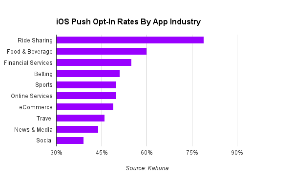
This data shows push enablement rates for iOS devices alone, because Android devices don’t ask users for push permissions. You can see that Ride Sharing’s average opt-in rate (79%) is twice the opt-in rate of Social (39%). This can translate to twice the engagement, revenue and retention, whereas low-performing apps are missing out.
People have an intuitive bias about push. They only want to receive push notifications that are relevant, time-sensitive, and valuable. Our data shows that consumers have innate assumptions about what an app will offer based on the app’s industry. As a result, an app’s ability to bridge the trust gap greatly impacts push enablement rates.
Attractive Industries
Clearly, some apps have an easier time getting push opt-ins than others. The industries with the highest average opt-in rates, specifically Ride Sharing, Food & Beverage (60%) and Financial Services (55%), are those with inherently time sensitive value propositions; users intuitively understand that push notifications will play an important role in the functionality of the app. For example, hearing about the arrival of your ride via push is very important, as is knowing the exact moment your take-out is ready for pickup. These industries benefit from the positive biases around push notifications, because people can see the value of push without much guidance.
Uber’s push notifications convey information that is integral to the functionality of the app and is supposed to be acted upon immediately. Users are able to understand this functionality without much explanation, which contributes to the much higher push enablement rates for Ride Sharing apps.
But What If You’re An Underdog?
If you are in an industry that suffers from low push opt-in rates, can you overcome this inherent user bias? There is a preconceived notion that these kinds of apps only send self-promotional push notifications, and users have a hard time seeing their value upfront. The good news: research shows that you can influence user opt-in rates with comprehensive onboarding strategies. Here are two different techniques to improve the user experience when you ask for push notifications to dramatically increase opt-in rates.
1) Make a Great First Impression
Start off the user’s app experience with a clear and informative splash page, an extra screen that pops up the first time a user opens your app. Use this prime real estate to showcase your app’s top features, and to demonstrate the value of opting into push notifications. When new users fully understand the value of your app and how push messages will add to their experience, they are much more likely to opt-in to push notifications. For example, the Crossfader DJ app launches an interactive tutorial upon first opening the app, explaining the core functionality and the role of push. This educational approach helps Crossfader achieve a 55% push enablement rate, significantly higher than the 44% industry average for News & Media apps.
When Crossfader educates new users about what the app does in a visual and structured way, users feel more compelled to have a dialogue with apps via push. After the core functionality is explained and users know how to use the app, Crossfader outlines exactly how push will add value to the app, and then prompts them to accept push permissions. This strategic approach to asking for push leads to a significantly higher opt-in rate than the industry average.
2) Pop the Question
You have one shot to ask for push permissions; ensure it isn’t wasted by first asking in a pre-ask splash page or in-app message, rather than the official iOS page. By diverting the initial question and gauging the user’s interest, you can save your one opportunity for when the time is right. If the user clicks “YES” in the pre-ask page, prompt them to the official permission page; if the user clicks “NO,” wait until they are more familiar with your app and ask them again later. Cluster utilizes this tactic to achieve a 60% push enablement rate in the social category, with 100% of users opting into push after tapping “Notify Me” in their pre-ask page. By following these best practices, you should be able to improve the user experience and dramatically increase push enablement rates from the industry average.
TechCrunch shows that Cluster has 60% push enablement rate, and during user testing, they saw 100% success rate in iOS push notification permission after tapping “Notify Me.”
If you take a tactful approach to push notifications, you can turn push into a communication channel that users embrace. Make sure you ask for push permissions very carefully to increase your app’s push enablement rate so you can take advantage of push’s full potential.
3) Maintain the Relationship
Once your users begin receiving push notifications, it is critical that you respect this incredibly personal communication channel. By only sending hyper-targeted, personalized push messages that actually add value, you can ensure that your users don’t later opt-out of push, or worse yet, uninstall your app.
There’s no reason your app can’t overcome bias about push notifications. Whether you’re in a high-performing industry like Ride Sharing or Food & Beverage or a low-performing one like News & Media or Social, there is always room for improvement. With a thoughtful, educational and transparent onboarding strategy, you can optimize the user experience and significantly increase your app’s push opt-in rate. Focus on creating and nurturing these important mobile relationships with push notifications to come out on top in the exciting future of mobile. Stay tuned for more data from Kahuna on how users are really responding to push.
Why aren’t App Constellations working? (Guest Post)
[Recently, I read this roundup of perspectives on “App Constellations” on the new social/professional news app Quibb. This is an emerging product strategy in mobile embraced by Facebook, Linkedin, Foursquare, Twitter, and others, and found it fascinating. Thanks to the authors below for sharing their opinions on this new approach. -Andrew]
Fred Wilson recently coined the term ‘App Constellations‘ to describe what he was seeing in the mobile app ecosystem with respect to distribution. Over the past few months, mobile companies have continued with this strategy, the idea being that standalone apps are better for mobile, versus the all encompassing platforms that dominate desktop experiences – and it’s a better position to own and control several of these key apps on any person’s device.
It has been interesting to watch as Dropbox, Facebook, and Foursquare experiment with this approach – but it doesn’t seem to be working, at least not yet. CB Insights shared some discouraging data last month, and things have only gotten worse over the past few weeks for the most recent apps to be put out by these big players:
It’s important to note that none of the companies using this strategy have promoted their unbundled apps aggressively – beyond Facebook Messenger, which is seemingly the only app where this App Constellation approach is paying off:
Toufeeq Hussain (Senior Product Manager at Storm8)
The App Constellation strategy works when you have a core resource which can be shared across multiple apps. Slingshot and Poke are attempting to create a new resource (reply-to-view-images for Slingshot and disappearing images for Poke) and hence isn’t really leveraging whats core to Facebook (social graph and shared photos). In the case of Slingshot, even the social graph had to recreated from scratch. So even though these apps get huge media attention when they launch, they slowly slide down the charts as there is nothing holding them up.
One company that has done a great job of using core resources and creating a “basket of apps” is Evernote. It currently has Evernote Hello, Evernote Food, Skitch and Penultimate. Each of these are focused around helping users create more notes and thereby getting more usage of the core Evernote product. Of course, not all of Evernote’s apps are in the top-50 lists but they are targeted mainly at new users who are looking for more specific solutions to note taking. Carousel is on the same lines but my feeling is that Dropbox needs more apps that read data stored in Dropbox than contributing to it. If the goal is to contribute to the Dropbox then it needs to be something more than just syncing photo/videos as the default Dropbox app already performs that.
The Asian messenger apps use the contact list as the core resource across any apps integrated into LINE or WeChat. Invitations are sent through the core messaging app but specific functions are performed in the corresponding apps. Games, photo sharing, stickers all have specific apps but use the core LINE or Wechat identity and social graph to seamlessly work across multiple apps.
In conclusion, though its very valuable for a Facebook or Dropbox to shoot for “stars” and build constellations, what we have seen from companies like Evernote and the asian messenger apps (LINE, WeChat) is that a “basket of apps” approach that leverages a common core resource between other apps might actually be a more scalable strategy. Its very hard engineering “stars” – a lot of things need to fall in place to be a top-50 free app, a better strategy for Facebook might be to play to its strengths than alienating new apps from core FB resources.
Bubba Murarka (Managing Director at Draper Fisher Jurvetson)
App constellations are being deployed because the problem of distribution on mobile is “solved” in the sense that large incumbent app owner, and mobile marketers with sufficient resources, can predictably drive installs of their other apps via well known set of steps that includes cross promotion, cross linking, merchandising on mobile web & of course paid distribution. One of the best examples of this is how Facebook has managed to drive massive number of installs of the standalone Messenger app via the main Facebook integration. I would go so far as to say that if an unbundled app from a large incumbent does not to have a massive install base it is intentional to enable the app to mature before investing in driving distribution. FWIW, I am not saying distribution for younger companies without existing massive install bases, well known brand names or meaningful financial resources is “solved” yet…because, well it is not.
As for the value of this strategy it is easy to say it doesn’t work but that is not nuanced enough analysis of why companies pursue this approach. The multi app strategy allows more experimentation, different release cycles and tailored experiences to drive deeper engagement. This allows faster iterations for nascent product lines which is critical for finding product market fit (traditionally the key advantage startups have over large incumbents). Using Facebook Messenger, as an example again, FB only focused on driving installs 3 years after they had initially released the standalone app. I’d hypothesize that once Dropbox wants to drive installations of their app constellation they will have no problems – “Install Carousel and get 500 free MBs of storage” or “To sync your photos to Dropbox you need to install Carousel”. In summary, I’d suggest the best way to assess the value of this strategy is not to look at installs as the only measure of success.
Casey Winters (Growth Marketing Manager at Pinterest)
App unbundling or constellations are a nuanced strategy that I think needs a few, rare conditions to be effective. One is that your main app needs to be a top app already, with little room to improve. Then, it is advantageous to create a new app to see if you can take another top spot on the App Store/Google Play, and another icon on a user’s phone (see my blog post for more details on that strategy).
When you have this scenario, it’s little risk to create a new app, but it means that a very successful company needs to launch a new app and have it be an immediate success. You don’t have the advantage of iterating and starting small and working your way up to popularity like most apps do. It’s very tough to launch new apps this way and be successful because a ton of people try the app the moment it’s launched before you have any market feedback. Typically, people try it, discard it, and you don’t get another shot. So what ends up happening is that popular apps buy newly popular apps instead.
The only way I have seen the constellation strategy work is if the new app was already a core feature of the main app and is then unbundled. Facebook Messenger is an example of this. Since the feature is already popular inside Facebook, and the new app is now where that functionality lives (and that functionality hasn’t meaningfully changed), the new app is successful. Where foursquare erred is the the check-in was declining in popularity in their app, and when they unbundled it they changed the functionality meaningfully to upset those core users.
Alex Schiff (CEO and Co-Founder of Fetchnotes)
Unbundling into “app constellations” is understandably a compelling strategy. More real estate, more targeted products, and more mind share — hooray!
The thing is, outside the tech community most people just don’t download that many apps. Statista put out a report late last year that on average, US smartphone holders have installed 26 apps. To put that in perspective, that’s just over a page of apps on an iPhone 5 screen. Not only are most people not reading about or searching for apps, but when they do hear about one from a company they know, the default behavior is not, “Wowee! I already have Facebook – I should start using their new app!”
Putting the apathy of mainstream consumers aside, there’s a much deeper problem with the whole unbundling strategy. It only works if it’s a fundamentally distinct behavior being segmented into a stand-alone application. I think Facebook Messenger is a great example of unbundling that worked — messaging is very different from browsing stories and stalking people. Separating the two made both my messaging and social voyeurism (let’s be real, that’s what Facebook is for) experience better. Moreover, Facebook wanted to be your go-to messaging utility. That couldn’t happen, I believe, unless it was its own application.
Today, over 200M people use Messenger.
Now compare that with the launch of Paper. Paper, for all intents and purposes, has the same core features as Facebook proper – you browse stories, accept friend requests, view notifications, etc. More recently, they even added back in some of the features they left out, like birthdays and events. The major difference is UI (it’s beautiful) and a philosophical focus on stories over people.
In other words, it’s just a different approach to Facebook. Most users I’ve talked to use Paper instead of Facebook, not alongside it. Since Paper offers pretty much the same functionality as Facebook proper, most people just aren’t that motivated to try it out. As of June 11, Paper has only 119,000 MAUs. Frankly, I wouldn’t be surprised if Paper was just a test for a new approach they’ll be bringing to the core Facebook app. Unless Facebook strips Paper down to be stories and stories alone, I don’t see it surviving long-term as a stand-alone app.
There are certainly more granular product reasons Slingshot, Paper, Carousel, etc. haven’t taken off. However, across any app constellation effort, the products need to compliment — not cannibalize — each other.
Messenger does exactly that. Paper doesn’t.
Adam Sigel (Product Manager at Aereo)
App constellations, unbundling, whatever you want to call it, will ultimately yield a better experience for mobile users and better business practice for the companies making apps, but we’re going to have to work through some pain in the short-term. The trouble for now is that app constellations are ahead of the rest of the mobile experience.
It starts with app discovery. The App Store (for iOS especially) is largely leaderboard driven, and it’s hard to crack into the top ranks, especially for non-gaming apps. One “north star” app in a constellation makes it much easier to build satellites around, and we’re seeing that with Facebook, Dropbox, Google, LinkedIn, and Amazon. As Fred Wilson wrote, this creates a “rich get richer” scenario and creates enormous challenges for newcomers.
Having different apps optimized for different use cases is great, but managing all those apps is a pain. As I mentioned in a blog post about invisible apps, the mobile OSes need a way to have apps that exist outside the homescreen. “Winning the homescreen” just doesn’t make sense for lots of apps (finance and travel, to name a few). iOS is the worst offender here compared to Android and Windows Phone, but this could be addressed a number of ways including design changes, gesture controls, or anticipatory computing.
Even though more apps are building in deep linking capabilities—a very good thing for the mobile experience overall—app switching still stinks. It’s visually jarring to a lot of users, and app management is still a power user skill. To go with the typical early majority example, my parents don’t double-tap the home button to switch apps, nor do they put very much thought into which apps go on which screen or in which folders.
These are temporary imbalances, and recent announcements from Google and Apple suggest directional improvement. As app discovery improves, mobile OSes continue to evolve, and the market matures, we’ll get new, more sophisticated and seamless mobile experiences.
More:
There’s even more discussion in the comments, on Quibb.
There’s only a few ways to scale user growth, and here’s the list
Scaling growth is hard – there’s only a few ways to do it
When you study the most successful mobile/web products, you start to see a pattern on how they grow. Turns out, there’s not too many ways to reach 100s of millions of users or revenue. Instead, products mostly have one or two major growth channels, which they optimize into perfection. These methods are commonplace and predictable.
Here are the major channels that successful products use to drive traction – think of them as the moonshots.
- Paid acquisition. If your users give you money, then you can buy users directly through ads. Usually companies try to maintain a 3:1 CLV:CAC ratio to keep their margins reasonable after other costs. (eBay, Match, Fab, etc.)
- Virality. If your users love your product, then you can get major “word of mouth” virality driven by a high Net Promoter Score. If you can get your product to spread as a result of users engaging with the product, you can further optimize the viral loops using A/B tests to generate even more virality. People often measure “viral factor” to see how effectively existing users attract new users, and of course, you want your viral factor to exceed 1.0. (Facebook, Instagram, Twitter)
- SEO. If your product creates a ton of unique content, in the form of Q&A, articles, long-form reviews, etc., you might end up with millions of unique pages that can in turn attract hundreds of millions of new users who are searching for content via search engines. (Yelp, Rap Genius, Stack Overflow, etc.)
- Sales. For startups targeting SMBs or the enterprise, you’ll end up fielding a large sales org to handle both inbound and outbound. This is especially true for companies targeting local SMBs, where telesales becomes the only option. Of course, to make this work, you’ll need to generate a multiple in revenue of what you pay them.
- Other. There’s the odd partnership, like Yahoo/Google, that can help make or break a startup – but these are rare and situational. But sometimes it happens!
These channels work and scale, because of two reasons:
- They’re feedback loops. Each of these channels creates exponential growth because when you make money from customers, you can use that money to buy more customers, which give you more money. Or in the virality scenario, a cohort of new users will invite even more users, who then invite even more on top of that.
- They have a high ceiling on saturation. Part of why paid acquisition will always be around is because people like free products, which cause these products to monetize using ads. As long as people will love free products (which they will, forever), there will be advertising to buy. The biggest ad networks reach a billion users or more. Similarly, SEO works because almost everyone uses Google, so as long as you’re dealing with a high-volume base of searches (like music lyrics, or products) then you’ll be able to reach hundreds of millions of users.
It might seem like it’s best to crack one of these channels right away, and then ride then into glory. But that almost never happens, and instead startups have to work towards them – but it takes time. To figure out if your CLV and CAC match up, you need to buy some users, then wait 6 months to see how well they monetize. If you want to see if your product is viral, you need to build your app, then wait to see if you have the retention and frequency to support a strong viral loop. SEO is hard because after the content is built, Google has to index it and you have to build PageRank. This can take months and years.
New products often only have months, or a year, to live, so these strategies are often not a real option.
High-risk, high-reward
Attacking one of these scalable channels is high risk but also high reward. Every startup has to make sure they are able to slot themselves into one of channels in order to scale their business, but in the meantime, how do you show enough traction to not run out of money?
This essay by Paul Graham gives us a clue, as he writes about Startups = Growth:
A good growth rate during YC is 5-7% a week. If you can hit 10% a week you’re doing exceptionally well. If you can only manage 1%, it’s a sign you haven’t yet figured out what you’re doing.
Another way to say this is, growth is measured through a percentage and so early on, small things can drive a high % growth when the base is small. When you’re starting, there’s a whole list of other tools you can use which don’t scale at all but are nevertheless low risk.
Here are some low-risk, unscalable ways to get users:
- Getting your friends+family to use the product
- Emailing/posting among your local community, whether that’s college or an alumni mailing list or whatever
- Guest writing on niche blogs – you often see this with mommy blogs, etc.
- Cold e-mailing potential users and influencers
- Engaging with potential users over Twitter, Reddit, forums, and other communities
- Contests and giveaways, partnering with a blogger/YouTuber or something
- Getting covered in niche press outlets, like the tech press
- … etc., etc.
All of the above require hustle, but are low-risk and fairly high-percentage. And when a contest can generate a few thousand signups, on a small base that’s not bad at all. The other added benefit is that these methods put you in direct/close contact with your users. So in the early phase, when you are still working on product/market fit, this can be an important way to learn if you have the right product.
However, none of these methods scale well, which is OK, if you know when you need to move on. Even getting covered in the mainstream press, like NYT level, maybe only garners a few hundred thousand signups max. Getting featured by Google or Apple is about the same thing. That’s better than nothing, of course, but it’s still far below what you need to get on a rocketship trajectory. For the rocketship, you’d need to perfect one of the 4 main channels I listed earlier.
So ultimately, how do you balance these? Let’s talk about the barbell strategy.
The barbell
To answer the question of how to balance these growth projects, let’s talk about the barbell strategy. The barbell strategy is a way that investors can split their holdings between some high-risk/high-return investments as well as low-risk/low-return conservative investments. Investopedia describes it:
Put your eggs in two baskets. One basket holds extremely safe investments, while the other holds nothing but leverage and speculation.
In the context of these growth channels, the key is to balance a series of progressively more scalable growth projects, while keeping track of the big growth channels that will help you shoot the moon.
Do the methods that don’t scale
During the early days, by all means, sign up friends and family. And get those blog mentions, and do all the content marketing you can handle. That’ll help create a base of engaged users, while you hit product/market fit. At each point, as what works caps out, go after the next marketing channel that can drive incrementally more users. In the early days, perhaps a contest partnership with a niche blog would do, but after a while, maybe you’d hire a small team to author long-term content marketing pieces to circulate.
Invest in moonshots
The other end of the barbell, the high-risk/high-reward projects, should be taken with deliberate projects and analysis. If you need your userbase to generate a lot more unique content for SEO, start fiddling around with features that reward long-form content. And start tracking what % of users write great content. And start making the small changes needed for Google to index your site. After a few months of this, you can start to understand what it would take to create enough pieces of unique content to make an SEO strategy work. You can usually work this kind of thing out on a spreadsheet.
Balancing between the two
It’s important to balance these short-term and long-term efforts. If all you do is work on nonscalable marketing methods, then inevitably the channels will tap out and your growth will slow. When you see the startups that are highly dependent on press hits for their traction, but seem anemic otherwise, this is exactly what’s happening.
The barbell strategy helps products make progress on long-term goals while still creating short-term momentum – you’ll need momentum to attract investor interest, but you’ll need the long-term scalable growth channels to really build your business.
Good luck. And if you have a product that’s working well, has a nice base of traction, and now the only things that can move the needle are scalable methods, don’t hesitate to email me for advice: voodoo at gmail.
Lessons learned adding messaging to a notes app (Guest Post)
[Today we have a guest post from Alex Schiff, who’s a co-founder and CEO of Fetchnotes, which makes simple, smart tools that help people work together and get things done. Fetchnotes graduated from Techstars Boston in November 2012, and is currently a team of 5 in Cambridge, Massachusetts. -Andrew]
Alex Schiff, CEO of Fetchnotes:
There’s a big craze in messaging right now, and everyone seems to be trying to integrate some form of it into their product. Having learned that people who shared notes were way more likely to build a habit with Fetchnotes, we definitely caught the bug in our last iteration. It also coincided with a goal to evolve our value proposition beyond just personal organization — there’s just a lot of noise in that space.

A more detailed overview of that product, featured to the left, can be found here. To summarize, we wanted to create an organized feed for the things you’re keeping track of as well as the things other people want you to be keeping track of. Effectively, we built out messaging features (revolving around @-mentions) that allowed you to communicate in a hyper-organized way, on top of what was still at its core a personal notes/to do list app.
We learned a lot about the way people communicate and work together (which is informing a lot of future product plans), but we didn’t really budge the core metric we were trying to move: % of monthly active users sharing at least one note per month (below).

The % of users sharing actually went down before returning to pre-launch levels. We had a large influx of users from launch press, but the sharing value proposition still didn’t click. As a result, we had an even higher percentage using it as a personal notes app. Not the results we wanted, but we learned a lot in the process.
For anyone out there building social products, I wanted to share some of those lessons.
Be aware of invisible mental walls
Before we launched this iteration, a common complaint we heard was that the places people kept track of information personally tended to be isolated from where other people sent it to them (email, SMS, and other communication channels). This was pretty consistent across both people who used Fetchnotes and people who used other tools, and it was a major influence on the product we designed.

It turns out that while information silos are indeed a pain point, a major reason they exist is because people tend to think of “personal stuff” and “shared stuff” differently. They don’t want them co-mingled in one organizational area. When we started asking people the right questions, we also found “I need to send this to someone” is just not the same mental mode as “I need to remember this for myself.”
With good reason, too — here are some problems that you run into when you try to combine the two:
- People have different ways of organizing, prioritizing, categorizing, etc. that conflict with each other. And they are very particular about it — everybody’s a little OCD.
- Where you keep track of personal information is sacred. When other people’s stuff start showing up, you feel like it’s not yours anymore. That leads you to not want to put deeply private material there.
- Messaging/communication is inherently noisy and chaotic. Personal organization is about order.
Most often, people bucket Fetchnotes as either social-only or private-only, and generally it’s the latter. So if you’re building a product that has anything to do with shared and personal organization, make sure you give people walls to protect their “personal space.”
The concentration of communication channels
We were trying to get people to use Fetchnotes to communicate things that had an element of permanence or action. It was all about adding things to people’s lists — i.e., organizing your communication so it was where the recipient wanted it (featured to the left). What we didn’t want was the more conversational fluff, like this:

At that point, we might as well be having a conversation in Google Docs.
By talking to a lot of users and non-users about their habits, we learned that communication channels tend to concentrate around only a handful of categories:
- People. “When I want to talk to Hans in Germany, I use WhatsApp. When I talk to my mom, I use SMS.”
- Context. “When I want to talk about work stuff, I use Slack. When I want to talk to my friends about going out later, I use Facebook Messenger.”
- Media type. “When I want to send my friends photos, I use Snapchat. When I want to communicate via text, I use SMS.”
- Publicity. “When I want everyone to see my thoughts, I use Twitter. When I want to send messages privately, I use SMS.”
If someone can’t use a product for all of their communication within one of those buckets, you tend not to use it for any of your communication. There are certainly exceptions, but they’re exactly that — exceptions. People need an extremely clear mental model to answer the question, “When do I use this app?”
Regardless of what product you’re building (though it’s especially true in messaging), make sure that your users can answer that without having to think.
Make sure your “viral hook” is organic and frequent
Our users frequently asked for ways to share their notes with non-users, and that underpinned a big part of our growth strategy. That was the thinking behind our address book integration, which actually works quite well when people need it. In fact, about 25% of all notes shared are shared with non-users (via SMS or email).
The problem, as we realized, is that communication is about sending (one-way) information to another person. When I message someone about say, a link I think they should check out, I’ve already checked that link out. I don’t need to save that information for myself, so I have no reason to send that information to you via Fetchnotes (since it will just send you a text anyway). People do share with non-users in other ways (like sharing pre-existing notes after the fact), but that behavior isn’t frequent enough to make an impact on growth (less than 1%).
So as you’re thinking through your “viral hook,” make sure you’re building it around something that people organically need to do, and need to do often. “Non-user sharing” around inorganic behavior is just an invite system no one uses. Get granular, map it out from beginning to end, and talk to people about how they accomplish these steps currently. Don’t take shortcuts or make assumptions.
Your network-specific identity is probably confusing people
Way too many companies start off thinking, “We need our own identity!” Pretty much every major social network has one, and they’re enticing from a brand perspective (i.e., “Follow me @alexschiff on Twitter!”). However, most products don’t really need usernames to be front and center. People don’t want yet another identity to think about, and it usually ends up causing a lot of design complexity. Product managers tend to believe people will value their usernames, but unless you’re a product that is public in nature people stop caring after five minutes.

Ideally, identity should be something that fades into the background of a social product. Particularly for productivity-oriented tools, no one wants to share with “@alexschiff” — they want to share with “Alex Schiff”. Unless your product is public in nature, you might not even need a username at all. Either way, focus on real names, not aliases.
How groups adopt tools
Finally, we noticed a major trend in the way groups adopt tools — one that existed across families, businesses, friends, and pretty much anyone we talked to. We identified 3 major personas when a group chooses to use a new product, and one of them is much more important than the others.
The Leader

The leader isn’t necessarily the “alpha” of the group, but they’re the one who takes the lead in planning and organizing. More importantly, they’re the one who searches, evaluates and introduces a tool into the group — they want to use something to improve efficiency. They would generally set up Fetchnotes, load in a bunch of information (i.e., a list of prospective apartments you’re sharing with your roommates), and start using it completely. Frankly, they’re not that picky — they just want it outside of the noise of normal communication channels.
The Engaged Follower
The engaged follower is the person who contributes to the conversation, but defaults to using existing channels like email or text. For example, rather than adding a new apartment listing in Fetchnotes, they would send everyone an email, text, FB message, etc. They vary in reluctance to adopt new technology, but the unifying pattern is that they end up dragging the conversation back into email by not using the chosen tool.
The Passive Follower
These are the people that just go with the flow on how things are planned. They might contribute a little or not at all, but they’ll generally just go wherever the conversation is happening. This is because, for them, the conversation is more for reference than it is actively contributing their own ideas and effort.
Today, collaboration products are built for the leader. In other words, they’re built with the assumption that everyone in the group is planning on using it. But the secret truth is that they’re already plenty satisfied with the tools available — it’s the lack of adoption by other members that causes problems.
The key to getting group collaboration tools adopted, I believe, is by making it work for the “engaged followers.” The “passive followers” will go wherever the conversation goes, and the leaders are generally satisfied with the tools that already exist — besides the fact that no one will use them.
Retention is King (Guest Post)
This is a guest post by a friend of mine on retention. Jamie Quint is Managing Partner of Quint Growth, a full-service growth consultancy that works with companies like Twitch and Hipmunk. Previously, he was the PM of Growth at Swipely and a Y Combinator alum. -Andrew
Jamie Quint:
There are too many companies asking, “How do we acquire more users?” that should instead be asking “How do we get better at keeping the users we already have?”.
Its easy when approaching the problem of growth to think that you just need to get more users, after all that seems to be the very definition of growth. However, if you take a step back though and think about growth as the maximization of user-weeks over time, it quickly becomes apparent that focusing on retention has a much larger effect than topline growth. This is also much more of a sustainable growth mindset. Rapid user growth followed by rapid user attrition is an indicator of unsustainable growth. Strong retention of users over time is a good indicator of product-market fit, something you’re hopefully looking to achieve anyway.
Viral Factor and Retention
At a high level, retention is more important than virality because if your users don’t stick around they are not able to invite others to your product over an extended period of time. If you have high retention and no virality you will sustainably grow your user-base over time. If you have high virality and no retention you will not. Between these two extremes it gets a bit more complicated. In order to explain in detail we first need to review a couple of terms: viral factor and retention.
It will help as you follow this post to use our in-house growth model to play with the numbers yourself, the graphs we reference later on in this post are derived from it.
Viral Factor
This describes the growth rate of a site or app based on invitations from existing users of the service. This is often called k factor.
i = number of invites sent by each customer
c = conversion rate of those invites (#signups/#invites)
k = i * c
Viral factor on a weekly basis usually looks something like the graph below. This varies for different products, but I’ve seen this shape again and again across the products we consult on. It is front-loaded like this for three reasons:
- The effectiveness of onboarding invitation flows.
Onboarding is one of the few times you have a high level of user attention towards completing a specific goal (signup) and when you instruct users to invite others they often will without thinking much about it.
- Users’ level of excitement.
Humans are most excited by new things, this applies to internet products as well. The excitement users get when trying a new product leads them to share more, but this sharing tapers off as product becomes normal in their everyday lives.
- Low invite saturation of users networks.
When a user first starts using a product they know many more people that don’t use the product than do use it. Over time they share your product with others they know. Eventually, even a user who is very passionate about your product has nobody left to share it with that hasn’t already heard about it leading to lower virality as time goes on. This can also be an issue if your company grows very large, but that is a good problem to have.

Retention
This is the number of users that stick around from one time period to another. There are two ways to express retention, overall retention and week-to-week retention:
- Overall Retention
Overall retention is cumulative over time. If you have 30% overall retention in Week 3 it means that 30% of your users who started at the beginning of Week 1 are still around in Week 3. This is how companies normally express retention when discussing it internally.
- Week-to-Week Retention
For growth purposes its often useful to look at retention on a week-to-week basis instead. Week-to-week retention is how many users move from one week to the next. If Week 2 has 40% overall retention and Week 3 has 30% overall retention than our week-to-week retention from Week 2 to Week 3 is 75%. If week-to-week retention is below 100% it means we’re still losing users.
Retention on a week-to-week basis usually looks something like the curve below. It is lowest from the first week to the second week and approaches 100% as time goes on.

Why is retention so important?
In order for virality to be more important than retention your viral factor must be greater than your overall retention up to that point in time. We’ll prove this mathematically later in this post. The math is hard to simplify exactly, but there is a basic rule you can follow which approximates it. If you take only one thing away from this post it should be this:
Do not focus on improving virality unless your overall retention is stable, not continuing decrease after some reasonable period of time.
To help illustrate this, lets look at a few examples:
- Your product has a very high immediate viral factor.If your product is front-loaded with invites that are sent out and accepted at a high enough rate, it is possible to achieve an immediate k > 1 viral factor. In this case, if your invites have an acceptance rate that is quick enough, your monthly active user numbers will continue to grow even if you have zero retention past the first-use of your app/site. Growth of the high virality, low retention type is almost always unsustainable as the viral loops being exploited to attain quick k > 1 virality eventually expire. This has been the downfall of many companies that appeared to grow fast, raised a lot of money on that growth, then quickly died. Like Viddy…

Viddy growth model with viral channels working looks like this.
Viddy growth model with viral channels broken looks like this.
- Your overall retention is high and decreases slowly as time goes on, but you have strong virality.In this case, products actually do see long term benefit from focusing on increased virality, but it’s often a false signal. Its only worth focusing on virality if you think you can improve virality more than overall retention. If you switch focus too early it will lead to sub-par growth metrics. This is because the compounding effects of retention improvement are much stronger than those of virality improvement.We can illustrate this easily with our retention/virality simulator and setting week-to-week retention and virality to be equal. We can then measure the effect of proportional changes to one of the other in terms of number of users that we have at some point in the future. In the real world virality is not likely to ever be equal to week-to-week retention, but for purposes of this example please disregard that as it helps illustrate our point in the clearest way possible.
Base Case – Equal Virality and Retention: ~88k users total in Week 7, 44k from retention and 44k from virality as seen in the stacked bar chart.
20% Increased Week 1 Virality: ~110k users total in Week 7, 53k from retention and 57k from virality.
20% Increased Week 1 Retention: ~125k users total in Week 7, 65k from retention and 60k from virality.
As you can see here, changes in retention have long term effects that have a greater effect than equivalent changes in virality.
- Your overall retention is high and stable.If you have maximized your retention to the point where you think you can increase virality more than overall retention, even accounting for the compounding effects of retention, then it makes sense to focus on virality.
Prove It!
It’s easy to model growth in Excel and there are some great models that have been shared online to help do this. The one I use is available for download at http://bit.ly/growthmodel. It’s a slightly modified version of this great one from Rahul at Rapportive. It will give you a nice overview of how you can expect to grow if you plug in some numbers. From a user accounting perspective this is great, but its a bit hard to conceptualize how growth actually works by looking at it that way. To get a bit of a different perspective, building a tree to see exactly where users that exist in a given week come from is quite helpful.
In the tree below w0 represents some set of users that start at time 0. Each level of the tree is a week in time. At each subsequent level you get users that stick around from retention or are invited via user virality. The number of users at a given node is just the product of all the nodes leading to that point. The coefficients represent the viral and retention factors over time, v2 is the viral coefficient in week 2 from the above virality graph, r3 is the retention coefficient in week 3 from the above retention graph, etc.

The number of users at any given level can be simplified into a recursive equation.

As you can see, this matches exactly what we saw in the tree graph above. The leading viral factor (current virality vi) matters relative to overall retention (trailing product of rn‘s).
Visualizing Retention and Virality
For the client work that we do at Quint Growth we built a tool to plug in numbers and visualize the retention/virality tree. Its the same tool we mentioned in the beginning of the post and used in Viddy example above. We’ve found it incredibly useful for visualizing how much more important retention is than virality (and the few cases in which it is not). We’ve made it available at http://quintgrowth.com/growthmodel.html and hope you find it as useful as we do!
Special thanks to Isaac Hodes for help with the d3 visualizations for the retention/virality visualizer.
Why consumer product metrics are all terrible
The reality of consumer products
I’ve never met an entrepreneur who’s happy with their metrics.
Whether you’re talking about sign up rates, retention rates, or how often your users create content – on face value, the metrics always seem terrible. The secret is, almost everyone’s consumer product metrics are horrible, so once you start to compare them with everyone else’s terrible metrics – then at least we’re all in the same leaky boat together!
Other than the exceptional cases, consumers are impatient and disinterested in your product. Even the ones who sign up to try it out, only a small % are willing to stick around to use it more. As we discuss later, a typical product might see 90% refuse to sign up to a product. And then of the ones who do sign up, over 90% of users disengage and become inactive over time. These metrics are terrible, but they’re normal.
The purpose of this discussion isn’t to excuse mediocre engagement or retention, but rather, to have an honest discussion of what most companies are seeing in the market. This will help us plan better, give us more options for our Plan B, versus being total newbs on the issue.
This essay breaks down a few different metrics and the uphill slog we all face as consumer-focused entrepreneurs:
- Signup rates
- Retention and frequency
- Social graph density
And before we start, it’s worth mentioning that every product is different. Mobile apps often have better engagement metrics, but have lower upfront conversion rates. SEO products have the lowest signup rates. But the intention of this essay is to add to the discussion for the kinds of social apps being built right now – social consumer products on web and mobile – and give everyone a baseline for discussion.
Signup rates as low as 1%
Average signup rates are surprisingly low. On homepages, it’s not so bad- sometimes 10 or 20% signup rates are possible. But they can be as low as 1%, or even lower, when you’re talking about non-homepage pages where people are coming in from SEO. In the extreme, when a user arrives on a content-filled landing page after typing in a query like “what is this growth I have on my back?” their primary interest is the content, not the product you’ve created. Similarly, there’s always pressure from Google’s robots to present as much content as possible, rather than hiding it behind a registration wall.
Thats why for SEO-driven products like Stackexchange, Yelp, and others, the conversion to a signed up user is extraordinary low on these content pages, sometimes much less than 1%. This leads to a pretty depressing metric in an era where most social products measure and report their Monthly Active Users, which consist of activity from users who have signed up. Unique users per month seems so 1998 :(
What if you want to raise the signup rates on these detail pages? Of course you can choose to raise this number by gating the content, as Quora has does, but perhaps at the expense of UX:
But these are just the content pages. If we’re talking about the homepage, we’d expect signup rates to be much higher. The reason is that this traffic is usually based on word of mouth, which leads to sign up rates that are 10% or higher, since people are looking for your product in order to try it. Even better, you can send them to a minimal homepage that generates signup rates closer to 20% or 30%.
Over 95% of your users are inactive on any given day
Another metric that’s easily depressing is retention, where it’s common to see that the vast majority of your users, often over 90%, aren’t engaged on a daily basis. Instead, they’ve churned or are only active a few days per month.
The reasoning for this is simple. It’s become common to look at retention/frequency metrics in the form of D1 versus D7 versus D30 retention. Naturally, D1 means, “the number of users active on the day after signing up.” And usually retention curves look something like the below, where there’s fall-off pretty quickly with eventually stabilization around a mediocre number – often a single digit percentage:
Usually there’s a very steep drop-off over the first week or two, and then it starts to stabilize. But you lose a ton of active users in the meantime, which is a result from multiple factors. This curve combines a few different aspects of your product:
- First, how many users sign up and actually try out your product (onboarding)
- And also, within a month, how many days are they active? (frequency)
- Finally, how useful is your product over time (long-term retention)
Given that frequency is often low – 3 or 4 active days per month isn’t uncommon – when you pair that with crappy onboarding or retention, then very quickly you’ll see that getting 10% of your users to come back every day is an amazing feat. Anything more than 10% of your total users coming back every day is a success case! More often it’s 5%, or even lower.
So what if your metrics aren’t at this level? Sadly, this isn’t something that’s easily fixable with something superficial, like more email or push notifications. As I’ve noted before, a lot of these engagement metrics are more nature than nuture, and getting high usage every day has as much to do with the product category you’re building for as anything else. I’ve yet to see a product with horrible DAU/MAU get fixed using cosmetic changes. If your engagement or frequency sucks, figure out how to tie it into someone’s pre-existing behaviors, rather than asking them to do something new.
Changing engagement metrics might be the hardest thing to do with products, though. You can make your onboarding better, or get people to invite incrementally more friends. But getting them to come back over time, that’s not something that’s easy to solve using optimization techniques.
50% of your users are forever alone
So let’s say you build a new social product, whether it’s a new form of microblogging or a new messaging app. Of course, the ideal is to have a nice feed full of personalized content. But it turns out, most products are very, very far away from that. How many people have, effectively, zero friends? You’d be surprised to know that often 50% or more of your users don’t know anyone else in the service, meaning that you need to backfill their feed with a bunch of content just from one person, or worse yet, impersonal content.
In fact, one of the most explosively viral products in recently history had a full 65% of their users disconnected from anyone else: Instagram.
Here’s a pie-chart by RJMetrics of how many Instagram users followed, while the product was in their first year:
And later in the article, this is what they say about it:
Interestingly, over half of Instagram’s users are following exactly one other user, with another 13% not following anyone. We checked into that, and it looks like the vast majority of users who follow only one other user are following the “Instagram Team” account, which was likely automatically added to their list at signup.
This means that 65% of users effectively follow no one.
(Emphasis added.) This is amazing, and ultimately didn’t stop them from becoming a very functional social network alternative to Facebook itself.
When you combine the fact that getting social graphs to fill is very hard, and the fact that only a few percentages of users will author content (known by the 1% rule), then you can imagine why creating a healthy, dynamic news feed is so hard.
Ultimately, density can be solved by more growth. More users mean a denser social graph. But also, a key component of getting people to follow more people is to connect their Facebook accounts, their email addressbooks, and other pre-existing graphs which help them bootstrap their relationships. Or do what Twitter does, in forcing users to follow before creating an account.
Mediocre metrics aren’t an excuse
The point of this essay isn’t to provide an excuse for mediocre metrics, but rather, to point out the harsh reality of the situation. There’s just a stark contrast between how much we as consumer entrepreneurs care about our products, versus our target audience who really doesn’t give a shit about how much effort we put in. As a result, people aren’t signing up, and if they do, they don’t use the product nor have a good experience. It’s very hard.
But even as the average product’s metrics suck, as an industry we’re looking for the unicorns. So just as I say that a 30% DAU/MAU is good, when you compare that to Whatsapp’s 70%, you can see the gulf between good versus great. We all want great, because the tech industry is all about building great products.
On the plus side, even though these percentages all seem small, great businesses have been built from a few percentage points here or there. How many paid subscription services monetize by convincing 2-3% of users to pay? Tons of them. Or who build billion dollar ad-supported businesses just based on getting a few % of users to click on ads? That’s everyone in the ads business. So it can work, but until it’s scaled and is growing faster, these metrics can look like a mess. Until then, keep at it.
How to solve the cold-start problem for social products
Social products need mass before scaling growth
I often write on the topic of how social products can scale growth, resulting in inbound emails to the effect of “how do I get my product to go viral?” The problem is, until you have a strong baseline of engagement, it’s nearly impossible to have a metrics-oriented discussion on growth and virality. So you have to get that first, before you can talk about the next step.
The focus should be on creating that baseline – a small-to-medium sized network of highly engaged users in a big market, that’s growing. Maybe this is 10,000+ active users organically gaining hundreds per day, at a 20%+ DAU/MAU. If you can hit that, then it’s much easier to talk about how to scale it up. I’ve written Zero-to-Product/Market Fit in the past to talk about some of the steps you might take to reach this stage. Similarly, I have some slides for this topic. (And if you’re at this point, don’t hesitate to email me)
There’s a unique aspect to social products in getting to this baseline, which is how can you solve the dreaded cold-start problem? If your product is inherently social, but you don’t have a critical mass of users, then it’ll naturally fail. How do you get beyond that? This is different than productivity or SaaS products because you don’t just have to get the product right- you have to get your initial user network to be large enough and active enough too.
Here’s a few ways I’ve collected over time on how to approach that problem:
Single user utility
This is one of the most common ways to approach the cold-start problem. Give people a value-proposition that gets them creating/curating content within your network, and as a by product, it’ll help bootstrap the network around the user. I think of Pinterest as the quintessential example here, where you can use it as a tool to collect/gather/organize content around a particular project you’re pursuing- decorating a new apartment, planning a wedding, or switching to a new diet. As you’re doing this, then you use the common mechanisms around finding friends, Facebook sign in, etc., to build a network around the user. If you can get this to grow fast enough, and build the right social feedback loops, then users will find themselves blending a single user value prop with a network value prop over time.
Linkedin is another classic example here, where initially they could market themselves as a way to put your resume online. But of course, once you go through their onboarding flows, you’ll quickly find out that people are connecting and reaching out to you via your profile, thus cementing the network value proposition.
A blog network like Tumblr is another great example. People like making their own websites, and you can use Tumblr for that – plus you get the themes, tools, and domain for free. But once you’re set up, it becomes easy to get reblogged and followed and all of a sudden you’re part of the network product.
The trickiest part of using this strategy is that you’re asking users to switch their mindset from one value proposition into the other. Managing that transition isn’t easy. You may find that users actually want their single user value prop to be private, and nonsocial by nature. Or you might find that if you don’t get the social feedback loops right, you may not be able to convert your one-off users into network users fast enough, and it feels like you are maintaining two separate products. And it might feel like your product isn’t really working if the majority of your users aren’t involved in the network.
Publishing into an pre-existing network
A variation of the single user utility is one where the primary functionality of your product is to share into a pre-existing network. The classic example of this is Instagram, which provided the initial value prop of photo filters and sharing to Facebook, which can be used even if none of your friends are using the service. However, it spread virally over time, which brought more people to Instagram, and this was then used to bootstrap a separate network based on following celebrities rather than the bidirectional Facebook friend model.
(I published a guest post Social Products with with utility, not invites, as a longer exploration of this idea)
The main challenge with this model is twofold: One is the “two value proposition” problem as stated before: Initially, a large % of your users might view Instagram as “that app I use to post to Facebook” rather than a destination in itself. The second challenge is that you can have a platform dependency that may not end well if your “host platform” decides to cut you off.
Small network requirements
Not every product has to have a single user value proposition, and in fact, it can complicate things to feel like you have to design for multiple use cases at the same time. Instead, a different approach would be to focus on building a product that has a small critical mass requirement. In fact, you could look at the following categories and assess their critical mass requirements:
- Skype: 2+ people
- Group mailing list: 5+ people
- Social network: 10+? 50+?
- Social+mobile+location based: Lots :)
So one strategy is, how can your product be useful for just a small handful of people? That way, if you have a big launch, you can get lots of active pairs of users, like families or couples, and you can hold on to your audience. But if your product requires a very large critical mass of users, then maybe it will be very hard to get there.
Local network saturation
For products that require a large critical mass to get started, I’m already skeptical. But if you must, going after some kind of hyper-connected vertical is a good way to start. Rather than getting 1,000 users randomly and who don’t know each other, instead you focus on getting 1,000 users who are densely connected already. That way, you can saturate the network and hold onto that group of 1,000, and then go from there.
Although the following companies also often had attributes such as single user value prop and small network requirements, it’s useful to think about starting within a niche: Yammer did this within a company. Yelp did this within San Francisco. Facebook within Harvard, and Twitter within the tech community at SXSW. Snapchat within SoCal high schools.
Perhaps there’s a niche hyper-connected pre-existing network that matches with your product, and if you can retain those users, then you can build a much larger network from there.
Why big unfocused launches often fail
The above provides a clue on why big social product launches on Techcrunch or DEMO or whatever often fail. The problem comes down to the fact that for social products, you often need hit some metric of connection density to succeed. A “minimum network density” metric, if you will. And when you think about it like that, you’d much rather have 100,000 users with a density of 30 connections/person, than 1,000,000 who have a density of 2 connections. Because ultimately, those million users will churn out because they won’t have the content and feedback loops necessary to stay engaged.
Big launches fail because they might pump up the total users number, but don’t help much with the network density number. If anything, they might lower the average. So if you want to go with the big launch, make sure that it either targets a network that’s hyper-connected, and who will onboard nicely into your product. Or make sure there’s a very strong single user value prop, and even if they can’t find anyone they know in the product, that’s OK.
OK, good luck my friends!
How to design successful social products with 3 habit-forming feedback loops
Social products share a common ancestry and set of problems
It’s been a decade after Friendster popularized the notion of the social network, and we’ve seen hundreds of flavors of social products. Many of them are very different from each other, showing that success can come from many variations. I’ve come to believe there’s 3 main feedback loops that drive the success of these social product designs – here’s the trifecta:
- A feedback loop that rewards content posters when they push new content into the network
- A feedback loop that rewards passive content consumers with relevant and valuable content
- A feedback loop that rewards (and culls) connections within the network
It’s great when all three feedback loops act in harmony. As users act within each feedback loop, everyone’s happy, and the players in the ecosystem produce and consume valuable content for the network. When this happens on a daily or hourly basis, it creates habitual usage within your product- driving engagement and retention.
On the other hand, when even one feedback loop starts to fail, reverse Metcalfe’s Law goes into effect, leading to stagnation and ultimately, network collapse.
As an industry we’ve often talked about the distribution of content creators, curators, and consumers – it’s often known as the 1/9/90 principle. But that’s about the distribution of these different kinds of users, and not about fundamental motivations behind their actions. The feedback loops for social product aims to think in terms of why these feedback loops are able to create happy emotions and build up habits. Furthermore, by looking at each loop in isolation, it becomes more obvious where one could innovate- by adding a twist in content creation, consumption, or how people are networked. I’d argue that anonymity, constrained media types, algorithmic news, and other innovations all fit into these feedback loops in different ways.
Content posters that crave feedback (or utility)
First and foremost, let’s talk about the folks who post content – these are the 1% and 9% part of the 1/9/90. These users might post content by creating it in a textarea or uploading a photo, or it might be more curation oriented- simply retweeting a funny link or sharing a link. Either way, they take an action that writes new info into your network that impacts the content consumption experience. The feedback loop that’s important here is to reward content posters with social feedback. You publish content to your audience and then social feedback trickles in over time, drawing you back to the product. If content creation is easy enough, and the social feedback is compelling enough, then you do more. And so the loop continues.
It turns out that what type of content people post is important: Social products ultimately have some kind of content in the middle of it (sometimes called the social object), that determines the posting/consumption behavior of the content. This might be a tweet, a photo, a musical playlist, a restaurant review, or even a commerce page. It would be a mistake to assume that it’s as simple as wanting this content to be as simple as possible to create, because you also need to make it a frequent behavior. You also need the resulting content to be compelling as well – it’s these constrains that make this system tricky.
First let’s talk about what it means to make the posting “easy” – it’s not just that the tools are simple, but also:
- You’re already creating it, so it’s not a new behavior (for example, almost everyone sends links, photos, etc.)
- You can create it in seconds (sometimes via an artificial constraint)
- You do it all the time, and over a long period of time
- You don’t feel self-conscious publishing it
- You can use new technology that lowers the bar (location sensors, camera, etc.)
A lot of the recent innovations in social products have focused on making this easier. One important tool is the use of constrained media types, where a tweet of 140 characters ensures a level playing ground for content so everyone can write a tweet in a few seconds. The 6-second Snapchat lowers the mental effort in taking the perfect photo. Foursquare uses our smartphones to make it easy to publish our location, whereas years ago, the effort on a feature phone would have been much higher. Similarly, the new trend of anonymity is another way to lower our inhibitions towards content creation. (I’m excited about the trend towards wearable and ubiquitous computing because they’ll be tools for all sorts of easy content creation.)
The tricky part of content creation is that the output has to be compelling to consumers, and over a long period of time. If your content is novelty (for example an avatar creator), then it may thrive for a period of time but ultimately the loop will weaken and stop. That’s fine for an ad campaign but not a product.
On the other hand, sometimes content can be very high cost but still be really compelling, for example long-form writing or high-production video production. You end up with a small % of creators who can actually author the content, but the end result is compelling enough that the whole thing keeps going. Yelp reviews, Stackoverflow, and others operate like this, with a push from SEO which help both creators and consumers find the site again over time.
Ultimately, the balancing act between content creation cost, the frequency/retention of it, and how compelling the output is – well that’s the magic of a new product design.
The health of the feedback loop around content consumption versus social feedback is based on a number of key variables, all of which are interrelated with each other:
- What % of users create content
- How much content is created (ease, frequency, retention)
- Who this content is shown to
- How compelling the content is
- What % of consumers give feedback to the content creators
- How compelling that feedback is
- Whether the feedback brings back content creators to make more
The tricky part to the above is that many key variables oppose one another. You can increase how often content is shown to people just by blasting out content indiscriminately, but that decreases the relevance of the content. You can make it really easy to give user feedback, but at the cost of making the feedback less compelling. All of these tradeoffs ultimately manifest themselves in the design of a social product, hopefully in the right dosage and combination.
One footnote is that content posters can also be compelled by providing a single user utility, which produces compelling content as a byproduct. The classic example of this is bookmarking- Pinterest and Delicious help you organize content as your single user utility, but once the content is in the network, other folks can interact with it. This ultimately bootstraps the network as positive social feedback flows in, ultimately replacing the “organize stuff” value proposition with a “people tell you how much they love your stuff” benefit.
Content consumers want relevant content, updated frequently
Now lets think about the viewing experience. When it comes to content consumption, I think about the things that people want to look at every day. There’s not too many of them. News about their friends/family, news about the world. News about work. That’s one big chunk. Entertainment, which these days might look like YouTube videos, but even easy-to-create memes. For some demographics, maybe they want to see commerce content – shopping is always fun. And if you have hobbies, maybe you want to see a bunch of vertical content about that kind of thing – whether it’s about the arts, cooking, or programming.
The feedback loop for content consumers is simple: Every time they open your app or website, they see compelling content. That builds a habit for them to check in every morning, every time they’re standing in line, and every time they’re bored at work.
Yet the loop is easily broken – here’s the usual failure states:
- Feeds that lack content
- Feeds with stale content
- Feeds with too much content
- Feeds with irrelevant content
Lack of content and stale content comes from using a friending/following method of connecting content posters and consumers – but often, the network is underdeveloped or isn’t growing fast enough. Or maybe there’s not enough friend density to drive a full feed. Or even if there is a lot of users using the product, there isn’t the “right” users – for instance, an adult user stumbling into a website mostly filled by teens. These are some of the common reasons why it can be difficult to evaluate new social products – even if the mechanics and loops are well setup, if you don’t have the right users it’s hard to see the magic.
But once there’s a nice balance of new content coming into a feed at about the rate that content consumers want to see it, something great happens. Then the engagement can lead to people giving social feedback to the folks who posted it in the first place – via likes, comments, re-shares – and that stimulates the production of more content.
Connecting content posters and consumers to drive relevance
The way that content consumers participate in the feedback loop is that they give feedback to content creators. But before they do that, they need to have a method of picking what content is relevant to them on their home screens:
- Picking people (Facebook, Twitter)
- Picking topics (Quora, Stackexchange)
- Leaderboards (Reddit, Hacker News)
- Editorial curation (Medium)
- Algorithmic curation (Flipboard, Prismatic)
- Location (Foursquare, Highlight)
- Anonymously matched (Secret)
- … and more to be invented!
All of the above work, with different tradeoffs. Allowing people to customize their content consumption based on people and topics is the most scalable, but the hardest to get started. It’s a classic cold-start problem. To get to that, you need a critical mass of content creators who are making the kind of content that might attract a passive audience. Given that content creators are also consumers, that’s why oftentimes it’s the easiest to get started with a group of content creators.
The feedback loop about generating meaningful connections needs to reward the network when authentic connections are made. When you pick a new topic, or a new person, does that expose you to new content that then gives you new opportunities for people to follow? Do you have plenty of opportunities to unfollow or otherwise clean out your feed of irrelevant information? And are new people joining the product all the time, driving notifications, re-engagement, and ultimately new content into the network?
Editorial curation and leaderboards (like Hacker News) are easier to start, but have the drawback that they don’t scale well. Editorial requires you hire lots of people. Leaderboards create a single public space where it’s difficult to create a “one size fits all” experience that makes everyone happy.
It’s also difficult to mix the two. If you combine user generated content with editorial, within the same feed, then inevitably editorial content will “steal” the feedback from the UGC. That’ll weaken the loop. Instead, to really make sure that enough social feedback is being given, the goal is to make a feed with compelling assortment of content, and a lot of easy ways for consumers to interact with the content creators.
Another interesting issue on social feedback is the issue of quality. If you upload a video to YouTube, and then get 1000s of incomprehensible comments from teenagers, is that better than a smaller number of comments from thoughtful people? I suppose it depends on your own tastes, but over time, I’ve personally come to value the feedback of a small group of people I respect rather than trying to maximize the levels of pageviews or comments that I get.
This can be a difficult challenge because startups obviously face the pressure to grow, and one of the easiest ways to do that is to get your users to invite and add lots of meaningless connections. At the same time, if they follow too many users, or topics, then their feed will get busy and the product will lose relevance. So ideally, you have a system in place where users can add (and remove) connections to other users easily, and the system is able to suggest more relevant connections. This should also provide a better and more personalized experience around content consumption.
Building a checklist to ensure your loops are healthy
I leave you with a checklist for those of you who are designing social products, but find that your feedback loops aren’t quite working. The question I’d ask is, zoom into each of the feedback loops, starting with the folks who are posting content. Ask yourself, are they getting feedback on every action they take? Is it high quality feedback that makes them feel good? Are they making enough content to be interesting? If not, the feedback loop is broken and needs to be fixed.
For content consumers, are people getting high value, meaningful feeds? Or is it a random mishmash of popular content in your product? And if the feedback loops aren’t working, consider creating a small network where it all works, and grow that out, rather than forcing bad feeds on everyone that visits.
Or alternatively, consider taking a small part of another products’ feedback loops, and tweaking it a little. There’s many innovative products yet to be invented.
In a decade of social product design, we’ve seen many significant innovations around many components of these feedback loops. Facebook innovated with real names and a privacy model which helped drive closer-knit social feedback. They also invented the feed, a new way for posters and consumers to more efficiently transact on content. Twitter pioneered the follow model, which is yet another way to connect people. Instagram took advantage of much easier content creation methods on your smartphone, combined with plugging into existing networks, to bring something new to the model. And recently, anonymity apps like Secret are connecting people in yet another new way.
When I first arrived in Silicon Valley back in 2007, I remember a very smart B2B investor asked me, “Does the world need another social app?” implying that the category had been fully exploited. I think we see that in fact, given the years of solid innovation since then, there’s many new social products yet to come.
Congrats to my sis Ada Chen, who’s joining SurveyMonkey as VP Marketing
I’m happy to congratulate my kid sister Ada Chen (@adachen) who joined SurveyMonkey as their VP Marketing this week. Awesome.
Ada is exceedingly modest for a successful entrepreneur. She has two successful exits and a deep background in marketing (yes, it runs in the family!). After attending UPenn and joining Microsoft, she soon moved from Seattle to San Francisco to join her fiance Sachin Rekhi (now husband). In the process, Ada met with a ton of different startups, ultimately joining as one of the first dozen employees at Mochi Media, an Accel-backed games+ads startup. Soon after, it was grown to over 100M uu/month and acquired for $80M by Shanda Games, a public games co in China.
Soon after, she started Connected with her husband Sachin, backed by Trinity and 500 startups, which aimed to manage all your professional relationships in one place. The technology behind the product was amazing, and was quickly picked by Linkedin to form their new Contacts product – the announcement here. And now, she’s moved on to one of the so-called “unicorn” billion dollar companies in Silicon Valley at SurveyMonkey.
It’s great to see friends do well, and even better to see my sister do well. I’m happy to share this good news.
And finally, a photo of us in our bowl cut days:
How to make content creation easy: Short-form, ephemeral, mobile, and now, anonymous
Like many folks over the last couple days, I downloaded Secret and started playing with it over the weekend. The NYT even wrote an article about this category of apps. A few thoughts went through my head- is this a gimmick? Are the push notifications too much? Will I have secret fatigue? Yet after a couple days of using the app, I’ve come to believe that anonymity is a powerful new innovation that dramatically lowers the cost of creating content.
This is important because content creation is the heart of any social app. If it’s easy to create compelling content, then that content is quickly shared to other networks, driving viral growth back to its source. A fresh stream of compelling content brings the bulk of any social product’s primary audience – a large group of passive consumers who just want to flip through all the cool photos, videos, tweets, and more, maybe commenting or liking a few they really feel strongly about.
However, content creation is hard. That’s why, famously, only 1% of users will do it. In the last few years, social products have started to innovate around making it easier to create and curate content. I wrote about this previously before in the essay, Constrained media: How disappearing photos, 6 second videos, and 140 characters are conquering the world.
But to summarize, here are some of the ways content creation is being made easier:
Short-form content forces everyone on the platform to keep things casual. For example, Vine’s 6 seconds or Twitter’s 140 characters. This reduces competition and the feeling that you have to do something really long, well thought out, and intense.
Ephemeral content makes everything throwaway, like Snapchat’s photos. If you can’t save it, and look at it later, then it’s no big deal if you send an ugly/uncomposed photo, especially if it’s an ugly duck face selfie.
Mobile content takes advantage of the fact we’re now carrying a bunch of sensors with us at all times. Foursquare makes it easy to share a location by using your phone’s GPS – this is something that’s unique and wouldn’t have been easy 10 years ago. Photo-sharing social apps have exploded now that we all carry cameras 24/7. Wearable computing will lower the barriers even more, and enable ambient/ubiquitous content creation – Runkeeper maps are just the beginning.
Curated content can be great because you don’t have to create the content yourself- you just have to share the link. So whether it’s sharing shopping links on Pinterest or memes on Reddit, all you need to know is copy and paste.
… and now, it’s clear that Anonymous content may be it’s own thing:
Anonymous content makes it easier to share what you really think, without worrying about what other people will think of you. For the last few years, the trend has been towards real identities – but with that paper trail, it’s easy to self-censor. Anonymity removes the desire to self-censor, at least for certain kinds of content.
I think we’ll find that anonymity, just like the other above options, is just a design choice that has its own limitations and tradeoffs. The power of real identity is that your content becomes an extension of yourself. So as long as the content is positive – an accomplishment, or a fancy vacation – then you’re likely to want to share it publicly, attached to your friends, with your real name. But there’s also a world of content we’re all censoring from other people – our insecurities, authentic (sometimes negative) opinions, and so on. – and anonymity is powerful there.
It’s impressive to see entrepreneurs continue to reinvent social paradigms even 10 years after Facebook got started. I remember a few years ago, a smart VC asked me, “why does the world need another social network?” when in fact, it looks like we’ll see many new successful social products over the next few years. Excited to see what else people come up with.
My 2013 essays on mobile, startups, and tech
Happy new year! Here’s a quick list of some of the essays I wrote (and guest posted) for 2013.
Long form stuff
Zero to Product/Market Fit (Presentation)
Here’s a presentation I gave to a group of entrepreneurs talking about the issues starting out and getting to product/market fit. Given that most startups fail before hitting that, I think it’s the right thing for most folks to focus on, versus growth or company culture or whatever.
Rational Growth (PDF): An intro to growing user signups via data and analytical thinking
An ebook on how to think systematically about growing user signups. Covers the idea of taking a user flow, modeling it out on a spreadsheet, then tweaking numbers to guess effects, and then A/B testing to validate.
Essays that I wrote in 2013 about startups and tech
Mobile traction is getting harder, not easier. Here’s why.
The mobile ecosystem is evolving, and a lot of the marketing tactics that worked a few years ago don’t work anymore. Launches, getting featured, are all helpful but aren’t as powerful as before.
When a great product hits the funding crunch
An analysis of Everpix and how they failed to raise their next raise, even given their high-quality product and effective freemium numbers.
Constrained media: How disappearing photos, 6 second videos, and 140 characters are conquering the world
A key bottleneck in social products is the participation rate of content creators – adding constraints like 140 characters and 6 second videos helps make content creation more casual, and thus more people do it.
Confessions of a Startup Seagull
It’s easy to criticize new startups.
Why it’s hard to evaluate new social products
Social products create an experience using both the “bits” combined with the other people who are using the service. It’s hard to evaluate a new social product if you don’t have a critical mass of friends using it too.
Books I’m Reading
I read some random books.
Ignore PR and buzz, use Google Trends to assess traction instead
It’s easy to confuse PR buzz and traction. I use Google Trends to figure out how many people are searching for a brand, which IMHO has been one the best ways to assess if something’s really working.
I’m a Google Glass skeptic and think it’ll be the next Apple Newton
Wrote this before I even used a Google Glass, and now that I have, I definitely haven’t changed my mind. It has to be a lot better than the less geeky alternatives (smartphones, smart watches), in order to get people to wear it 24/7.
Minimize your Time to Product/Market Fit
Given that most startups fail before hitting P/M fit, here’s a couple thoughts on how to increase the odds of getting there.
Why are we so bad at predicting startup success?
Humans suck at probability, and VCs/entrepreneurs are no different. It’s hard to draw conclusions by looking at the 10-20 successful startups generated each year, the dataset is too small.
How this blog grows: Evergreen content, Social whales, and “Don’t get bored”
Build a feedback loop using evergreen content that cross-sells to social media channels.
Why developers are leaving the Facebook platform
The Facebook growth opportunity is 100% over. Move to mobile.
The death of RSS in a single graph
I turned off RSS subscriptions on my blog this year, and am moving to email. Here’s one of the main reasons why.
Linkedin, Facebook, Google, Twitter, eBay, YouTube, Wikipedia, Amazon, Hotmail, Blogger, Apple: How they used to look
Humble beginnings.
New college grads: Don’t sell your time for a living
I wrote this as part of a Linkedin feature for new college grads. Most people sell their time for a living, and as a result, they lack understanding on how they create value in the world plus it’s a shitty personal business model since you’re always running out of time.
Also, I had some wonderful guest essays this year too – I won’t attempt to summarize them:
Why you can’t find a technical co-founder (Elizabeth Yin at Launchbit)
The critical metrics for each stage of your SaaS business (Lars Lofgren of KISSmetrics)
9 ways a billion dollar new mobile company might be created (Bubba Murarka at DFJ)
The highest ROI way to increase signups: Make a minimal homepage (Mattan Griffel)
Use this spreadsheet for churn, MRR, and cohort analysis (Christoph Janz, Point Nine Capital)
3 common email marketing failures (Elizabeth Yin at Launchbit)
Social products win with utility, not invites (Sangeet Choudary)
How to grow your app revenue with DuPont analysis (Kenton Kivestu)
When a great product hits the funding crunch
Building a great product is not enough
Today I read a well-done article by The Verge on the shutdown of Everpix, a photo startup that’s gained a small but loyal following. It’s a great read, and I’d encourage you to check it out. There’s a lot of things to comment on, but the Everpix story is a common one these days- a lot of startups have built great initial products, and even shown some strong engagement, but ultimately not enough traction to gain a Series A.
The essay on Everpix drove home a lot of recent trends in startups that have gained momentum for the last year or two. Let’s examine a couple of these trends.
Funding goalposts continue to move
The first thing we’ll talk about is the company metrics. One of the best things about this article was that they did a good job of covering some of Everpix’s stats on engagement, conversion rate to premium, etc.
Everpix stats
- 55,000 total signups and 6,800 paid users
- Freemium biz model of $4.99/month or $49/year
- Free-to-paid conversion rate of 13%
- 4.5 star rating with 1,000+ reviews
- MAU/signups of 60%
- WAU/signups of 50%
- Raised $1.8M and then a seed extension of $500k
- Ex-Apple founders with 6 FTEs
You can see that other than the top-line metric of total signups, the other metrics are quite solid. If this company were started just a few years ago, I’m convinced they would have had no problem raising their Series A. These days though, it’s gotten a lot harder.
The reason for that is the “moving goalposts” on what you’re expected to do with your funding.
It’s been widely noted that investing milestones have evolved quickly over time:
- In 1998, you’d raise $5M Series A with an idea and not much else. The capital would be spent to build the product, and hopefully you’d have some customers at the end of it, but it wasn’t required. You had to do crazy stuff like put machines into a datacenter, at this point. Then you’d raise a Series B to scale the marketing. The qualitative bar for the team, idea, and market was high.
- In 2004, you’d raise $500k with just an idea. Then you’d build the product and spend $5M to market it. At this point, you could use a free Open Source stack which would accelerate development. You didn’t need to build a datacenter either.
- In 2013, these days, you are expected to have a product coded up and ready before you raise your first substantial angel round. Maybe the product won’t be launched, but people will want to play with a demo at least. Then you raise $1-2M to get traction on your product. Then if you have millions of signups, then you get to raise your Series A of $5-10M.
In fact, it’s been famously written by Chris Dixon, now a partner at Andreessen Horowitz, that 10 million users is the new 1 million users. I’ve previously written that Mobile Startups are Failing Like It’s 1999, due to the long launch cycles that the Apple Store encourages. I’ve also written about mobile getting harder and not easier over time.
There’s a couple things going on: The sheer proliferation of seed-funded startups, combined with investors who want to invest post-traction, post-product/market fit. Combine this with 1999-style launches for mobile apps, and you have a big mismatch in the supply and demand for funding. Series A venture capitalists are often acting like growth investors now, where they want the entire equation de-risked before they put in much capital, and it’s reasonable to expect this given the technology stack and massive distribution channels.
My question is, in 2016, will the bar be even higher? Maybe angel investors will expect a working product, reasonable traction, and product/market fit all before they put in the first $1M? How much can market-risk be proved out before any professional money is raised?
Monetization won’t save you if it’s not combined with growth
The Everpix story also shows that having a business model isn’t enough- after all, a 12% conversion rate to premium is stellar, which you can compare to Evernote’s 6%, as they mention. The problem is, if you have monetization in place, investors also want to see a lot of growth. Or you need enough growth and scale to be profitable without outside funding.
Work backwards on the latter to see what that looks like:
- 6 FTEs plus operations costs about $100k/month
- At $5/month, you need 20k paid subscribers to break even
- At a 12% free-to-paid rate, you need 160k signups
Turns out, 160k users is a lot, especially if you have a short runway. It’s well outside the boundary of a list of friends and family, or a Techcrunch article, or a big week of promotion from Apple . If you combine this with the rest of your schedule, like 6 months to raise VC, another 6-12 months to build the product, etc., then you don’t have much time to hit your traction milestones.
In contrast to the option to hit profitability, VCs don’t care that much about small scale monetization. They understand that a freemium service can get 1-5% conversion rates, and the question is if you have enough top-of-funnel signups to make the revenue numbers big. In fact, too much focus on monetization too early can lead a red flag, since it’ll mean maybe the entrepreneur is thinking small rather than focusing on winning the market.
A modern startup’s costs are all people costs
The final thing that’s worth pointing out in the article is the cost structure of the company and where the money went:
- $565k consulting and legal fees
- $128k office space
- $360k operating costs
- $1.4 total personnel costs
In other words, 80% of the costs went towards the employees and contractor/consultants/legal. It’s basically all people costs. You could argue that the office space is really just a function of the people too. Really, only ~15% of the capital went towards actually running the service.
If anything, this trend will only continue. San Francisco housing costs continue the rise, while computing infrastructure only gets cheaper and more flexible.
The nice thing about these costs, of course, is that you can always scale them down by scaling down your team. It’s complicated to do this, of course, since the value in this acquihires incent you to keep a large group of people going up until the end. But if you are convinced to work on the business for the long term, you can always scale things down to a few core folks, though it can be painful.
This is another reason why increasing your cost structure can be tricky if your product isn’t working in the market already. You end up in a case where just a year or two down the road, you have to make the tough decisions to keep going, or to shut the product down. So if you are working on something that you’re really passionate about – or as they say, amazing founder/market fit – then you may want to delay the team buildout so that you don’t end up creating that situation in the first place.
“Milestone awareness” and clear product roadmaps
Ultimately, this flavor of startup shutdown will continue to happen. Products that hit immense traction are the exception, not the norm, for a reason. Given that, what can you do? Ultimately, every founder needs a strong sense of “milestone awareness.” What I mean by that is the ability to understand what you need to accomplish before the next round of funding, and then to work backwards on that until you can put together a reasonable roadmap to get there. You might have to cut costs if the plan doesn’t seem to work. And you’ll have to revisit this plan on a regular basis to understand how it fits together.
The problem with hyper product-oriented entrepreneurs is that they often have one tool in their pocket: Making a great product. That’s both admirable, and dangerous. Once the initial product is working, the team has to quickly transition into marketing and user growth, which requires a different set of skills. It has to be more about metrics rather than product design: running experiments, optimizing signup flows, arbitraging LTVs and CACs, etc. It’s best when this is built on the firm foundation of user engagement that’s already been set up. In contrast, an entrepreneur that’s too product oriented will just continue polishing features or possibly introducing “big new ideas” that ultimately screw the product up. Or keep doing the same thing unaware of the milestone cliff in front of them. Scary.
Any startups that are at the “just add water stage” should email me and I’ll connect you with the resources and people to grow.
It’s funny that people take the lesson away from Apple that you should just focus on product. That’s only half the story, I think, because when you dig into why Apple is so secretive, it’s because the company is really focused on advertising and product launches. The secrecy that’s so deeply embedded in the organization facilitates their distribution strategy- can you imagine building your company culture around your marketing strategy? That’s what Apple’s done, though it’s not often talked about.
Good luck, guys
Finally, I want to wish the Everpix team good luck- they put together something that thousands of people enjoyed. That’s very hard, and more than most people can say. And they took away some very useful lessons that will only make them better entrepreneurs.
It’s never an easy thing to shut down something you’ve worked on for years, but I was insanely happy to see such a high-quality post mortem from The Verge. Thanks for writing this up, guys!
A clever way to buy Facebook ads based on what your users like (Guest post)
My friend Gagan Biyani wrote up a great piece how to analyze what your Facebook audience is interested in, and using that to buy ads. He’s generously shared it, below. Gagan is CEO and co-founder at Sprig, and before that was at Lyft and started up Udemy. You can follow him on Twitter at @gaganbiyani and he has a new Medium account here. -Andrew
Gagan Biyani, Sprig:
Building Target Groups for Facebook Ads
Facebook advertising is tricky and there are multiple facets to it. By far the most important value of Facebook is being able to target based on demographic information. In this post, I’ll show you exactly how to use the “affinity ratio” to figure out what Facebook likes to target and dramatically increase the performance of your Facebook advertising.
As mentioned above, you have to have Facebook Connect on your app and you must grab the likes of your users. A sample of your users is OK so even if Facebook Connect is merely one option amongst many, that’s fine.
(Credit: This method was created by my co-founder at Udemy, Eren Bali. We tested dozens of other forms of targeting and nothing came close. I’m sure there are many other companies that have come up with this on their own.)
Note: this only works if you have Facebook like data from your user base
Step 1: Figure out what Facebook pages your users like
Here’s the trick: Download a CSV of all of the unique facebook pages your users like and the COUNT() of the number of users who like each page. Example:
You’ll notice these numbers don’t make a whole lot of sense. That’s because I made them all up!
Notice a few things. First, this list is sorted by greatest # of likes. That list is already a bit useful — and probably something you’ve looked at before. The problem is it doesn’t make this data useful enough.Everyone and their mom’s likes Michelle Obama, so you can’t target your advertising that way. From here, you have to figure out which one of these pages is actually useful to you.
Second, if you have any reasonable-sized user base, you’ll probably have 1000’s of results on the left column. That’s fine but we’ll use a small list for this example. You may have to have some sort of COUNT() limit to make this easier (aka only pages with over 1,000 likes make the cut).
Step 2: Add in the “Global Likes” of those Facebook Pages
Now you need to figure out how many globlal likes each of the pages on your list has. Use the Facebook API or do it manually if you don’t have access to dev resources.
In our B.S. data set above, I went ahead and did it manually. Here’s the data:
In case you’re wondering, I came up with this list by checking Facebook’s page recommendations. They were right on some things (who doesn’t like a little Dr. Oz in the mornings?) and wrong on others (phh, I don’t care about animals).It is probably starting to make sense now. Its not just about the total count of your users who like a given page, its actually about the relativecount.
Step 3: Create a ratio of [Count(users)]/[Global Likes]
From here, your goal is to create an “affinity score” (name created by Dinesh Thiru, who runs marketing at Udemy)
To make these numbers easier to read, I multipled the affinity score by 10,000. Depending on the number of users you have in Column Count(users), you may multiply by a smaller factor of 10.
Now, you have a relative score that allows you to compare different pages. I sorted this list by affinity score. Its interesting to see pages like “Michelle Obama” and “Food Network” to go from the top to the near-bottom of our list! Of course this is make-believe data, but when you have real data you’ll see similar results.
Step 4: Group your high affinity pages
Once you have a list of affinity scores, you need to group them into categories. This is important because otherwise, you wouldn’t have good Facebook targeting groups. Targeting users who like BothSidesoftheTable and the Golden State Warriors will make it hard to write ad copy and create cohesive campaigns.
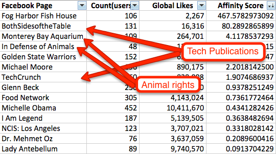 Natural groups will form when you start looking at your data.Two things matter when you are in the final stages of this:
- Sample size. The larger the size of your group, the more people you can target with your ads. You don’t want too large a size, though, because then you are paying crazy CPM’s and competing with a larger breadth of advertisers.
- Grouping. This is based entirely on your judgement. The natural groups are always ones where you think there’s a lot of overlap amongst those users. Its fairly obvious that people who like TechCrunch and BothSidesoftheTable overlap. In situations like the Monterey Bay Aquarium and In Defense of Animals group, its just a judgement call. Go with your gut.
- Expand your targeting using groups. As you create groups, it will be easy to start finding more users to target. So if you have tech blogs like TechCrunch on your list, you can add other ones such as PandoDaily, BusinessInsider and even CNet. Be careful though: there may be a reason your users don’t already like those pages. At Lyft and Udemy, we would use separate ad campaigns for “related” groups and monitor performance accordingly.
That’s a wrap folks. If you have questions, please feel free to ask and I’ll try to get to them.
P.S. This is why we started the Growth Hackers Conference and why I regularly read blogs like Andrew Chen’s or Sean Ellis’s. If you like this, I’ll also try to blog more to help share this kind of information. Tips like this used to be locked up in people’s heads — so poor entrepreneurs like me could never learn them. Now, you can pay $300 (with coupon code “FBadv”) and save months of time and thousands of dollars by going to conferences and reading blog posts about growth hacking. You might also find your next opportunity, meet a great candidate or connect with an industry insider who mentors you.
Use this spreadsheet for churn, MRR, and cohort analysis (Guest Post)
[Andrew: Christoph Janz has written some of the best essays on SaaS metrics and cohort analyses, and he was kind enough share the latest with us below. A bit about the author: Christoph is co-founder and Managing Partner at Point Nine Capital, an early-stage venture capital fund with a strong focus on SaaS investments. Their investments include Zendesk, FreeAgent, Clio, Geckoboard, Contactually and Unbounce. Christoph blogs here and is the creator of a popular SaaS metrics dashboard]
Christoph Janz, Point Nine Capital
Cohort Analysis Spreadsheet
If you’re a long-time reader of my blog (or if you know me personally) you’ll know that cohort analyses are one of my favorite tools for getting a deeper understanding of a product’s usage. Cohort analyses are also essential if you operate a SaaS business and want to know how you’re doing in terms of churn, customer lifetime and customer lifetime value. I’ve blogged about it before and have included “Ignore your cohorts” in my “9 Worst Practices in SaaS Metrics” slides.
My feeling is that over the last 12 months the awareness for the importance of cohort analyses has grown among startup founders. One reason may be that thought leaders like David Skok have been writing about the topic, another reason are web analytic tools like MixPanel and KissMetrics that make it simple to create cohort analyses.
And yet, many founders are still having difficulties with cohort analyses, be it with the collection of the data or the interpretation of the results. With that in mind I wanted to create a simple cohort analysis template for early-stage SaaS startups.
Download the Excel file here.
The idea is that you have to enter only a small amount of data and everything else is calculated automatically. Specifically, what you’ll have to type in (or import from a data source) is the basic cohort data: How many customers did you acquire in each month and how many of them were retained in each subsequent month. If you also want to see your churn on an MRR basis and get a sense for your CLTV, you’ll also have to enter the corresponding revenue numbers.
Get updates to this essay, plus more on cohort analysis and SaaS growth.
If you’re not sure how to read a cohort analysis, here’s a quick explanation:
Here are some brief notes on each of the arrays in the sheet:
A1: This is where you enter the raw data. Start with January 2013 and enter the number of new customers that you’ve acquired in that month. Then move to the right and enter how many of those January 2013 customers were still customers in February, March, April and so on. Then move on to the next row. If your data goes further back than January 2013, extend the table accordingly.
A2 and A3: A2 takes the data from A1 and shows it in “left-aligned mode”, making it easier to compare different cohorts. As you can see the columns have changed from specific months to “lifetime months”. A3 shows the number of churned customers as opposed to the number of retained customers. Both A2 and A3 aren’t particularly insightful to look at per se, but the data is necessary for the calculations in B1, B2 and B3.
B1: Shows the percentage of retained customers, making it easy to see how retention develops over time as well as to compare different cohorts with each other. What you’ll want to see is that younger cohorts are getting better than older cohorts.
B2. This is kind of like the “inverse” of B1, showing the percentage of churned customers as opposed to the percentage of retained customers. In any given row, the sum of the percentages of churned customers plus the percentage of retained customers equals 100%.
B3: B3 is similar to B2, but the difference is that churn isn’t calculated relative to the original number of customers of the cohort but relative to the number of the cohort’s customers in the previous month. Let’s say you have a cohort with 100 customers and after 6 months the cohort has been reduced to 50 customers. If you lose 5 customers in month 7, this represents 5/100=5% churn in B2 but 5/50=10% churn in B3.
So what’s the correct number? There’s no right or wrong here, it depends on the question that you want to ask. If you want to know e.g. “How many customers do I lose within the first six months?”, B2 (in conjunction with B1) gives you the right answer. But if you want to know what percentage of customers you’re losing per month (important when you look at data across multiple cohorts and for lifetime estimates), take a look at B3.
What you’ll want to see in this table is that after a usually relatively high churn rate in the first lifetime months churn starts to stabilize (because the people who never really adopted the product in the first place are now gone).
C1-C3: Same as A1-A3, just for MRR instead of customer numbers.
D1-D3: Same as B1-B3, just for MRR instead of customer numbers. What you’ll want to see is that your MRR churn is lower than your customer churn due to account expansions.
E1 and E2: If you enter the CACs for each cohort, these tables show you when each cohort breaks even.
Also take a look at the second tab in the Excel sheet, which calculates/estimates customer lifetime and customer lifetime value on a cohort basis. Note that the data is highly speculative for younger cohorts for which there isn’t much data yet.
Further notes are included in the Excel sheets.
If you have any questions or comments, please feel free to reach out!
Zero to Product/Market Fit (Presentation)
Readers,
Starting from a blank canvas is the absolute hardest thing to do. It’s insanely hard. And yet the brave entrepreneurs in the tech industry do it, time and time again, and every year, a few are successful. It’s an awesome thing when it works though.
Anyone who’s working on a new product has question: How do you get to product/market fit? If you’ve been wandering the desert and you can’t retain your users, is there anything you can do about that? Is there a way to add structure to something that seems awfully random? How do you even know you’re there?
Below is a short and sweet deck that I created and presented a few years back to Stanford students. It’s focused on a simple idea: The path from zero to product/market fit can be a straight line, or windy, depending on what kind of idea you choose. I present the tradeoffs involved in creating a product that’s a bit more incremental, versus something that’s more breakthrough.
Although this deck is mostly focused on consumer and consumery enterprise products, it’s also fairly general, drawing ideas from the book Blue Ocean Strategy and others.
Hope you enjoy!
Andrew
San Francisco, CA
Above: It’s difficult to product/market fit, but today we’ll talk about some of the tradeoffs you can make for it to be easier!
Traction is everything – it’s what investors ask for. It’s what prospective employees and your team is looking for. But getting traction is really a reflection of your product “working” – where users are engaged and retaining, and there’s some organic acquisition. Product/market fit is when people who know they want your product are happy with what you’re offering – more on the topic here at the a16z blog.
Above: Important, once you get to product/market fit, you can shift your focus from the initial product to distribution and win the market. It’s important to do it in this order! In the haste to get to market, there are teams that start spending too much time on partnerships, paid marketing, etc. – all in preparation for a big launch. But the problem is that if you have a leaky bucket, then all those users at the top of the funnel won’t help.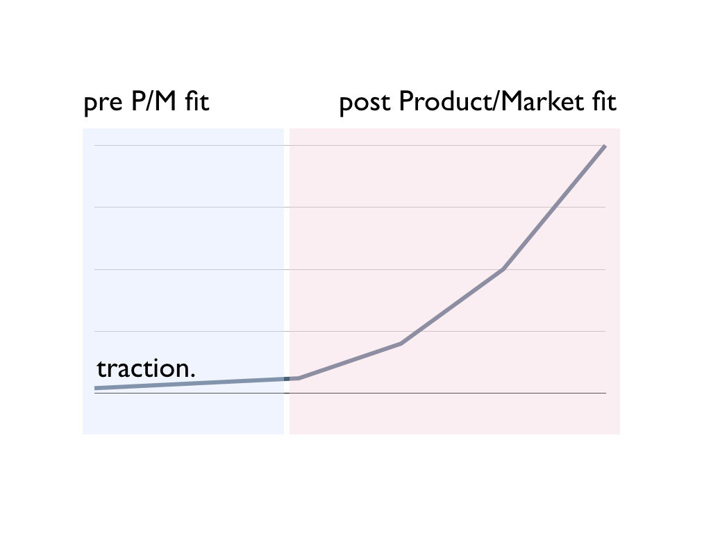
Above: So what does product/market fit look like from a metrics standpoint? Really the best metric to think about is probably retention, which you’d analyze using cohorts. That means it’s sticking, and you need to figure out acquisition. Once it’s all figured out though, then you get the hockey stick. That’s what we’re all looking for, right?
Hitting the inflection point means that you can focus on scaling growth. The activities here are many of the things that I write about – funnel optimization, new user activation, creating notifications and email drip campaigns, etc., etc.
But it’s important to think of these are distinct activities.
If your product isn’t working, you won’t solve that by doing growth activities.
There’s a certain lightning-in-a-bottle aspect to building new consumer companies for that reason.

This is why 20-something year olds often build awesome new companies in Silicon Valley- they make lots of stuff, hit product/market fit, and the capital/talent in the Bay Area comes to help them scale
Entrepreneurs who are young are less encumbered by the notion of “this is how things have always been done” or “this kind of thing has never worked.” They can try, fail, iterate, and make their way towards something pretty new.
Above: Here are some specific ways that I might quickly judge if a consumer product has p/m fit.
You want to see DAU/MAU at >25%. A world-class leading DAU/MAU would be over 50%.
There’s a certain minimum for organic acquisition. You want to see hundreds if not thousands of signups per day, and a D1 of at least 30%. >70% would be world-class there.
And ultimately there’s some scale to show it works – probably 100,000 DAU.

For a SaaS product, you’d like at other metrics that might focus on monetization rather than engagement. Although some products can be evaluated using both sets of metrics.

Above: If you think you have that, send me an email :)
If you compare the metrics above, most startups don’t have product/market fit. It’s usually not working.
So what do you do?
Above: These days, most startups fail because of lack of P/M fit, not technology risk. So if there’s one thing that will kill you, it’ll be the product never quite working, and thus, all the subsequent problems that come with that: Lack of investor interest, employees leaving, cofounder fighting, etc. It’s a stressful time when it’s not working
I find that product/market fit is usually reached either right away, or you have to be incredibly thoughtful about your iterations if you’re almost there but not quite.
So how do you get there?
Above: I want to present to you one framework to think about this, and what kinds of tradeoffs you can make.

Above: Here’s a coffee cup. Product/market fit is actually easy to get, for a coffee cup. It has to hold coffee. That’s about it. There’s not too many variables in designing a cup, and so there’s not a lot to mess up.
Above: Contrast that to a digital product, where there are a million variables. It’s so much more complex than a coffee cup! It’s easy to mess something up.
(The above is a Facebook experimental project, called Paper, that never quite worked out)
It’s easy to mess up because the software medium is so rich. You can build or create anything, and you often end up with something that users can’t quite understand. Worst yet, once it’s not working, adding features won’t help! Sometimes the foundation is just not strong.
Keep these examples in your head, as two extremes on a spectrum. The coffee cup. The messy random digital product.

Above: The more I’ve thought about this problem, the more I’ve come to realize there’s really a spectrum between new versus pre-existing product categories.
The new product category carries a lot more risk, which we’ll discuss.
The pre-existing category carries less risk, but you face more competition, more expectations, etc.
What you want is a point in between those two extremes.
First, over time I’ve come to believe that you actually do want your product to be in a pre-existing product category. Google was not the first search engine, Facebook was not the first social network, and Microsoft was not the first OS.
However, those companies came to dominate those markets because they came in early, when the dynamics were still developing. And the markets grew and grew. But it was also clear what they offered, how they developed something killer.

Above: I want to be more precise than to say that the market must be big – more specifically than that, there must be a large number of users who are pulling on this category in the market. By pulling, I mean folks are actively searching for the product. You can see it in Google Trends. They are clicking on links that mention products in the category. There’s already spend.
Let’s contrast this to the big fake market sizes that entrepreneurs often trick themselves into. Yes there are a lot of college students, and maybe that’s your target market. But how many of them actually want this? Already own a precursor version of your product, or are googling or searching or talking about the category? That’s the real assessment of demand.
Above: Related to the above point, the best markets already have competitors. And maybe they are pretty decent. It’s a good sign when folks can make a decent living building products in the space, but you just have to find a wedge to get in. Or maybe you have a clear thesis on why and how the market will get a lot bigger quickly.
The best case is where the market is large, but fragmented – perhaps because the competitors are not that competent or there’s something structural, like regulatory issues, that keep things small.
Above: If you are in a pre-existing market with competitors and pre-existing demand, then you need a wedge. You need to analyze the market, understand the segments, and figure out how to break in.
My favorite book on this topic is Different: Escaping the Competitive Herd. Worth reading.

Above: There’s a huge advantage to building for yourself because the intuitive advantage it gives you in iterating quickly is fantastic. This isn’t always possible, but it can be a good thing.
Just as we discussed with the coffee cup, one way to get to product/market fit quickly is to just copy something.
There are a ton of problems with this strategy though – if you’re the second player with the same product, you’ll always remain the second player. Your team will hate this strategy. Investors won’t get it.
Sometimes the market is big enough to make this work, but it’s not often.

Above: The better approach is to do a twist. On the spectrum of pre-existing market to new market, pick a point in the middle. Build something that consumers fundamentally understand, but with a clear innovation that you can market around.
A lot of getting to product/market fit is being thoughtful about the category, the axis of differentiation, etc.

I want to run through some common mistakes that people make.
Above: We love these “X for Y” type companies. And it can be a way to generate cool ideas, but it doesn’t say much about the underlying market size and existence of pull in the market.
For instance, “Pinterest for dogs” and “Pinterest for businesses” are both X for Y ideas, but only dogs are a segment of Pinterest. A business-targeted product is more a description of the mechanics of the product, not a smaller set of the broader Pinterest market. And as we mentioned, identifying a wedge in a pre-existing market is key.
As a result, you can think about existing versus new markets using The Substitution Test. If I use this new product you’re building, does it take away engagement or $ from something else. If so, then it’s truly a segment and a heads-on competitor. It’s counter-intuitive but I consider that a good thing, because they you are truly competing in a pre-existing framework- you just need the right functionality to win.
Above: Every existing market has a baseline of product quality, functionality, etc. We’d all love to build the minimum viable product, but sometimes it doesn’t work because the category has evolved sufficiently that you need more than the bare bones.
Sometimes people love a certain kind of tech. Today it might be crypto, tomorrow it might be something else. And they are looking for some kind of product and category to apply to, rather than fundamentally solving peoples’ core needs. It’s an easy mistake to make for technologists.
As you know, I hate new consumer behavior :) Sometimes this can work but it’s rare. At the very least, products have to tap into the same fundamental human motivations that have driven us for 100,000s of years.

Above: This is a San Francisco thing, but entrepreneurs are often building things that sound cool only to each other. No one else cares, but it’s fun and captures some tech trend that’s confined to the SOMA bubble. I call this “art for artists”
Above: This is common. You can execute everything correctly – iterate quickly, great tech, hire well, etc. – but ultimately still take huge risks on your product and market in such a way to not actually be successful.

Above: So let’s say you get something that has P/M fit, and it starts to take off! It’s a good problem to have. So what do you do?
Above: Luckily, you can summon the power of the Bay Area to help you solve this.
There’s a large body of work and experts on scaling companies. You can raise money, hire operators who’ve scaled, and you’re on your way.
I don’t mean to downplay this, except to say that the zero to product/market fit part is so hard that this next stage will be much easier than the first. Ultimately, there’s a few growth channels that work, and it’s much more of an optimization problem.
Above: For the paid ads channel, you’re ultimately looking at it as a LTV versus CAC problem. With some blended/organic traction too.
The ecommerce companies, OTAs, and marketplaces often grow like this.

Or you want to build a viral loop – if your product is social or collaborative in nature – and you can optimize for invites or content sharing or some other loop. This is a deep topic that could be a multi-part series of its own things.
This channel is used by the social networks, video sharing products, but also even productivity/collaboration products in the workplace.
If your growth loop involves a lot of user-generated content, then you can build on Google. For products that are really about reviews on local businesses, companies/products, or even real estate, we see them use this loop.

Above: If you’re at product/market fit, I want to hear from you! Send me a note anytime. Thank you :) (For future reference, you can also download the PDF here).
The Rise of Fat Venture Capital
Reinventing the VC industry
In 2007, before YCombinator and AngelList had changed the industry, I worked in a nondescript office park in the heart of the venture capital industry off Sand Hill Road. Amid the leafy sprawl of buildings next to 280 and Stanford University, billions of dollars were and are invested out of the fancy offices of VC/PE firms you’ve never heard of. The whole industry has been shrouded in opaqueness since it was created decades ago, built on relationships from business schools, professional networks, and investor referrals. In 2007, I worked at a big firm as an Entrepreneur-in-Residence, and did my best to make sense of this world.
The first thing I noticed was that the venture capital industry seemed so opaque as to be self-defeating. Entrepreneurs didn’t know who to talk to, and most can’t name more than 2 or 3 firms. While venture capitalists would pontificate about the importance of differentiation, all of their websites consisted of a bunch of blue-shirted dudes that all invested in the same stuff. This always confused me.
I remember at one point I had lunch with a General Partner of a Sand Hill firm and we talked about PR:
Me: So why don’t VCs do more PR?
General Partner: Great entrepreneurs know to come to us. We don’t have to go to them. And in fact, having great investment returns and being out there in the public don’t really correlate, so we don’t do it.
It sorta made sense to me then. This approach had been true for the first few decades of the venture capital industry. Getting ahold of a GP through an entrepreneur’s network seemed like a basic test of competence.
Thus, other than raising the money, you didn’t need much overhead to run a VC. You just needed a couple guys in a nice office, 1 admin per partner, and a website. If you wanted to get fancy, you could have a venture partner or associate or two. Maybe 6 professionals plus their admin staff.
But just a few years later, in 2013, we now see VC firms with over 80 professionals. Not just one, but multiple firms are doing this. And even small funds are experimenting with events, content marketing, software infrastructure, etc.
This is the new era of “Fat Venture Capital.”
How did this happen?
Lots of trends driving differentiation of capital
There’s a lot of trends driving VCs to differentiate. The obvious stuff: It’s cheaper to start a company. There’s more seed money, in the form of both accelerators writing $20k checks and seed funds writing $500k checks. There’s a lot more information out there, for both what firms to pitch and what terms to expect. There’s been a lot of great material covering the trends affecting startups so I won’t elaborate more here.
What’s less frequently discussed has been the recent trends on the venture capital side. A lot of firms decided that the high market risk, low tech risk nature of digital bets meant that they needed to employ a “barbell” strategy. Lots of seed stage investments, plus lots of late-stage investments, and not much in-between. Many early firms that traditionally would lead Series As and then hand off the larger “late stage venture capital firms” now see themselves playing at every stage. But if you wait to do later stage bets, then the traction is more obvious, and there’s more head-to-head competition between firms as they chase obvious deals. More head-to-head competition means that differentiation matters.
Similarly, the lower capital requirements of startups means that there’s been a lot of new firms started recently. It’s a lot easier for some successful startup execs to start a new VC fund by raising $20M or $50M, rather than a traditional VC that raises $200M or more. This has brought a lot of entrepreneurial energy to a sector that often behaves like a sleepy money management industry, rather than the dynamic startups in which they invest.
This entrepreneurial energy is especially important in an industry where the guys who invented the industry are now long retired. When you read books or watch documentaries about the early VC industry, you can see that the early guys who knocked on the doors of insurance companies in the midwest were truly entrepreneurs. Years later, many firms are led by professional investors who are two generations removed from these early innovators. While the successful-entrepreneur-turned-VC is still widely admired, plenty of firms are stocked with MBAs-turned-associates-turned-VCs, who are prone to view VC as a career rather than an competitive and entrepreneurial endeavour in itself.
And of course, many large firms are simply reacting to the competitive pressure from Andreessen Horowitz. They popularized this services-based approach and this WSJ interview is worth reading about their approach. The CAA analogy is particularly insightful.
The unbundling of the General Partner
The impact for entrepreneurs is straightforward. It used to be that an investment from a General Partner of a VC was a bunch of things bundled together:
- Money
- Expertise
- Oversight
- Professional network
These days, we’re moving to a model where this all gets unbundled. Money comes from the VC, but also from a long list of investors sourced from crowd funding platforms. The professional network for a firm is supported by a large services team. Advice can come from a long list of advisors and operational folks that are easy to track down on LinkedIn. Functions like executive recruiting, technical recruiting, PR, etc. don’t come from the particular GP who wrote the check, but rather, the services team that works for them. Instead of the GP sending you random links they’ve read, instead there’s dashboards and link-sharing services that are private amongst the other portfolio companies of the investor.
Furthermore, we’ll see the internal functions of a VC firm, like marketing, evolve to be pointed towards entrepreneurs rather than investor management. Instead of press releases on PEHub, we’ll see firms act more like SaaS marketers: Content marketing, professional events, even paid advertising. Why shouldn’t a VC firm be buying Facebook ads targeted at the next crop of Stanford CS graduates?
Ultimately great VCs will continue to do well. Many won’t embrace the Fat Venture Capital model, but will do fine, because their judgement, expertise or network is just that good. But for the rest of the industry, moving to differentiate will be the norm.
Entrepreneurs will benefit. More transparency and competition will mean that the “the good ones will come to us” attitude will be a thing of the past. Instead, great VCs will chase the great entrepreneurs, because in a world where the supply of great entrepreneurs is smaller than the supply of plain ol’ money, that’s the way it should be.
How Google and Zynga set & achieve meaningful OKRs (Guest Post)
[The topic of setting goals, especially quantitative ones, is a really important topic for any team and any startup. A common format has been the OKR, or “Objectives and Key results” which is in use at Google, Zynga, and many other companies. It consists of setting an objective, and also a series of measurable results aligned with that objective. My good friend Kenton Kivestu, (now Flurry but previously Zynga and Google) has experienced this framework first hand and had a lot of insightful stuff to say about it. You can follow Kenton on Twitter and read his blog here. -Andrew]
Kenton Kivestu, Flurry:
How to set & achieve meaningful OKRs
In 2011, when I joined Zynga to work on the mobile poker franchise, we were getting trounced by a competitor named Texas Poker. Their UX was better. They were smoking us on appstore top grossing rankings. And they had 5x the features (not to mention a “premium” pro version of the game they’d just launched). For a company who unequivocally dominated the poker space on FB, our position in the mobile poker market was borderline comical.
The team set an OKR to take the throne: become the #1 top grossing iOS poker game. And then something incredible happened, we did (~6 months later). In my career, I’ve seen many an OKR go haywire (both at Google and Zynga) so this post is my attempt to distill & isolate the common traits I’ve seen in good implementations of an OKR.
First, what is an OKR and why bother?
Google has used OKRs since 1999 at the urging of KPCB partner John Doerr and Rick Klau (former Googler, now Google Ventures partner) has a good post on what is an OKR is (and it’s history). And you can read up on them at Quora too. But the TL;DR is an OKR is a stated goal, known to the whole company and has a pre-defined rubric to measure your success in achieving it.
Whether your at a start-up or big co, the only thing in endless supply is constraints. Time, developer resources, energy and the list goes on. And in a resource constrained world, the best plan of attack is to marshall resources and focus efforts on the best leverage point.
Now the question is, how do you set good OKRs? Like all things, there are many ways to successfully skin a cat but the 3 most common traits I’ve seen in teams that have set and achieved awesome results with OKRs are these:
Measurable
Contrary to popular belief, this doesn’t mean the the OKR needs to be explicitly quantitative (eg drive X% increase in sign-ups or Y% year over year growth in recurring revenues), although it’s fine if that is the case. But it definitely needs to be measurable in the sense that the team can unequivocally evaluate their progress at the end of the OKR period.
For us, the iOS app store Top Grossing rankings were our measuring stick (for better or worse). There was no fudging the numbers and it was dead simple to measure, we were either ahead or behind.
Focused
OKRs are like money. Mo’ money, mo’ problems. The surest way to negate any positive impact from a good OKR is to set 10 good OKRs. It can seem alluring at first – “we’ll accomplish so many things this quarter/year!” – but it will backfire. There is little doubt that 10 good OKRs is worse than nothing. Your team will be torn between competing priorities – should John the engineer work on X or Y this sprint? One will get us closer to OKR A and the other toward OKR B. Inevitably this leads to prioritizing OKRs – this might work if you have 1 or 2 but anymore than that is going to be a recipe for a wasted quarter.
For us, we had 1. If a feature/chunk of work didn’t directly contribute to us climbing the iOS top grossing rankings, it was de-prioritized. As a result, we got a late start on expanding to other platforms (Android tablets, Kindle Fires). That was painful but the focus brought the right end result, since the iOS Top Grossing “pot o’ gold” was orders of magnitude more rewarding than early adoption of Fire or And tablets.
Worth doing
Again, this seems obvious but is worth stating. A good sanity test is ask yourself, “If the company were a person, would it put the successful completion of this OKR on its resume?” If the answer is no, boot it. All too often well-intentioned but “empty” OKRs end up dictating resource allocation. These culprit OKRs typically rise out of a discussion around some product tactics (eg let’s reduce friction in the sign-up flow by X%).
Ok, but OKRs stunt our creativity
An oft argued counterpoint is that OKRs will stunt creativity and the team’s ability to tinker and meander into some great discovery. Defenders of this theory highlight examples of accidental discoveries leading to huge innovations – but this is missing the point. OKRs don’t preclude accidental discoveries, they simply make sure that in absence of a brilliant accident the team is on track to do something else meaningful.
If you’re finding your team sets quarterly OKRs only to trash them each quarter given a brilliant mid-quarter discovery, you’re either:
- a 2-sigma team that repeatedly launches industry leading core features every quarter despite not initially planning them
- setting OKRs not “worth doing” as evidenced by repeated willingness to ditch them
- unfocused and need more operational discipline
In conclusion
OKRs are not a panacea. And they can lead a team astray if they don’t keep them focused, measurable and meaningful. But the flip side is that a well-set OKR can generate a 10x result. OKRs can drive focus and relentless execution, and in turn, those drive incredible results.
Case studies from “Why you can’t find a technical co-founder”
This is a followup guest post by Elizabeth Yin on her popular essay, Why you can’t find a technical co-founder. Liz is the CEO and a co-founder of LaunchBit, an ad network for email newsletters. Previously, she worked at startups and Google, and went to MIT for her MBA, and Stanford before that.
Elizabeth Yin:
Why you can’t find a technical co-founder (part II)
I received a lot of emails about my last post on Andrew’s blog: Why you can’t find a technical co-founder, which discussed:
-
Deal-breakers for non-technical entrepreneurs who are looking for technical co-founders (for example: location isn’t a deal breaker but idea validation is)
-
How to get traction on a product idea without a product
-
3 examples of startups (AngelList, Yipit, and Beat the GMAT) who have become successful today but started without full-fledged products
So, I wanted to dive into this topic more.
Building a minimum viable product with a static website
It can be all too easy to want to build out a full-fledged minimum viable product in code. But, as an entrepreneur, you only have so much runway. One of the best ways to cut down on the time required to get to product/market fit is to skip the coding process entirely. It’s more time-consuming to program in one direction only to realize that you need to build something in a completely different direction. Not to mention, morale takes a hit when you have to scrap all your work.
So, one of the best ways to speed up time-to-market is to build a minimum viable product with a static website. Disclaimer: this isn’t possible for every product, but a lot of web business ideas can be built initially with simple static websites.
Here are two case studies of companies that first used simple websites to test their respective business ideas before building out full-fledged dynamic sites. It was these static websites that helped them find product-market fit very quickly, which enabled them to scale sooner.
Fandeavor
Fandeavor is a company that offers game-day experiences. Founders Tom Ellingson and Dean Curtis previously worked at Zappos, a company that would often sponsor sporting events. Tom and a handful of Zappos employees would often get red carpet treatment at these sporting events, but these special experiences were limited only to high-end sponsors. “But what if general consumers could purchase the same awesome sporting experiences too?” they wondered. So before they left their full-time jobs, they decided to test whether this idea had any legs.
Tom called up a contact at the University of Nevada Las Vegas (UNLV) who ran sports tournaments. Tom convinced him that the Fandeavor team could help him sell special sporting experiences around the upcoming tournaments. These gameday packages would include things like signed basketballs, box suites, special sports gear, and even the opportunity to present the game ball at mid court. In parallel, Dean set up a basic website that would provide information about these gameday experiences.
Fandeavor’s initial website
Through a cross-promotional partnership with UNLV, who promoted these experiences through their Facebook fanpage, these first experiences quickly sold-out. It was from testing these first experiences that the Fandeavor team realized that doing cross-promotions with other organizations to promote their gameday packages helped them build their audience and also made their sales successful.
The duo continued testing their business idea by offering more experiences on their website. They even created sections of their site that were empty but helped track demand of what teams and sports people were most interested in. Just simply by tracking clicks on their relatively simple site, they could figure out what types of experiences to offer next.
Tom and Dean left their day jobs at Zappos to work on Fandeavor full-time. But soon, they realized that the kind of experiences people were interested in were not necessarily box suites. A lot of consumers wanted even simpler things — help with travel, hotels, and other logistics in building a great trip experience around tournaments and games. These were experiences that the team could build with virtually no special business development deals. So, they started curating these experiences themselves manually. Eventually, they were able to develop a process around doing this efficiently.
From doing quick tests using a simple website, Fandeavor was able to figure out the mechanics behind how to get their supply (the right curatable gameday experiences) and the demand (promoting through cross-promotional partnerships).
Fandeavor’s website today
Once they established the processes for scaling both sides up, they were able to later build a much more sophisticated backend to curate all their experiences and build their team to repeat these processes. Today, Fandeavor has raised $525k and is growing 50% month over month.
Moveline
Moveline is a company that aggregates moving quotes from moving companies. Founders Kelly Eidson and Fred Cook realized that the moving process was difficult for people for a whole variety of reasons and wanted to help make this process better.
Fred and Kelly collected leads on a simple website to start working with qualified consumers. And soon, they started going into homes of people who were moving to talk with them about moving issues.
Moveline’s initial website
Kelly and Fred quickly learned that it was a headache for people to document every little thing they had to move and then submit all those items to different moving companies to get quotes. Kelly and Fred realized that the crux to making the moving process better was to develop a better way of itemizing objects.
At first, the Moveline team was not really sure how to do this better. They initially went into people’s homes and manually categorized items into spreadsheets. They repeated this with dozens of people who were moving. The breakthrough in building a process around this came when someone in a different city contacted them requesting their itemization-help. Not able to physically go to that person’s home, Fred and Kelly asked to do the itemization over Facetime. It turned out they were able to accurately and quickly itemize over the video conferencing software, which later became a part of Moveline’s core product. It turned out that using video conferencing software gave them an edge — they could itemize just about any move from anywhere without requiring local on-the-ground teams.
It was from these initial conversations with dozens of consumers that Moveline was able to tease out a very specific problem to solve in moving. And, once they were able to manually figure out how to use technology to solve this problem, they were ready for scale. It was because they used a simple website that fed them leads, but still required the team to “be the product,” they were able to really understand and solve this particular problem in moving.
Moveline’s website today
Only once they had a clear idea of what needed to be built into the product, Fred started hiring a team of engineers and product people to build the first version of Moveline’s software. Today, Moveline is an 18 person company, has raised $3 million in funding, and since launching nationally in March has added over 200 moving companies to its network. They now serve customers in over 100 cities in the U.S. and internationally.
Both Moveline and Fandeavor primarily used static websites to collect leads and kickoff interactions with potential customers. Although static sites don’t seem very sophisticated, through the use of simple input fields and forms, you can collect information to vet potential leads, and you can use them to collect customer insights. Static websites are a great way to quickly test your product and get to product/market fit.
For more examples of companies who built minimum viable products without coding, see these awesome posts written by Ryan Hoover and Vin Vacanti:
P.S. If you want to learn how to build your first web prototype without coding, attend this workshop I’m hosting on Building a Mobile-friendly Websites Without Code on October 3. Get 25% off with this discount code: “andrew-hustler”.
Easter Egg Marketing: How Snapchat, Apple, and Google Hook You
This is a guest post by Ryan Hoover, the Director of Product at PlayHaven and creator of Startup Edition. Follow him Twitter at @rrhoover or visit his blog to read more on product design.
Ryan Hoover on Easter Egg Marketing
Last week I received this Snapchat from a friend:
I was quite surprised to see a black-and-white photo. “When did Snapchat add filters?” I asked in response.
With pride and delight, my friend responded with instructions: enter the text caption, “B&W…”, to activate the black-and-white filter. Grinning, I immediately sent a dozen B&W Snapchats to my friends, anticipating their curious replies because I knew something they did not. I knew a secret.
The black-and-white filter is one of Snapchat’s many Easter eggs. An Easter egg is an inside joke or hidden feature. The term was first coined by a programmer who hid his signature inside a secret room within the Atari 2600 video game, “Adventure”. Decades later, Easter eggs are a recurring meme in gaming, a head-nod to players, and have expanded into non-gaming, consumer products. Look closely and you may find Easter eggs hidden within your favorite applications.
The nature of Easter eggs is an oxymoron. Why would Snapchat or any other product hide functionality. Apps should be intuitive and accessible, right?
Easter eggs go against users’ expectations and in turn serve as a powerful form of marketing, enabling companies to:
- Get People Talking – People love knowing secrets but they like to share them even more. Consider the last time you heard office gossip or a twist ending to a much-anticipated film. Did you have an urge to tell others? Wasn’t it amusing to see your friend’s reaction as you revealed the secret?
- Bring People Together – As a child, we were told not to withhold secrets from our parents. But we did so anyway. Mutually shared secrets between our friends and siblings brought us together. The same is true for Easter eggs. Those aware of the Easter egg secret share a common understanding, separating people “in the know” from outsiders. This helps form a bond between holders of the secret and strengthens a community.
- Build a Brand – Easter eggs are fun and produce a “WOW!” effect. This delight forms a memorable connection between the brand and its users through a shared understanding not privy to everyone.
Here are three companies that use Easter eggs to spike engagement, establish a community, increase word-of-mouth, and build a memorable brand:
Apple (Siri)
When Siri launched, Easter eggs bombarded the internet. People could not get enough of Siri’s unexpected, witty answers to the hidden questions and phrases.
Siri’s humor was inescapable as blogs, TV shows, and social networks exploded in discussion. Websites dedicated to its Easter eggs sprung up. A Google search for “siri funny questions” results in over a million results. The free marketing instigated by these Easter eggs was arguably more impactful than Apple’s multi-million dollar advertising budget.
The secretive and clever nature of Easter eggs encouraged users to explore the product to uncover its secrets. When users cracked an Easter egg mystery, they acquired bragging rights, often sharing their discovery with friends. As a result, Siri became a celebrity as people promoted her wit.
Lyft
As I was walking down Howard St. in San Francisco, I overhead a group of people talking.
“What are those pink mustaches for?” A woman said, pointing to a blue sedan.
“I don’t know! I see them everywhere.” Her friend replied.
This wasn’t the first time I had heard this question. I observed two other groups of people ask the same question earlier that week.
Lyft, a ride-sharing service, aroused curiosity by decorating its fleet of vehicles with furry, pink mustaches. Instead of plastering its brand name on the side panels of its cars, Lyft used an Easter egg to catch people’s attention and get them talking. After seeing a half a dozen pink mustache-sporting vehicles, one is bound to resolve the mystery.
As users demonstrated an effort to understand the meaning behind the silly spectacle, by asking friends or searching online, Lyft became more memorable. This is especially important in competitive markets, where recall and top-of-mind-awareness determine which transportation service one turns to the moment they need a ride. Lyft creatively stood out from the competition by hiding its brand behind an Easter egg: a pink mustache.
Google
Google is known for its shenanigans and clever Easter eggs. The search goliath often replaces its logo with Google Doodles, turning its name into art in honor of holidays, special events, and anniversaries. The company even turned its logo into an interactive synthesizer and zamboni mini-game. These rotating doodles spur conversation and encourage people to visit the homepage to see what others are talking about.
Less obvious, though arguably more impactful, are Google’s hidden search terms. Visit google.com, type in “do a barrel roll”, and press enter! Be prepared for a delightful surprise as the screen rotates. This hidden gem continues to spread across the web years after its release in 2011, as evident by the hundreds of tweets like the one below, shared just this week.
Despite being a multi-billion dollar corporation, Google demonstrates playfulness, charming its users with fun surprises. Although Easter eggs provide no value to the product’s core offering, it creates a personality to the brand and encourages users to engage in marketing the product by forwarding it to friends.
Easter eggs are more than a fun distraction and can serve as a powerful form of marketing. Consider how you can incorporate Easter eggs in your product or service to increase engagement, establish a community, get people talking, and build a memorable brand.
And now that you know the secret, don’t you want to share it? ;)
For more essays on product design, subscribe to Ryan’s email list.
How is Yahoo really doing? Here’s the Google Trends data (Guest Post)
Note from Andrew: I recently wrote an essay on the virtues of using Google Trends to analyze the underlying traction of products instead of focusing on PR. I mentioned offhand that it would be interesting to break Yahoo’s properties apart to see how they are doing independently of each other, and Matt (bio at the end) sent me some great notes on the topic – you can also follow him on Twitter at @mattgierl. It’s worth noting the caveats that Google Trends data is directional, probably doesn’t do good job on mobile, etc., but nevertheless I found the findings thought-provoking.
Matt Gierl:
How is Yahoo Really Doing?
To say that there has been a bit of buzz around Yahoo as of late would be a drastic understatement.
From Marissa Mayer’s appointment to CEO, to their re-launch of photo-sharing app Flickr, their $1.1B acquisition of Tumblr, and most recently, their bizarre (ingenius?) 30-logos-in-30-days PR campaign: purple-mania has reached a fever pitch. Investors seem to have bought into the hype as well, as Yahoo’s stock price has nearly doubled from its 52-week low to over $28 per share as of the time of this writing.
But I, for one, am not ready to count myself as one of the believers. Let me tell you one of many reasons why.
In Andrew’s post last week, he made the case for why navigational query volume is a better proxy for evaluating a company’s traction in the market, as opposed to something like unique monthly visits (which can be inflated a variety of ways which Andrew discusses). Fortunately for us all, the Google Trends tool makes this ridiculously easy to do.
In the post, Andrew takes us through the charts for some of the current and former high-flyers in the tech space including AirBnb, Pinterest, Twitter and, last but not least, Yahoo. Here’s what he found:
Yahoo
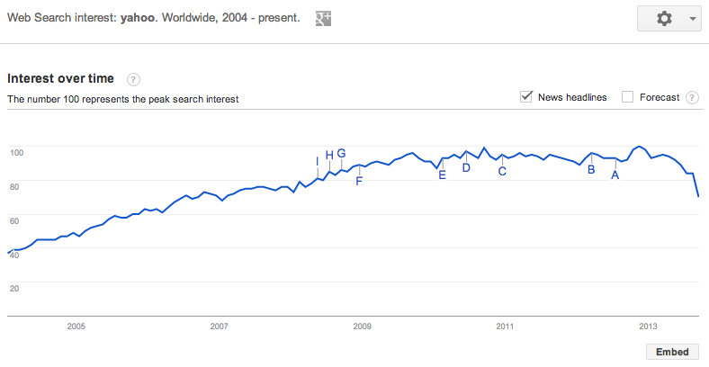
Surprisingly, Yahoo experienced pretty strong growth until mid-2009, where we see volume stall a bit. Further still, there has been a noticeable decline from the end of 2012 to today. While these are some interesting trends overall, it leaves a lot unsaid in terms of how the various Yahoo properties (e.g. Yahoo News, Yahoo Sports, etc.) may be affecting their overall navigational query volume, so I did some digging and found that it’s actually a bit of a mixed bag.
The Good
Several Yahoo properties are doing well on navigational queries: News and Sports, in particular.
Let’s start with Yahoo News.
Yahoo News
While there aren’t a ton of positives with respect to navigational query growth for Yahoo’s properties, there have been a couple bright spots. To begin, we see that Yahoo News has shown steady growth over the last 10 years. Whoever said journalism was dead?
Yahoo Sports
Yahoo Sports has enjoyed a positive trend overall as well, interspersed with cyclical spikes corresponding with the starts of the NFL/NCAAFB and MLB seasons. It’s tough to say definitively, but this is likely a result of the explosion of fantasy sports in the U.S. and abroad, which grew 60% from 2007-2011 and has shown no signs of slowing.
The Bad
On the other hand, several Yahoo properties are flat. As I alluded to earlier, it’s definitely not all roses for Yahoo though.
Yahoo Finance
Here, in one of the more interesting of all the Yahoo property charts, Yahoo Finance, we see a modest growth trend obscured by a stalagmite-like formation which occurred during the economic collapse of 2008-2009. The bump in ad revenues was a small silver lining for them in the midst of their stock plummeting to half of its former value, I’m sure.
Yahoo Weather
Yahoo Weather appears to be falling out of favor as well, as volume has declined to roughly half of what it was at its high at the start of 2011.
The Ugly
Several Yahoo properties are hitting slumps though, even in important categories like Mail, Travel, and Shopping.
Yahoo Mail
Turning now to one of the most critical properties in the Yahoo ecosystem, Yahoo mail, we see an even bleaker story still. After experiencing a strong period of growth from the Since mid-2010, search queries for Yahoo Mail have steadily declined, coinciding directly with the rise in volume that Gmail has enjoyed over the same time period.
Gmail
Yahoo Travel
Yahoo Travel hasn’t fared much better. Volume has continued to decline steadily since 2007, likely due to the growth of more sophisticated travel aggregators like Orbitz, Kayak, Hotwire, Hipmunk and even Bing Travel over the past 5 years.
Yahoo Shopping
And finally, in perhaps the most defining chart of all, Yahoo Shopping continues its decade-long decline in navigational query volume. But let’s be honest, when is the last time you’ve intentionally navigated to Yahoo Shopping for your consumer product needs? Yeah, I can’t remember either. And I bet you can guess one of the major culprits who appears to be syphoning off this volume…
Amazon
Now, I understand that navigational query volume is not everything and that there is much more to the Yahoo story than what I’ve managed to include here, but nonetheless, this doesn’t instill much confidence in their ability to reverse the trend and drive growth moving forward. When it comes down to it, they simply don’t have a single rockstar product to speak of that can serve as the archetype for success in the post-Web 2.0 era.
And while some may be quick to suggest that Tumblr fills this role, I think it’s still too soon to call. Hopefully for Yahoo’s sake, that hint of stagnation in Tumblr’s chart since 2013 is merely a red herring.
Tumblr
The Recap
So to recap, we have:
- Two of Yahoo’s properties, News and Sports, showing moderate to strong growth in the last decade
- Yahoo Finance and Yahoo Weather in steady decline since 2009
- Three of Yahoo’s key businesses in Yahoo Shopping, Mail, and Travel getting their lunches handed to them by the competition
- And, finally, a brand new $1.1B question mark
So while I must admit that I rather enjoy a gimmicky PR campaign every now and then, the negatives significantly outweigh the positives here. As a result, until Yahoo can show us some real, tangible traction with a core product, I will continue to remain a doubter.
About the author: Matt Gierl is a an MBA student at UCLA Anderson, digital marketer, and sporadic blogger over at Medium. As a former consultant at the data science firm, dunnhumby, Matt has helped some of the world’s most iconic brands achieve new growth by better understanding the behaviors of their most loyal customers. Matt currently resides in Los Angeles where he is an MBA student at UCLA Anderson. If you happen to be in the area, I hear he is willing to grab coffee and chat about marketing, tech, startups and the like, so get at him at @mattgierl.
Ignore PR and buzz, use Google Trends to assess traction instead
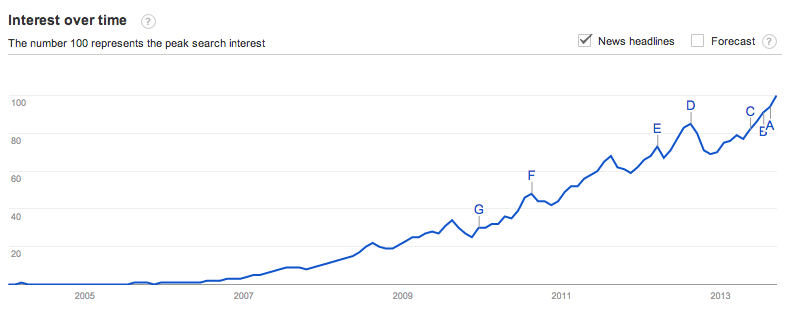
[Yelp shows a healthy navigational search graph – lots of people are continuing to search for its brand, and you can see some seasonality where it peaks every August, goes down during Q4, then starts coming back up in Q1.]
PR buzz is useless for assessing product traction
Traction is everything, and it’s easy to confuse press buzz with actually having product/market fit. Writers for blogs and newspapers love novel ideas that sound amazing on paper, especially when the new products are being introduced by credible entrepreneurs. However, when you’re in the business of making product and investment decisions, it’s important to understand what’s actually working and what’s not- having buzz isn’t enough.
This article is about one of the ways to answer the question, “Is X product really working?” The easiest, fastest, free way to assess the traction of a competitor or buzzy startup is to use Google Trends. It’s a great tool from Google that gives you a chart of how many search queries are being generated, which is a fantastic way to see if the consumer pull demand is increasing or decreasing.
Navigational queries are the best representation of consumer “pull” from the market
The reason why this works is that Navigational Queries are one of the three major kinds of queries that consumers plug into search engines. People search for a brand like “yelp” “facebook” “zynga” when they want to directly navigate to that domain, and as you might imagine, it’s a strong indicator of customer loyalty. These navigational searches represent the “pull” of the market, and if the graph of this pull is flat or declining, then you might have a problem on your hands.
Consumer demand is the leading indicator, uniques are the lagging indicator
The reason why a graph of navigational queries is so powerful is that it partially removes three major sources of traffic which are often inauthentic, unsustainable, or susceptible to artificial inflation:
- Unsustainable paid ads, where spending outpaces lifetime value of the users acquired. Or, commonly in mobile, where a bunch of ads are purchased in an attempt to shoot an app up in the charts.
- Content farming, where a lot of low-quality content pages are created. Although a lot of users may end up arriving at these pages as a result of searching and clicking on something, they don’t know (or care) that they are on these pages- these aren’t really long-term users or customers.
- Drive-by traffic, which often looks like photo/video hosting, or IFRAME’d content, which people click into from Twitter, Facebook, or some other social channel. Similar to content farming, these are often “one click wonder” visits where people click in to view some content, but don’t actually engage or care about the underlying product.
Of course, doing something simple like graphic navigational queries isn’t strong enough to remove the entire effect of the above- instead, it just mutes it a little bit, and that’s the important thing in the long run. Ideally you want to see a long, smooth set of traffic that’s been built over months and years, not a huge spike driven by unsustainable means.
This consumer demand curve is really the leading indicator of traffic. Generally if I continue to see the graph going up and to the right, I will think that a company is pretty healthy. If it’s not, no matter how much is being written about them in the press, I’ll be skeptical.
Zooming in on traffic seasonality
One of the best parts about Google Trends is how granular it gets. You can ask to see the graphs on a 30-day rolling basis, as well as breaking it down by country. One the common patterns you’ll see is that there are two kinds of websites:
- Time-saving, where you use them at work Monday-Friday and they help you do your job.
- Time-wasting, where you use them at home in the evenings, and heavily on the weekends. They spike Saturday/Sunday and flatten out during the weekday.
Here’s an obvious example of a time-saving product, Linkedin, which shows huge gains during the week but then it gets depressed during the weekends- amazingly the weekdays are 100% higher than the weekends, according to this chart!
Triangulate with AppAnnie, Facebook stats, Twittercounter, Twitter search, and Quantcast
Of course, there’s a ton of caveats to using such a simple tool. Searches will rise even when unsustainable methods are used, just because more consumers are being exposed to the brand. Similarly, the other big issue is that mobile apps don’t often benefit from search engine traffic the same way that websites do, since none of the content in the apps are being indexed.
Thus, remember that this analysis is strongest for web products, and to think of this as directional.
If you want a higher degree of confidence, consider using AppAnnie, Facebook stats, and Quantcast to figure out what’s going on. With AppAnnie, you can see the rankings of mobile apps and how they change over time. This can be useful in conjunction with Google Trends, since you can look up something like Angry Birds, which used to be the top grossing iOS app, which you can see below:
When you combine the above drop in rankings to their Google Trends chart, which I’ve included below, you can see that Angry Birds is stalling quite a bit:
You can also use Facebook stats services, for the products that allow for Facebook sign-in, to get a sense for how things are directionally going. Quantcast and Compete are also free services that let you look up uniques/month for web products, though they are often wildly in conflict with each other since they use the same kind of sampling that makes Alexa unreliable too. Back in 2006 I wrote about how Alexa works and all the flaws with their methodology, that I learned first-hand working with Nielsen/ComScore in my adtech days.
Qualitatively, doing a Twitter search on the brand is great too. Ideally you want to see a ton of authentic tweets about people actually talking about the product- again, the focus is on whether or not people really understand they are using a product and what they think of it. You can supplement this with a service like Twittercounter to see if their follower count is growing well over time. If a product claims a ton of uniques in a press release, but very few followers and very little Twitter conversation, it might be inauthentic traffic. (Thanks to Adam Besvinick for reminding me to mention Twitter searches)
How are Airbnb, Foursquare, Pinterest, Twitter, Quora, and Yahoo doing?
And finally, I thought it might be interesting to share the current graphs of a couple current (and previous) high-fliers to see how they’re doing on Google Trends. Some of the are universally considered to be doing well, and some are not. let’s see what Google Trends says, at least on a high-level.
Airbnb
Seems to be growing very nicely. You can see some seasonal peaks in August where people rush to go on vacation for the summer, and then it rapidly drops off from there. The growth seems very strong.
Foursquare
This is a tricky one- you both see that it’s flat, which is in line with what’s being discussed in the press. On the other hand, since it’s mostly mobile, it’s hard to say if this navigational query analysis is that useful. The silver lining on this also is that the traffic has held steady and hasn’t declined for a year now, which means there’s likely a strong core of retention holding everything together. Requires some more analysis to figure out what’s going on here.
Pinterest
Same kind of indicators as Foursquare. There was a huge run up in 2011/2012, due to a lot of Open Graph nonsense, but now that the traffic spigot has died down, there’s still a good base of activity. As I understand it, they’re over 100M uu/month and holding onto that traffic, which should be enough audience to build a solid company.
Twitter
Alongside Facebook’s graph, both seem like they are plateau’ing and going flat. But could this just be users transitioning from web-centric usage to mobile? I guess we’ll know when their IPO S-1 documents come out- are they accelerating audience growth or is is starting to slow down?
Quora
Although Quora hasn’t been in the news much lately, and a lot of digerati seem to have abandoned ship, their core base of traffic looks pretty good. Growing slowly. Building high-quality content via SEO is really hard- but it looks like Quora is gradually succeeding. Also note the epic launch curve, and that years later the current demand graph is still 1/3 of the initial peak.
Yahoo
It’s fascinating to me that Yahoo was actually still growing strongly up until 2010 or so. Now it’s flat and maybe even declining a bit. Curious to see if these curves can actually reverse themselves- a more detailed analysis would probably pull up these curves for every single important property, from Mail to News to everything else, and see if any one property is dropping faster than the others.
Books I’m reading (2013)
A friend asked me what I was reading this year, so I wanted to share the sorta tech/nerd related ones at least, along with a quick blurb about what they are:
- The Little Kingdom. Michael Moritz, in his previous job as a journalist, covers the early Apple years. Late on he wrote a followup, which I haven’t read yet. Great complement to all the contemporary Steve Jobs adoration, since it’s written from the perspective of the early days.
- Expert Political Judgement. UPenn professors analyze why people are so bad at predicting all sorts of things in geopolitics, whether it’s elections or which dictators get deposed. Talks about two styles of analysis- hedgehogs which have “a big idea” and start their analysis with that versus foxes that try to analyze lots of data.
- Predictable Revenue. Ex-Salesforce sales head breaks down how they sold to B2B. Lots of great details on how to organize sales teams, generate leads, incentive compensation, etc.
- Engineers of Victory. Detailed dives into specific WW2 engineering problems: Defeating the UBoats, resisting the blitzkrieg, etc. Talks about how the engineers played a role in winning the war.
- The Better Angels of our Nature. Amazing book by Steven Pinker, which I originally found via this glowing review by Bill Gates. He calls it one of the most important books he’s ever read. Pinker tells a compelling story, via graphs, anecdotes, and academic studies, about how violence has fallen over the last several thousand years.
- The Signal and the Noise. One of my favorite books I read this year, by Nate Silver. Talks through how people go about modeling different things, whether it’s elections, gambling or weather. Lots of important points made about model errors and how people suck at predicting.
- Sports Gene. After reading Malcolm Gladwell’s Outliers, this book is a great followup that talks more about the “nature” part of the nature/nurture debate. Talks about Jamaican sprinters, Kenyan runners, high jumpers, and the variance in the 10,000 hour “rule.”
- Antifragile. Loved the first 1/3 and last 1/3 of this book. Taleb talks about the idea of antifragility, where things benefit from disorder. (Not just robustness, which resists disorder). He starts with the idea from a financial concept, but cleverly applies it to his own personal health and weightlifting routine. Could probably be shorter and less boastful though.
- Your First 1000 Copies. Short and sweet book on how to build a mailing list to launch a book. A friend sent it to me after he started noodling on writing a book. I found some of the mailing list ideas helpful for this blog.
So there you have it! If you have more recommendations for what to read this year or next, shoot me a tweet at @andrewchen.
