Archive for September, 2013
Case studies from “Why you can’t find a technical co-founder”
This is a followup guest post by Elizabeth Yin on her popular essay, Why you can’t find a technical co-founder. Liz is the CEO and a co-founder of LaunchBit, an ad network for email newsletters. Previously, she worked at startups and Google, and went to MIT for her MBA, and Stanford before that.
Elizabeth Yin:
Why you can’t find a technical co-founder (part II)
I received a lot of emails about my last post on Andrew’s blog: Why you can’t find a technical co-founder, which discussed:
-
Deal-breakers for non-technical entrepreneurs who are looking for technical co-founders (for example: location isn’t a deal breaker but idea validation is)
-
How to get traction on a product idea without a product
-
3 examples of startups (AngelList, Yipit, and Beat the GMAT) who have become successful today but started without full-fledged products
So, I wanted to dive into this topic more.
Building a minimum viable product with a static website
It can be all too easy to want to build out a full-fledged minimum viable product in code. But, as an entrepreneur, you only have so much runway. One of the best ways to cut down on the time required to get to product/market fit is to skip the coding process entirely. It’s more time-consuming to program in one direction only to realize that you need to build something in a completely different direction. Not to mention, morale takes a hit when you have to scrap all your work.
So, one of the best ways to speed up time-to-market is to build a minimum viable product with a static website. Disclaimer: this isn’t possible for every product, but a lot of web business ideas can be built initially with simple static websites.
Here are two case studies of companies that first used simple websites to test their respective business ideas before building out full-fledged dynamic sites. It was these static websites that helped them find product-market fit very quickly, which enabled them to scale sooner.
Fandeavor
Fandeavor is a company that offers game-day experiences. Founders Tom Ellingson and Dean Curtis previously worked at Zappos, a company that would often sponsor sporting events. Tom and a handful of Zappos employees would often get red carpet treatment at these sporting events, but these special experiences were limited only to high-end sponsors. “But what if general consumers could purchase the same awesome sporting experiences too?” they wondered. So before they left their full-time jobs, they decided to test whether this idea had any legs.
Tom called up a contact at the University of Nevada Las Vegas (UNLV) who ran sports tournaments. Tom convinced him that the Fandeavor team could help him sell special sporting experiences around the upcoming tournaments. These gameday packages would include things like signed basketballs, box suites, special sports gear, and even the opportunity to present the game ball at mid court. In parallel, Dean set up a basic website that would provide information about these gameday experiences.
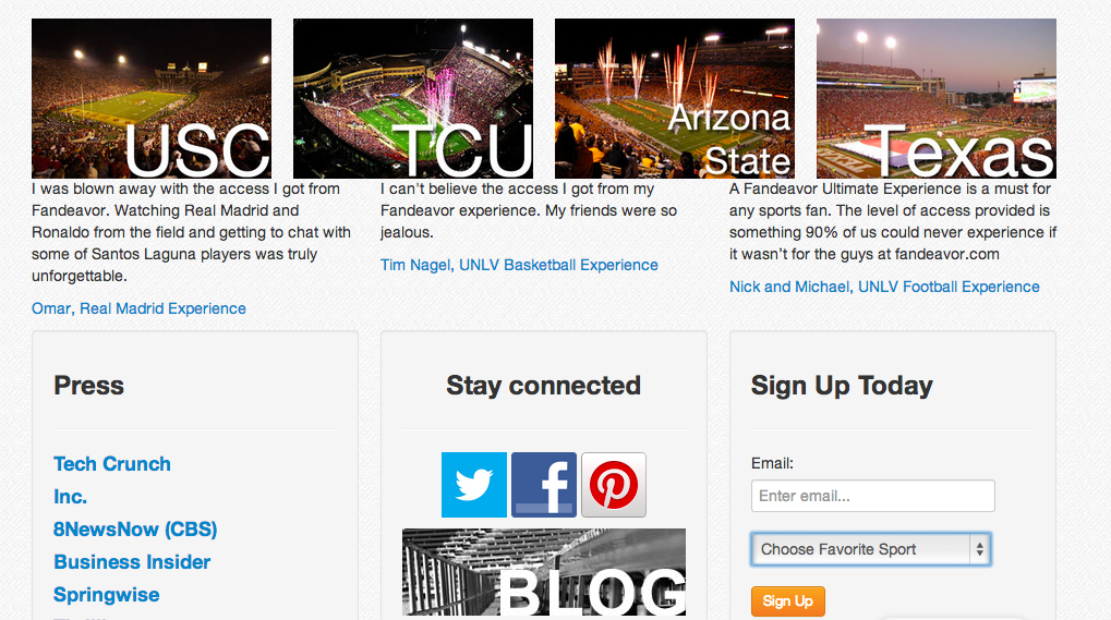
Fandeavor’s initial website
Through a cross-promotional partnership with UNLV, who promoted these experiences through their Facebook fanpage, these first experiences quickly sold-out. It was from testing these first experiences that the Fandeavor team realized that doing cross-promotions with other organizations to promote their gameday packages helped them build their audience and also made their sales successful.
The duo continued testing their business idea by offering more experiences on their website. They even created sections of their site that were empty but helped track demand of what teams and sports people were most interested in. Just simply by tracking clicks on their relatively simple site, they could figure out what types of experiences to offer next.
Tom and Dean left their day jobs at Zappos to work on Fandeavor full-time. But soon, they realized that the kind of experiences people were interested in were not necessarily box suites. A lot of consumers wanted even simpler things — help with travel, hotels, and other logistics in building a great trip experience around tournaments and games. These were experiences that the team could build with virtually no special business development deals. So, they started curating these experiences themselves manually. Eventually, they were able to develop a process around doing this efficiently.
From doing quick tests using a simple website, Fandeavor was able to figure out the mechanics behind how to get their supply (the right curatable gameday experiences) and the demand (promoting through cross-promotional partnerships).

Fandeavor’s website today
Once they established the processes for scaling both sides up, they were able to later build a much more sophisticated backend to curate all their experiences and build their team to repeat these processes. Today, Fandeavor has raised $525k and is growing 50% month over month.
Moveline
Moveline is a company that aggregates moving quotes from moving companies. Founders Kelly Eidson and Fred Cook realized that the moving process was difficult for people for a whole variety of reasons and wanted to help make this process better.
Fred and Kelly collected leads on a simple website to start working with qualified consumers. And soon, they started going into homes of people who were moving to talk with them about moving issues.

Moveline’s initial website
Kelly and Fred quickly learned that it was a headache for people to document every little thing they had to move and then submit all those items to different moving companies to get quotes. Kelly and Fred realized that the crux to making the moving process better was to develop a better way of itemizing objects.
At first, the Moveline team was not really sure how to do this better. They initially went into people’s homes and manually categorized items into spreadsheets. They repeated this with dozens of people who were moving. The breakthrough in building a process around this came when someone in a different city contacted them requesting their itemization-help. Not able to physically go to that person’s home, Fred and Kelly asked to do the itemization over Facetime. It turned out they were able to accurately and quickly itemize over the video conferencing software, which later became a part of Moveline’s core product. It turned out that using video conferencing software gave them an edge — they could itemize just about any move from anywhere without requiring local on-the-ground teams.
It was from these initial conversations with dozens of consumers that Moveline was able to tease out a very specific problem to solve in moving. And, once they were able to manually figure out how to use technology to solve this problem, they were ready for scale. It was because they used a simple website that fed them leads, but still required the team to “be the product,” they were able to really understand and solve this particular problem in moving.

Moveline’s website today
Only once they had a clear idea of what needed to be built into the product, Fred started hiring a team of engineers and product people to build the first version of Moveline’s software. Today, Moveline is an 18 person company, has raised $3 million in funding, and since launching nationally in March has added over 200 moving companies to its network. They now serve customers in over 100 cities in the U.S. and internationally.
Both Moveline and Fandeavor primarily used static websites to collect leads and kickoff interactions with potential customers. Although static sites don’t seem very sophisticated, through the use of simple input fields and forms, you can collect information to vet potential leads, and you can use them to collect customer insights. Static websites are a great way to quickly test your product and get to product/market fit.
For more examples of companies who built minimum viable products without coding, see these awesome posts written by Ryan Hoover and Vin Vacanti:
P.S. If you want to learn how to build your first web prototype without coding, attend this workshop I’m hosting on Building a Mobile-friendly Websites Without Code on October 3. Get 25% off with this discount code: “andrew-hustler”.
Easter Egg Marketing: How Snapchat, Apple, and Google Hook You
This is a guest post by Ryan Hoover, the Director of Product at PlayHaven and creator of Startup Edition. Follow him Twitter at @rrhoover or visit his blog to read more on product design.
Ryan Hoover on Easter Egg Marketing
Last week I received this Snapchat from a friend:

I was quite surprised to see a black-and-white photo. “When did Snapchat add filters?” I asked in response.
With pride and delight, my friend responded with instructions: enter the text caption, “B&W…”, to activate the black-and-white filter. Grinning, I immediately sent a dozen B&W Snapchats to my friends, anticipating their curious replies because I knew something they did not. I knew a secret.
The black-and-white filter is one of Snapchat’s many Easter eggs. An Easter egg is an inside joke or hidden feature. The term was first coined by a programmer who hid his signature inside a secret room within the Atari 2600 video game, “Adventure”. Decades later, Easter eggs are a recurring meme in gaming, a head-nod to players, and have expanded into non-gaming, consumer products. Look closely and you may find Easter eggs hidden within your favorite applications.
The nature of Easter eggs is an oxymoron. Why would Snapchat or any other product hide functionality. Apps should be intuitive and accessible, right?
Easter eggs go against users’ expectations and in turn serve as a powerful form of marketing, enabling companies to:
- Get People Talking – People love knowing secrets but they like to share them even more. Consider the last time you heard office gossip or a twist ending to a much-anticipated film. Did you have an urge to tell others? Wasn’t it amusing to see your friend’s reaction as you revealed the secret?
- Bring People Together – As a child, we were told not to withhold secrets from our parents. But we did so anyway. Mutually shared secrets between our friends and siblings brought us together. The same is true for Easter eggs. Those aware of the Easter egg secret share a common understanding, separating people “in the know” from outsiders. This helps form a bond between holders of the secret and strengthens a community.
- Build a Brand – Easter eggs are fun and produce a “WOW!” effect. This delight forms a memorable connection between the brand and its users through a shared understanding not privy to everyone.
Here are three companies that use Easter eggs to spike engagement, establish a community, increase word-of-mouth, and build a memorable brand:
Apple (Siri)
When Siri launched, Easter eggs bombarded the internet. People could not get enough of Siri’s unexpected, witty answers to the hidden questions and phrases.
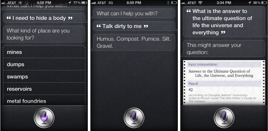
Siri’s humor was inescapable as blogs, TV shows, and social networks exploded in discussion. Websites dedicated to its Easter eggs sprung up. A Google search for “siri funny questions” results in over a million results. The free marketing instigated by these Easter eggs was arguably more impactful than Apple’s multi-million dollar advertising budget.
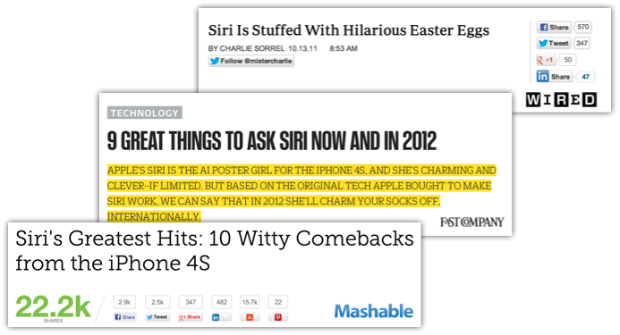
The secretive and clever nature of Easter eggs encouraged users to explore the product to uncover its secrets. When users cracked an Easter egg mystery, they acquired bragging rights, often sharing their discovery with friends. As a result, Siri became a celebrity as people promoted her wit.
Lyft
As I was walking down Howard St. in San Francisco, I overhead a group of people talking.
“What are those pink mustaches for?” A woman said, pointing to a blue sedan.

“I don’t know! I see them everywhere.” Her friend replied.
This wasn’t the first time I had heard this question. I observed two other groups of people ask the same question earlier that week.
Lyft, a ride-sharing service, aroused curiosity by decorating its fleet of vehicles with furry, pink mustaches. Instead of plastering its brand name on the side panels of its cars, Lyft used an Easter egg to catch people’s attention and get them talking. After seeing a half a dozen pink mustache-sporting vehicles, one is bound to resolve the mystery.
As users demonstrated an effort to understand the meaning behind the silly spectacle, by asking friends or searching online, Lyft became more memorable. This is especially important in competitive markets, where recall and top-of-mind-awareness determine which transportation service one turns to the moment they need a ride. Lyft creatively stood out from the competition by hiding its brand behind an Easter egg: a pink mustache.
Google
Google is known for its shenanigans and clever Easter eggs. The search goliath often replaces its logo with Google Doodles, turning its name into art in honor of holidays, special events, and anniversaries. The company even turned its logo into an interactive synthesizer and zamboni mini-game. These rotating doodles spur conversation and encourage people to visit the homepage to see what others are talking about.

Less obvious, though arguably more impactful, are Google’s hidden search terms. Visit google.com, type in “do a barrel roll”, and press enter! Be prepared for a delightful surprise as the screen rotates. This hidden gem continues to spread across the web years after its release in 2011, as evident by the hundreds of tweets like the one below, shared just this week.
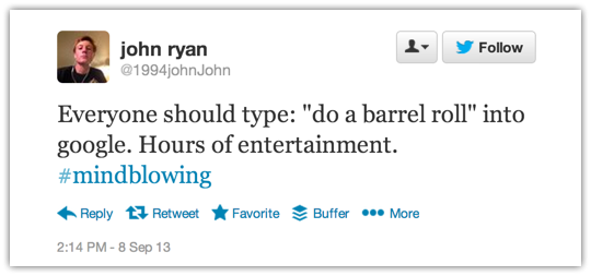
Despite being a multi-billion dollar corporation, Google demonstrates playfulness, charming its users with fun surprises. Although Easter eggs provide no value to the product’s core offering, it creates a personality to the brand and encourages users to engage in marketing the product by forwarding it to friends.
Easter eggs are more than a fun distraction and can serve as a powerful form of marketing. Consider how you can incorporate Easter eggs in your product or service to increase engagement, establish a community, get people talking, and build a memorable brand.
And now that you know the secret, don’t you want to share it? ;)
For more essays on product design, subscribe to Ryan’s email list.
How is Yahoo really doing? Here’s the Google Trends data (Guest Post)
Note from Andrew: I recently wrote an essay on the virtues of using Google Trends to analyze the underlying traction of products instead of focusing on PR. I mentioned offhand that it would be interesting to break Yahoo’s properties apart to see how they are doing independently of each other, and Matt (bio at the end) sent me some great notes on the topic – you can also follow him on Twitter at @mattgierl. It’s worth noting the caveats that Google Trends data is directional, probably doesn’t do good job on mobile, etc., but nevertheless I found the findings thought-provoking.
Matt Gierl:
How is Yahoo Really Doing?

To say that there has been a bit of buzz around Yahoo as of late would be a drastic understatement.
From Marissa Mayer’s appointment to CEO, to their re-launch of photo-sharing app Flickr, their $1.1B acquisition of Tumblr, and most recently, their bizarre (ingenius?) 30-logos-in-30-days PR campaign: purple-mania has reached a fever pitch. Investors seem to have bought into the hype as well, as Yahoo’s stock price has nearly doubled from its 52-week low to over $28 per share as of the time of this writing.
But I, for one, am not ready to count myself as one of the believers. Let me tell you one of many reasons why.
In Andrew’s post last week, he made the case for why navigational query volume is a better proxy for evaluating a company’s traction in the market, as opposed to something like unique monthly visits (which can be inflated a variety of ways which Andrew discusses). Fortunately for us all, the Google Trends tool makes this ridiculously easy to do.
In the post, Andrew takes us through the charts for some of the current and former high-flyers in the tech space including AirBnb, Pinterest, Twitter and, last but not least, Yahoo. Here’s what he found:
Yahoo
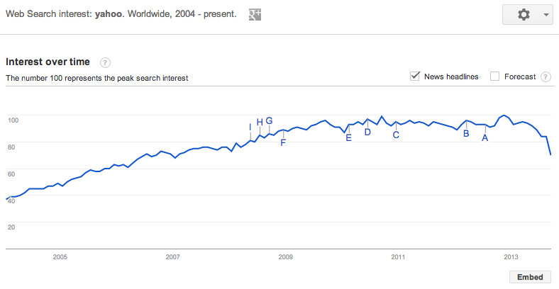
Surprisingly, Yahoo experienced pretty strong growth until mid-2009, where we see volume stall a bit. Further still, there has been a noticeable decline from the end of 2012 to today. While these are some interesting trends overall, it leaves a lot unsaid in terms of how the various Yahoo properties (e.g. Yahoo News, Yahoo Sports, etc.) may be affecting their overall navigational query volume, so I did some digging and found that it’s actually a bit of a mixed bag.
The Good
Several Yahoo properties are doing well on navigational queries: News and Sports, in particular.
Let’s start with Yahoo News.
Yahoo News
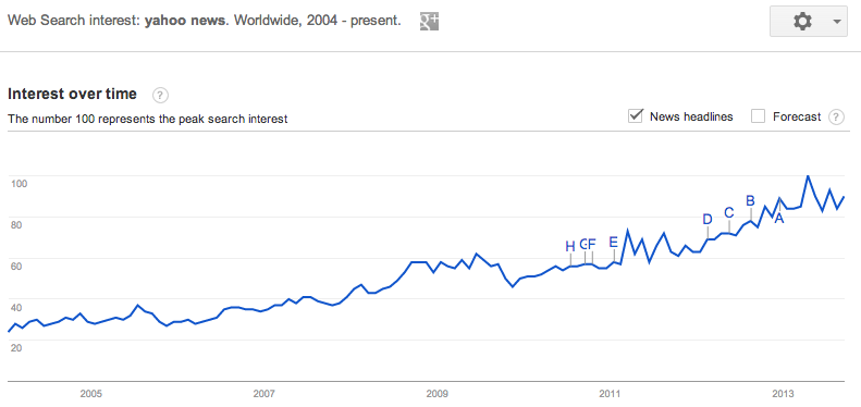
While there aren’t a ton of positives with respect to navigational query growth for Yahoo’s properties, there have been a couple bright spots. To begin, we see that Yahoo News has shown steady growth over the last 10 years. Whoever said journalism was dead?
Yahoo Sports
Yahoo Sports has enjoyed a positive trend overall as well, interspersed with cyclical spikes corresponding with the starts of the NFL/NCAAFB and MLB seasons. It’s tough to say definitively, but this is likely a result of the explosion of fantasy sports in the U.S. and abroad, which grew 60% from 2007-2011 and has shown no signs of slowing.

The Bad
On the other hand, several Yahoo properties are flat. As I alluded to earlier, it’s definitely not all roses for Yahoo though.
Yahoo Finance
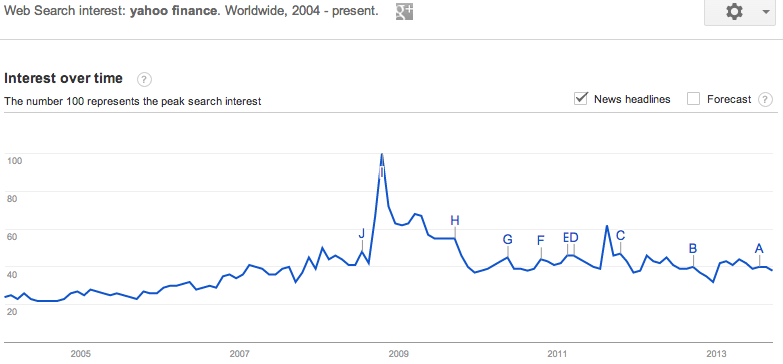
Here, in one of the more interesting of all the Yahoo property charts, Yahoo Finance, we see a modest growth trend obscured by a stalagmite-like formation which occurred during the economic collapse of 2008-2009. The bump in ad revenues was a small silver lining for them in the midst of their stock plummeting to half of its former value, I’m sure.
Yahoo Weather
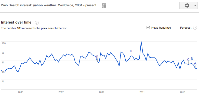
Yahoo Weather appears to be falling out of favor as well, as volume has declined to roughly half of what it was at its high at the start of 2011.
The Ugly
Several Yahoo properties are hitting slumps though, even in important categories like Mail, Travel, and Shopping.
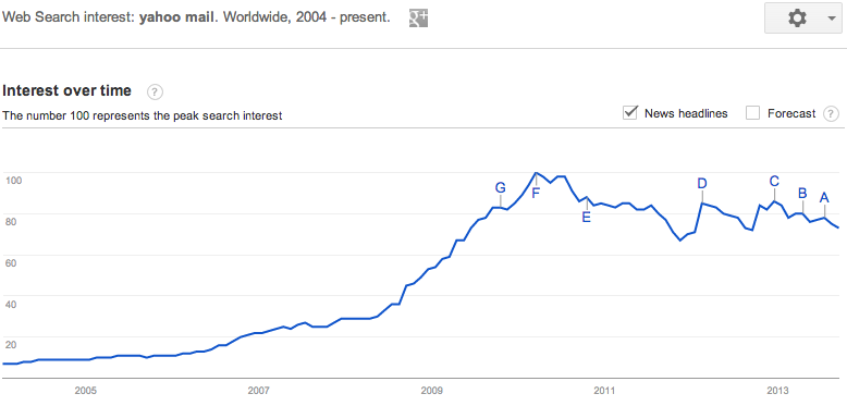
Yahoo Mail
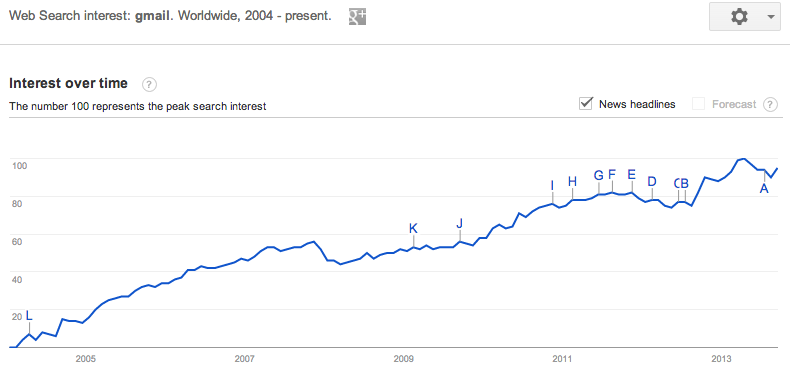
Turning now to one of the most critical properties in the Yahoo ecosystem, Yahoo mail, we see an even bleaker story still. After experiencing a strong period of growth from the Since mid-2010, search queries for Yahoo Mail have steadily declined, coinciding directly with the rise in volume that Gmail has enjoyed over the same time period.
Gmail
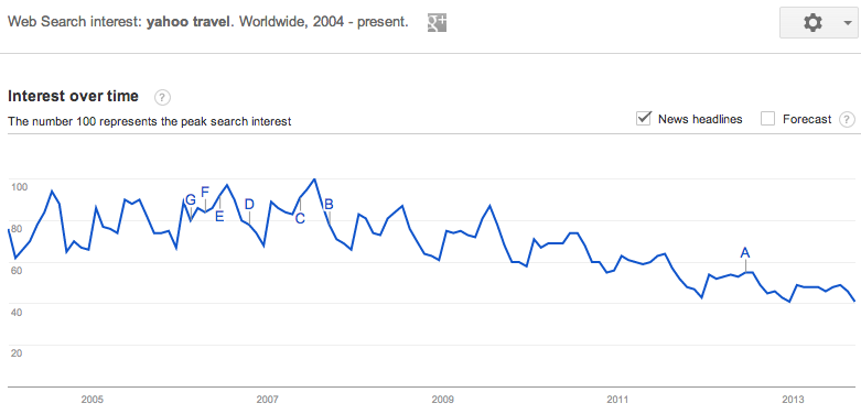
Yahoo Travel
Yahoo Travel hasn’t fared much better. Volume has continued to decline steadily since 2007, likely due to the growth of more sophisticated travel aggregators like Orbitz, Kayak, Hotwire, Hipmunk and even Bing Travel over the past 5 years.
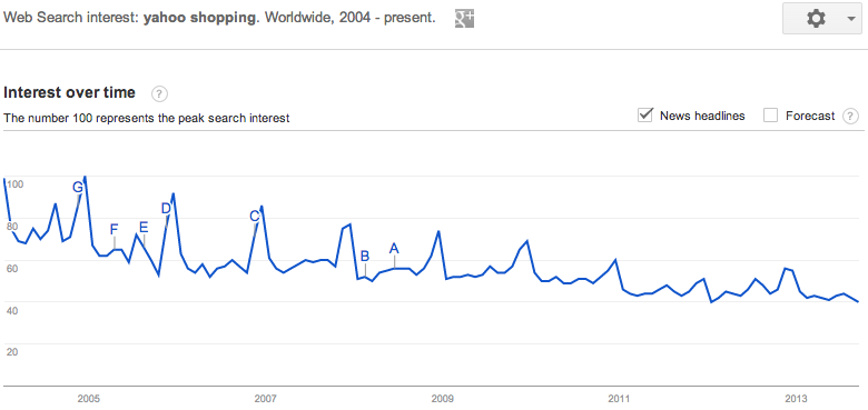
Yahoo Shopping
And finally, in perhaps the most defining chart of all, Yahoo Shopping continues its decade-long decline in navigational query volume. But let’s be honest, when is the last time you’ve intentionally navigated to Yahoo Shopping for your consumer product needs? Yeah, I can’t remember either. And I bet you can guess one of the major culprits who appears to be syphoning off this volume…
Amazon
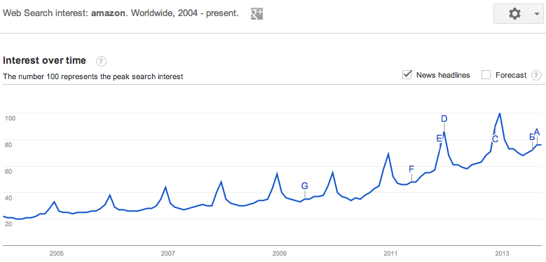
Now, I understand that navigational query volume is not everything and that there is much more to the Yahoo story than what I’ve managed to include here, but nonetheless, this doesn’t instill much confidence in their ability to reverse the trend and drive growth moving forward. When it comes down to it, they simply don’t have a single rockstar product to speak of that can serve as the archetype for success in the post-Web 2.0 era.
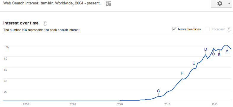
And while some may be quick to suggest that Tumblr fills this role, I think it’s still too soon to call. Hopefully for Yahoo’s sake, that hint of stagnation in Tumblr’s chart since 2013 is merely a red herring.
Tumblr
The Recap
So to recap, we have:
- Two of Yahoo’s properties, News and Sports, showing moderate to strong growth in the last decade
- Yahoo Finance and Yahoo Weather in steady decline since 2009
- Three of Yahoo’s key businesses in Yahoo Shopping, Mail, and Travel getting their lunches handed to them by the competition
- And, finally, a brand new $1.1B question mark
So while I must admit that I rather enjoy a gimmicky PR campaign every now and then, the negatives significantly outweigh the positives here. As a result, until Yahoo can show us some real, tangible traction with a core product, I will continue to remain a doubter.
About the author: Matt Gierl is a an MBA student at UCLA Anderson, digital marketer, and sporadic blogger over at Medium. As a former consultant at the data science firm, dunnhumby, Matt has helped some of the world’s most iconic brands achieve new growth by better understanding the behaviors of their most loyal customers. Matt currently resides in Los Angeles where he is an MBA student at UCLA Anderson. If you happen to be in the area, I hear he is willing to grab coffee and chat about marketing, tech, startups and the like, so get at him at @mattgierl.
Ignore PR and buzz, use Google Trends to assess traction instead
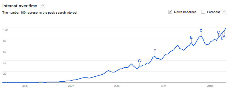
[Yelp shows a healthy navigational search graph – lots of people are continuing to search for its brand, and you can see some seasonality where it peaks every August, goes down during Q4, then starts coming back up in Q1.]
PR buzz is useless for assessing product traction
Traction is everything, and it’s easy to confuse press buzz with actually having product/market fit. Writers for blogs and newspapers love novel ideas that sound amazing on paper, especially when the new products are being introduced by credible entrepreneurs. However, when you’re in the business of making product and investment decisions, it’s important to understand what’s actually working and what’s not- having buzz isn’t enough.
This article is about one of the ways to answer the question, “Is X product really working?” The easiest, fastest, free way to assess the traction of a competitor or buzzy startup is to use Google Trends. It’s a great tool from Google that gives you a chart of how many search queries are being generated, which is a fantastic way to see if the consumer pull demand is increasing or decreasing.
Navigational queries are the best representation of consumer “pull” from the market
The reason why this works is that Navigational Queries are one of the three major kinds of queries that consumers plug into search engines. People search for a brand like “yelp” “facebook” “zynga” when they want to directly navigate to that domain, and as you might imagine, it’s a strong indicator of customer loyalty. These navigational searches represent the “pull” of the market, and if the graph of this pull is flat or declining, then you might have a problem on your hands.
Consumer demand is the leading indicator, uniques are the lagging indicator
The reason why a graph of navigational queries is so powerful is that it partially removes three major sources of traffic which are often inauthentic, unsustainable, or susceptible to artificial inflation:
- Unsustainable paid ads, where spending outpaces lifetime value of the users acquired. Or, commonly in mobile, where a bunch of ads are purchased in an attempt to shoot an app up in the charts.
- Content farming, where a lot of low-quality content pages are created. Although a lot of users may end up arriving at these pages as a result of searching and clicking on something, they don’t know (or care) that they are on these pages- these aren’t really long-term users or customers.
- Drive-by traffic, which often looks like photo/video hosting, or IFRAME’d content, which people click into from Twitter, Facebook, or some other social channel. Similar to content farming, these are often “one click wonder” visits where people click in to view some content, but don’t actually engage or care about the underlying product.
Of course, doing something simple like graphic navigational queries isn’t strong enough to remove the entire effect of the above- instead, it just mutes it a little bit, and that’s the important thing in the long run. Ideally you want to see a long, smooth set of traffic that’s been built over months and years, not a huge spike driven by unsustainable means.
This consumer demand curve is really the leading indicator of traffic. Generally if I continue to see the graph going up and to the right, I will think that a company is pretty healthy. If it’s not, no matter how much is being written about them in the press, I’ll be skeptical.
Zooming in on traffic seasonality
One of the best parts about Google Trends is how granular it gets. You can ask to see the graphs on a 30-day rolling basis, as well as breaking it down by country. One the common patterns you’ll see is that there are two kinds of websites:
- Time-saving, where you use them at work Monday-Friday and they help you do your job.
- Time-wasting, where you use them at home in the evenings, and heavily on the weekends. They spike Saturday/Sunday and flatten out during the weekday.
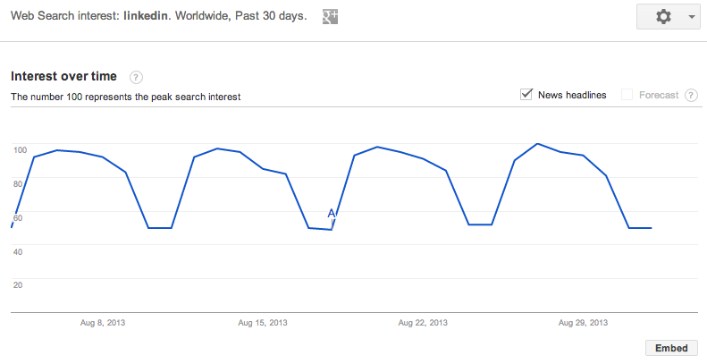
Here’s an obvious example of a time-saving product, Linkedin, which shows huge gains during the week but then it gets depressed during the weekends- amazingly the weekdays are 100% higher than the weekends, according to this chart!
Triangulate with AppAnnie, Facebook stats, Twittercounter, Twitter search, and Quantcast
Of course, there’s a ton of caveats to using such a simple tool. Searches will rise even when unsustainable methods are used, just because more consumers are being exposed to the brand. Similarly, the other big issue is that mobile apps don’t often benefit from search engine traffic the same way that websites do, since none of the content in the apps are being indexed.
Thus, remember that this analysis is strongest for web products, and to think of this as directional.
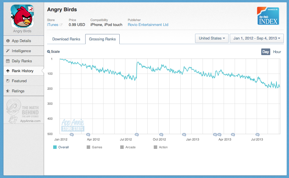
If you want a higher degree of confidence, consider using AppAnnie, Facebook stats, and Quantcast to figure out what’s going on. With AppAnnie, you can see the rankings of mobile apps and how they change over time. This can be useful in conjunction with Google Trends, since you can look up something like Angry Birds, which used to be the top grossing iOS app, which you can see below:
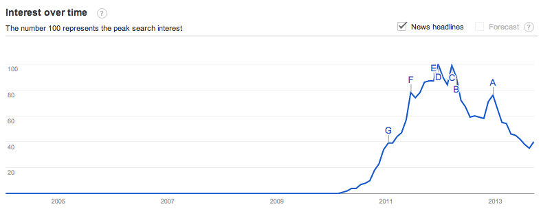
When you combine the above drop in rankings to their Google Trends chart, which I’ve included below, you can see that Angry Birds is stalling quite a bit:
You can also use Facebook stats services, for the products that allow for Facebook sign-in, to get a sense for how things are directionally going. Quantcast and Compete are also free services that let you look up uniques/month for web products, though they are often wildly in conflict with each other since they use the same kind of sampling that makes Alexa unreliable too. Back in 2006 I wrote about how Alexa works and all the flaws with their methodology, that I learned first-hand working with Nielsen/ComScore in my adtech days.
Qualitatively, doing a Twitter search on the brand is great too. Ideally you want to see a ton of authentic tweets about people actually talking about the product- again, the focus is on whether or not people really understand they are using a product and what they think of it. You can supplement this with a service like Twittercounter to see if their follower count is growing well over time. If a product claims a ton of uniques in a press release, but very few followers and very little Twitter conversation, it might be inauthentic traffic. (Thanks to Adam Besvinick for reminding me to mention Twitter searches)
How are Airbnb, Foursquare, Pinterest, Twitter, Quora, and Yahoo doing?
And finally, I thought it might be interesting to share the current graphs of a couple current (and previous) high-fliers to see how they’re doing on Google Trends. Some of the are universally considered to be doing well, and some are not. let’s see what Google Trends says, at least on a high-level.
Airbnb
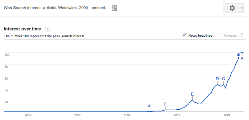
Seems to be growing very nicely. You can see some seasonal peaks in August where people rush to go on vacation for the summer, and then it rapidly drops off from there. The growth seems very strong.
Foursquare
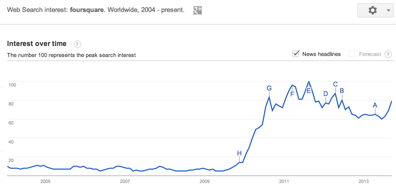
This is a tricky one- you both see that it’s flat, which is in line with what’s being discussed in the press. On the other hand, since it’s mostly mobile, it’s hard to say if this navigational query analysis is that useful. The silver lining on this also is that the traffic has held steady and hasn’t declined for a year now, which means there’s likely a strong core of retention holding everything together. Requires some more analysis to figure out what’s going on here.
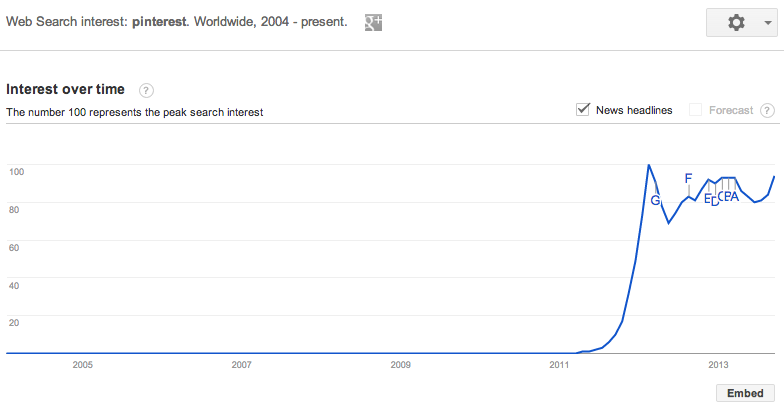
Pinterest
Same kind of indicators as Foursquare. There was a huge run up in 2011/2012, due to a lot of Open Graph nonsense, but now that the traffic spigot has died down, there’s still a good base of activity. As I understand it, they’re over 100M uu/month and holding onto that traffic, which should be enough audience to build a solid company.
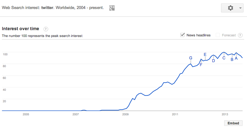
Twitter
Alongside Facebook’s graph, both seem like they are plateau’ing and going flat. But could this just be users transitioning from web-centric usage to mobile? I guess we’ll know when their IPO S-1 documents come out- are they accelerating audience growth or is is starting to slow down?
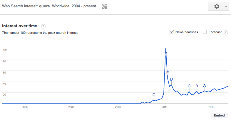
Quora
Although Quora hasn’t been in the news much lately, and a lot of digerati seem to have abandoned ship, their core base of traffic looks pretty good. Growing slowly. Building high-quality content via SEO is really hard- but it looks like Quora is gradually succeeding. Also note the epic launch curve, and that years later the current demand graph is still 1/3 of the initial peak.
Yahoo
It’s fascinating to me that Yahoo was actually still growing strongly up until 2010 or so. Now it’s flat and maybe even declining a bit. Curious to see if these curves can actually reverse themselves- a more detailed analysis would probably pull up these curves for every single important property, from Mail to News to everything else, and see if any one property is dropping faster than the others.